17 Green Bedroom Wall Ideas Every Shade From Sage to Forest
The color you choose will determine whether your space feels restful or bold, intimate or expansive. From soft sage to dramatic forest, each green hue carries distinct properties that shift with natural light exposure, surface texture, and surrounding furnishings.
Understanding how these greens interact with natural oak or walnut wood tones, warm brass hardware accents, and linen or cotton bedding materials becomes essential to achieving your desired atmosphere. Whether you lean toward muted, dusty sage with its gray-green undertones or rich, saturated forest green with deep blue-black depth, the wall color anchors every other design decision in the room.
Sage Green: The Timeless Soft Foundation
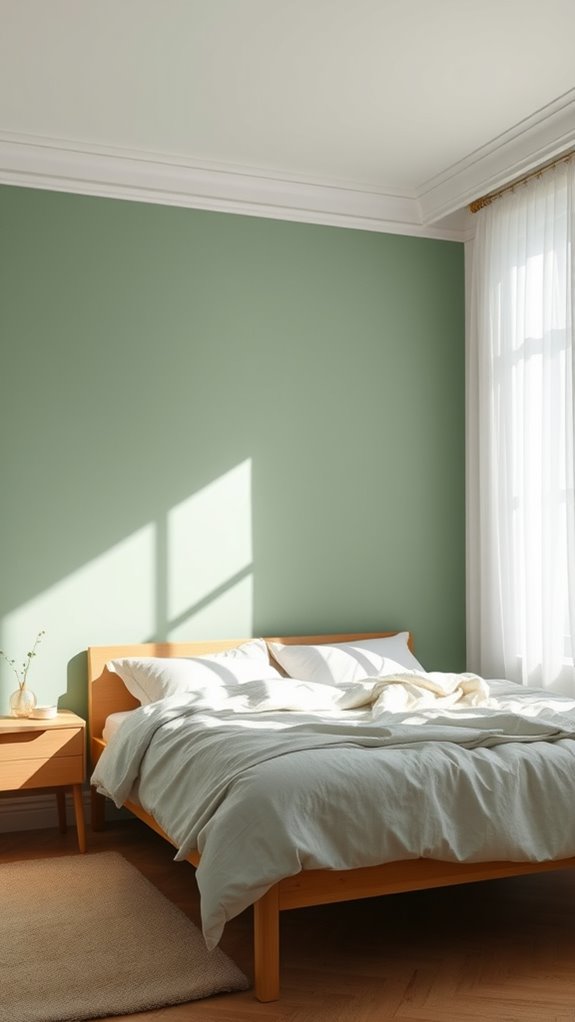
Because sage green balances warmth with restraint, it’s become one of the most versatile choices for bedroom walls. This muted, grey-toned green — cool yet organic, subdued yet present — creates a calming, enveloping backdrop without visually compressing or overwhelming the space.
Pair it with natural oak or walnut furniture, stone-washed linen bedding, and warm-toned neutral accents like terracotta, cream, or aged brass to deepen its grounding, restorative qualities. Sage green performs consistently across varied lighting conditions — softening under warm incandescent light, sharpening under cool northern exposure — making it a reliably adaptable, low-risk anchor for your bedroom’s color palette. Like the best neutral color schemes, sage proves that a restrained palette can still deliver remarkable personality and depth.
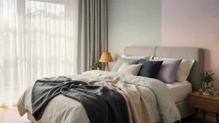
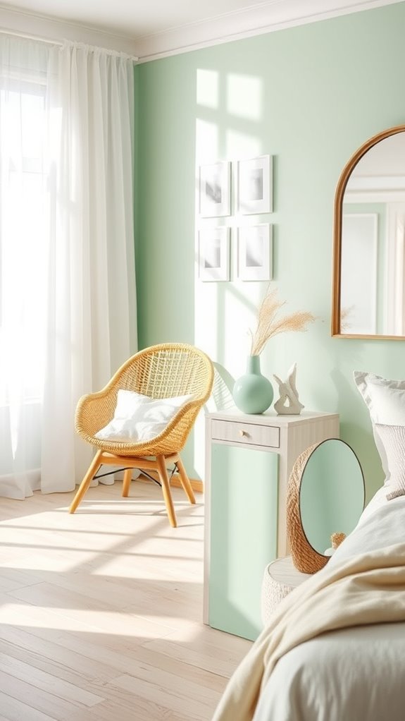
Celadon: Pale Green With Sophisticated Depth
Celadon is a pale, blue-tinged green with a cool luminosity that distinguishes it sharply from earthier, more muted greens like sage or olive. Where those shades anchor a space with warm, grounded tones, celadon lifts it—introducing a refined airiness that feels both deliberate and serene.
This particular hue pairs exceptionally well with natural materials: undyed linen textiles, raw oak furniture, matte ceramic vessels, and warm-toned hardwood flooring. The result is a layered, atmosphere-forward space that communicates understated elegance without heaviness, making celadon an especially strong candidate for bedrooms designed around quiet sophistication and restorative calm. To enhance this serene quality, consider incorporating soft, layered lighting throughout the space rather than relying on a single overhead fixture.
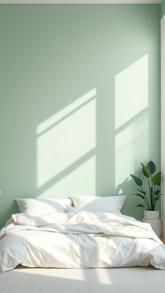
Seafoam Green: Airy and Refreshing Calm
Seafoam green and celadon may appear similar at first glance, but their distinct chromatic properties set them apart in meaningful ways. Seafoam green carries a higher luminosity value with pronounced blue-green wavelength dominance, while celadon leans into muted gray-green tones with a denser, more glazed ceramic-like visual weight.
For bedroom applications, seafoam green’s lighter spectral composition and cooler coastal undertones generate a more psychologically refreshing atmosphere than celadon’s sophisticated, earthbound depth. Its translucent, salt-air quality actively promotes melatonin-friendly relaxation responses. Choosing paint with higher luminosity values prevents the common mistake of visually compressing your bedroom space. Pair it with high-thread-count white cotton linens, matte-finish natural oak or driftwood furniture, and linen-textured window treatments to amplify the restorative, sleep-optimized environment.
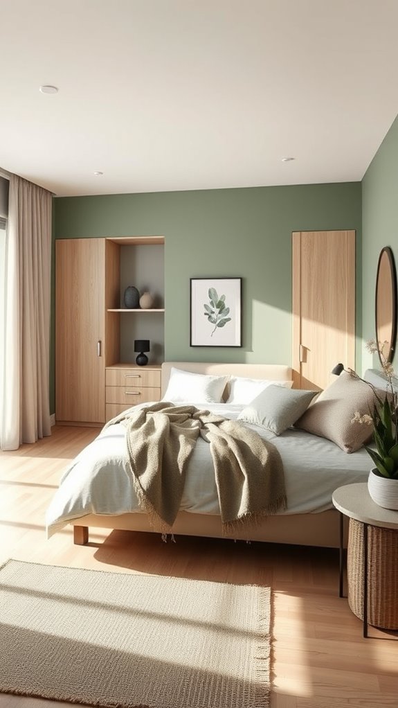
Pistachio: Soft Green With Playful Warmth
Pistachio occupies a distinctive position in the green spectrum, blending cool, muted undertones with a subtle warmth that prevents it from reading as stark or clinical. This nuanced, yellow-kissed green sits comfortably between breezy coastal aquas and the deeper, earthier tones of traditional sage, making it a versatile anchor color for bedroom walls.
Its soft luminosity pairs exceptionally well with raw oak and walnut furniture finishes, warm-toned cream and ivory textiles, and layered botanical artwork featuring pressed fern prints or watercolor leaf studies. Pistachio walls create a cohesive, organically grounded aesthetic that feels simultaneously restful and visually engaging, supporting a sleep environment that’s calm without feeling flat or uninspired. This balanced approach to color naturally complements Japandi bedroom design principles, where the harmony between serene tones and thoughtful material choices creates a sanctuary that honors both simplicity and comfort.
Mint Green: Cool Freshness That Won’t Overwhelm
Mint green delivers a cooler, more refreshing aesthetic than pistachio, yet it avoids the harshness that makes overly saturated, high-chroma greens feel clinical or visually fatiguing in a bedroom setting. Its soft, desaturated blue-green hue sits at the intersection of calm and brightness, making it a versatile choice for walls, textiles, or accent furniture.
The color pairs exceptionally well with soft whites, warm creams, and pale Scandinavian-style birch or ash wood tones, creating a serene, light-filled environment. Layer in stonewashed linen bedding, sheer cotton curtains, and abundant natural light to amplify its inherently calming properties without overpowering the visual balance of the space.
For renters seeking a mint green aesthetic without permanent changes, removable wall coverings offer an ideal solution that requires no nails, no paint, and no landlord permission.
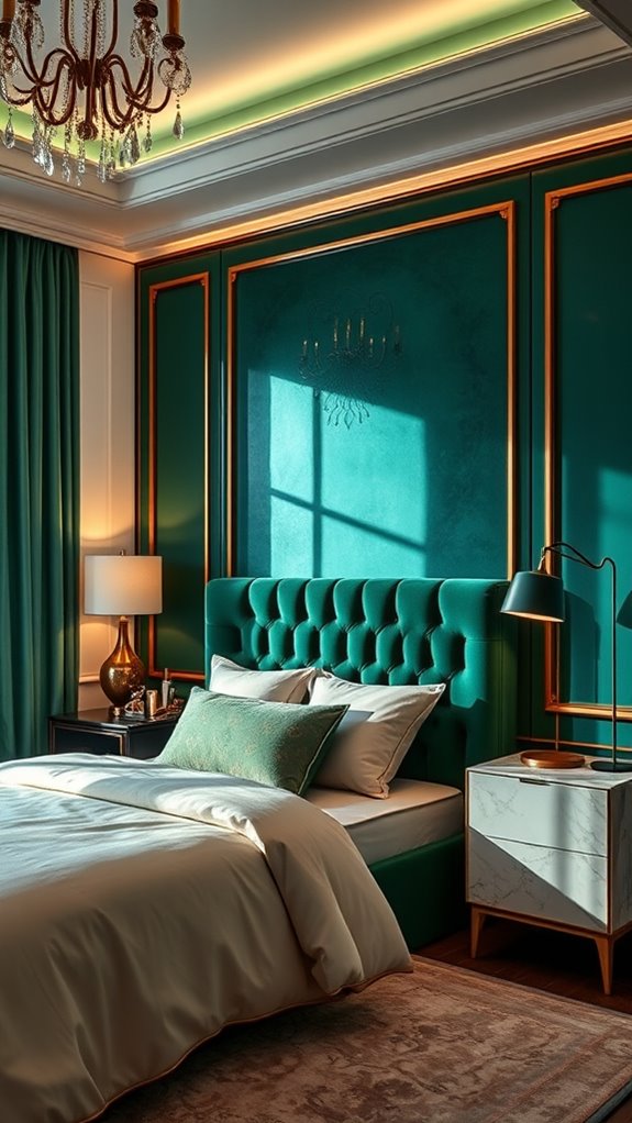
Teal Green: Blue-Leaning Shade for Unique Character
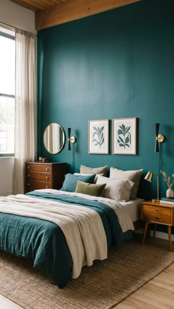
Teal green pushes beyond mint’s gentle coolness by introducing stronger blue undertones, creating a deeper, more saturated hue that commands attention while still maintaining bedroom-appropriate serenity.
This complex, blue-leaning pigment carries a distinctive chromatic weight — rich enough to anchor a room’s visual identity, yet refined enough to preserve a calm, restful atmosphere essential to sleep-focused spaces.
You’ll find teal works particularly well paired with warm-toned natural wood furniture, polished brass hardware and accent pieces, and soft tactile textiles like linen, velvet, and woven cotton.
This shade establishes sophisticated, layered character without overwhelming your space, making it ideal for crafting an environment that feels simultaneously restful and visually compelling.
A deliberately designed teal bedroom demonstrates how bold color choices can feel intentional and complete even without traditional anchor pieces like headboards.
Eucalyptus: Muted Green With Modern Appeal
Eucalyptus green occupies a distinctive position in bedroom design, functioning as a muted, sophisticated shade with cool-gray undertones balanced by subtle warm, organic undertones. This nuanced dual-tone quality makes it exceptionally versatile across décor styles, from Scandinavian minimalism to transitional and contemporary aesthetics.
The color pairs beautifully with natural wood furniture in walnut, oak, or teak finishes, soft linen bedding in ivory or warm white, and streamlined minimalist accessories in matte black or brushed brass. It creates a calming, spa-like atmosphere without projecting the coldness associated with pure gray or blue-green tones, delivering modern visual appeal that reads as both grounded and refined. For siblings sharing a space with different style preferences, eucalyptus green serves as an ideal neutral compromise color that bridges varying tastes without overwhelming either child’s personality.
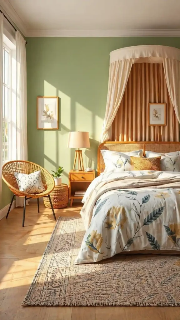
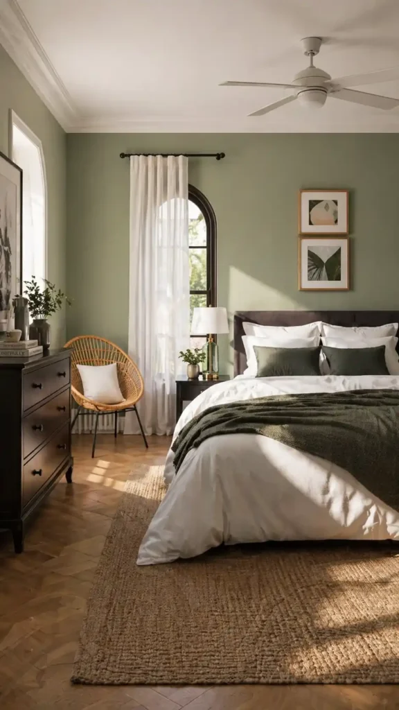
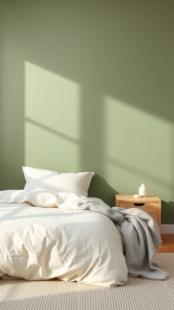
Olive Green: Earthy Tone for Warmth and Balance
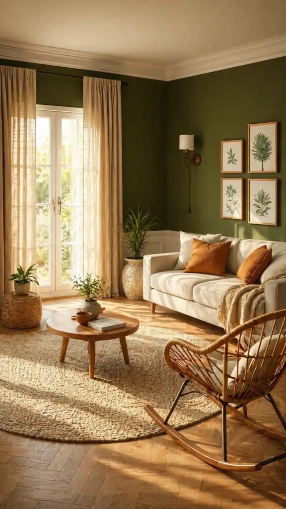
A sun-warmed bedroom interior featuring matte olive green walls with visible brushed texture, a solid oak bed frame with linen upholstery in warm ivory, layered cream cotton bedding with subtle woven texture, burnished brass bedside sconces casting soft amber light, a worn Persian rug in terracotta and ochre tones on wide-plank hardwood flooring, potted fig tree with broad green leaves in a terracotta vessel beside the window, sheer linen curtains filtering golden afternoon light, and a rustic walnut nightstand holding a ceramic lamp with a warm-toned shade. Designers often rely on earthy color combinations to create bedrooms that feel both grounded and effortlessly sophisticated.
Moss Green: Natural Texture Without Heavy Drama
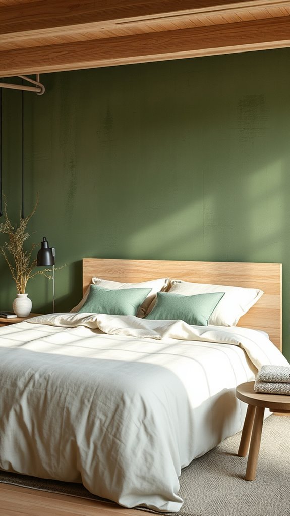
Moss green delivers natural warmth through its muted, earthy, sage-adjacent tones that feel simultaneously grounded and inviting — making it an ideal choice for bedroom environments where sensory calm and restorative atmosphere are the primary design goals. This low-saturation, organic hue pairs beautifully with raw natural materials like rough-sawn oak, brushed linen, undyed cotton, and weathered rattan, building layered tactile texture without introducing visual drama or chromatic tension. The key is maintaining earthy bedroom ideas that feel grounded and natural without tipping into boring or muddy territory, ensuring the space remains visually engaging even at low saturation.
Consider painting a single accent wall in a flat or matte finish to anchor the room with depth, or introduce the color through heavyweight linen bedding, a chunky-knit throw, or linen-cotton blend pillow covers to establish a serene, nature-connected foundation for your restful sanctuary.
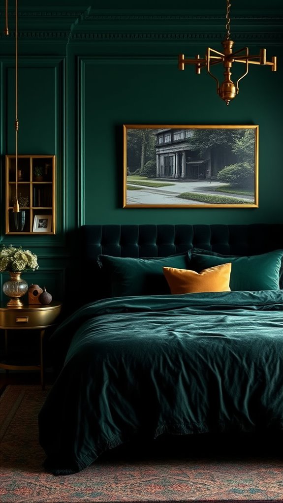
Jade Green: Rich Jewel Tone for Luxury Feel
Jade green offers a sophisticated alternative to soft, understated palettes, commanding attention without feeling aggressive or overwhelming. This rich, deeply saturated jewel tone — reminiscent of polished malachite and imperial Chinese porcelain — transforms a standard bedroom into a space that feels intentional and curated.
The color pairs beautifully with warm brass fixtures, veined marble accents, and dark-stained walnut or mahogany furniture, creating layered visual depth. Jade green cultivates a luxurious atmosphere that balances psychological calm with refined visual impact, making it a compelling choice for bedrooms designed around understated opulence and tactile richness. For those incorporating a bedroom office combo, establishing clear visual boundaries between your workspace and sleep area helps preserve the restorative atmosphere this dramatic color creates.
A bedroom with deep jade green walls, a tufted velvet headboard in matching green tones, brass bedside sconces casting warm amber light, a marble-topped nightstand with dark wood legs, crisp white linen bedding with subtle texture, a Persian-style area rug with jewel tones, floor-to-ceiling curtains in forest green silk, a large ornate mirror with a brass frame, soft shadow patterns across the walls, photorealistic interior photography style, moody and sophisticated lighting, shallow depth of field.
Emerald Green: Deep Jewel Tone for Sophistication
Emerald green delivers a deeper, more intensely saturated jewel tone that commands authentic sophistication in your bedroom, moving well beyond jade’s balanced, earthy richness. This bold, chromatic shift introduces a dramatic visual weight, anchored by its high-saturation pigment depth and cool-leaning blue undertones that distinguish it from softer, muted greens.
Pair emerald walls with aged brass fixtures, dark walnut or ebony wood furniture, and crushed velvet textiles in complementary tones like champagne, ivory, or deep burgundy to amplify the inherently luxurious atmosphere. This richly dimensional shade performs best in generously proportioned rooms with abundant natural light streaming through large windows, preventing the high-saturation walls from creating a visually compressed or oppressive spatial experience.
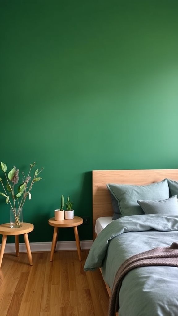
Forest Green: Dark Statement Walls for Bold Retreats
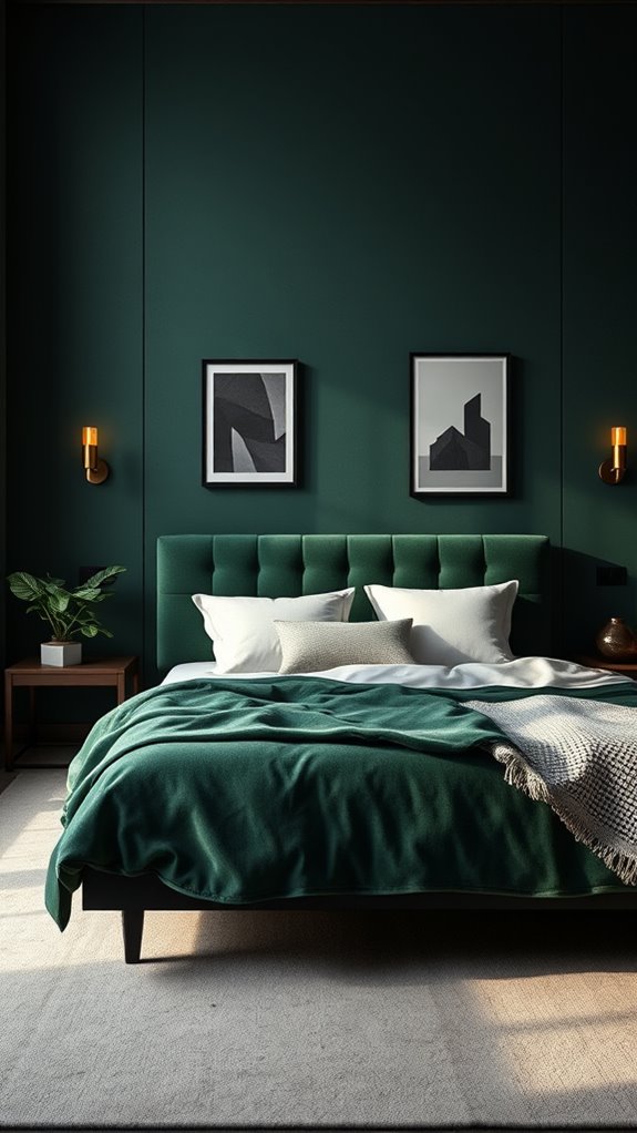
Forest green creates dramatic accent walls that establish authority and depth in your personal retreat. This rich, saturated hue pairs beautifully with warm brass fixtures, dark walnut furniture, and cream-white trim work, creating a layered tonal palette that feels intentional and curated.
Interior designers consistently note that forest green’s deep chlorophyll-dense pigmentation absorbs ambient light in a way that fosters relaxation while sustaining visual interest. The result is a commanding, enveloping atmosphere that transforms an ordinary room into a bold, deliberate sanctuary for those drawn to deeper color statements.
Which Green Shade Matches Your Style?
Now that you’ve explored how forest green commands a room, it’s time to contemplate which green shade truly aligns with your personal aesthetic and lifestyle. Consider your lighting conditions, existing furnishings, and desired mood — matte sage absorbs warm-toned ambient light beautifully in Scandinavian-minimalist spaces, while jewel-toned emerald with its high-saturation depth amplifies the richness of mahogany furniture, brass hardware, and traditional architectural millwork.
Assess multiple paint samples — ideally 4-inch swatches on white card stock — against your bedroom’s north-facing natural daylight and warm-bulb artificial lighting before committing to your final selection.
Green Walls + Natural Wood: The Perfect Pairing
How does natural wood enhance green walls in your bedroom? Wood tones, whether warm oak or cool walnut, ground green walls beautifully. The organic textures complement each other, creating visual harmony.
Wood furniture, flooring, and accents balance the boldness of green, while natural materials work together to establish a cohesive, calming environment that feels both sophisticated and welcoming throughout your space.
Green Walls + Neutral Bedding: The Calming Formula
When you pair green walls with neutral bedding, you’re creating a visual foundation that lets your wall color become the room’s focal point. Cream, beige, or gray linens recede visually, allowing your green walls to command attention.
This combination establishes balance and promotes restfulness, making your bedroom feel cohesive and intentionally designed for relaxation and sleep.
Sage Green With White Trim: A Crisp, Clean Look
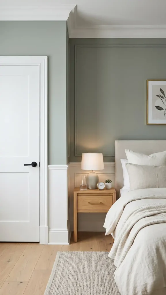
Sage green walls paired with crisp white trim create a clean architectural separation that enhances visual structure and spatial sophistication. The white molding — sharp, precise, and high-contrast — frames each wall plane beautifully, while the muted, gray-toned sage green delivers calming chromatic depth without visual weight.
This combination performs exceptionally well alongside warm light oak or bleached ash furniture pieces, layered soft linen bedding in ivory or oatmeal tones, and minimalist hardware in brushed brass or matte black.
The resulting environment reads as serene and deliberately organized, carrying a sensibility that feels simultaneously contemporary and enduringly classic throughout the bedroom space.
How Different Light Transforms Your Green Walls
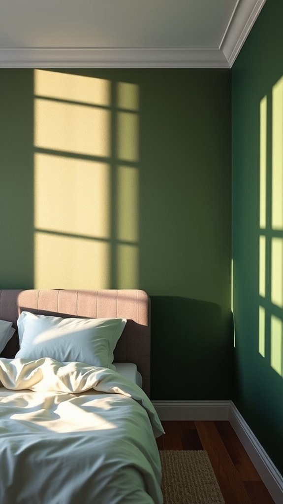
Light fundamentally reshapes how your green walls appear throughout the day, altering both their color intensity and the room’s overall mood. Natural sunlight enhances cool undertones in sage and eucalyptus shades, while warm artificial lighting brings out earthier, olive-based hues.
North-facing rooms create muted, sophisticated effects with diffused, blue-toned ambient light, whereas south-facing spaces intensify vibrancy and depth considerably, saturating pigment-rich forest and emerald tones with golden, directional rays.
Final thoughts
You’ve explored seventeen green shades, from soft sage to dramatic forest, each offering distinct moods and atmospheric qualities for your bedroom. Your color choice, combined with thoughtful selections of warm natural wood tones, aged brass accents, and high-quality linen or velvet textiles, creates a layered, cohesive environment that feels both intentional and inviting.
Consider your room’s natural light exposure and existing furniture finishes before committing to a specific shade. Test large paint samples directly on your walls, observing how shifting morning and evening light affects the undertones and depth of the color, ensuring your chosen green genuinely supports both deep relaxation and your personal aesthetic.