27 Bedroom Color Combinations That Designers Use on Repeat
You’re standing in your bedroom, unsure why the space feels unfinished, and color is likely the missing layer. Designers return to 27 specific combinations because they solve this exact problem, balancing warmth, depth, and texture without overwhelming the room.
You’ll find soft white paired with warm taupe, deep navy against blush, and charcoal gray with mustard yellow among the most reliable solutions. The right pairing transforms walls, bedding, and furniture into a cohesive retreat that feels intentional, layered, and visually grounded. What separates a flat room from one that feels designed is the deliberate relationship between hues, tones, and the surfaces they inhabit.
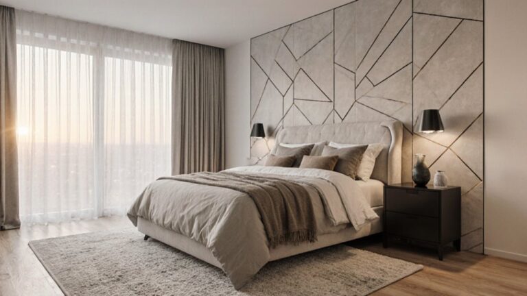
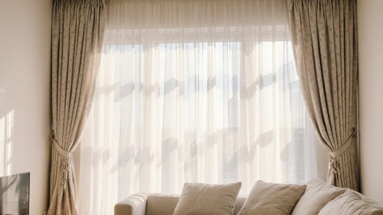
Soft White and Warm Taupe for Everyday Serenity
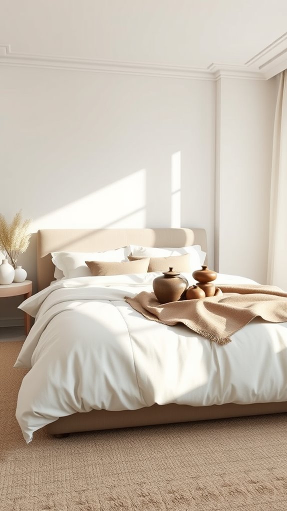
Why settle for stark white when you can wrap your bedroom in something gentler? You soften walls with warm taupe—a mid-tone, gray-brown hue with subtle yellow undertones—layering soft white cotton-linen blend bedding and raw, unfinished oak nightstands for visual depth and tactile contrast.
You amplify this grounding quality by introducing hand-woven seagrass baskets with open lattice weaves and floor-length linen curtains in an undyed, oatmeal finish, creating a lived-in serenity that signals calm from the moment you enter the room.
This neutral palette approach demonstrates how restrained color choices can still deliver remarkable personality and depth through thoughtful material selection.
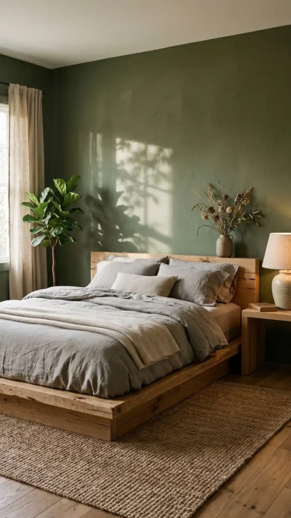
Sage Green and Crisp White for Calm Energy
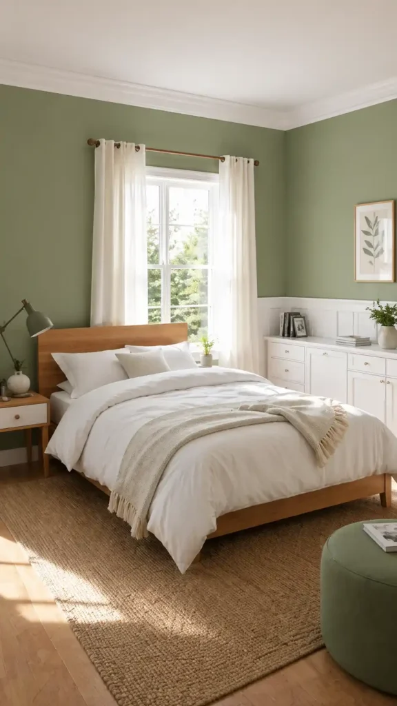
Sage green walls paired with crisp white trim create a bedroom that breathes with quiet, restorative energy. The contrast balances organic warmth against architectural crispness, inviting the outdoors in without overwhelming the senses. Apply sage to the ceiling for an unexpected canopy effect that wraps the room in soft, muted depth. This Japandi-inspired combination draws from the design philosophy that merges Japanese minimalism with Scandinavian warmth, creating spaces that feel both intentional and inviting.
Ground the space with a sage linen-upholstered headboard positioned against white cotton bedding, layered with natural-fiber throw blankets and textured cushions. Heavyweight linen drapes, raw cotton duvet covers, and woven jute accent rugs amplify the earthy, grounded calm this palette naturally produces.
Navy Blue and Blush Pink for Refined Contrast
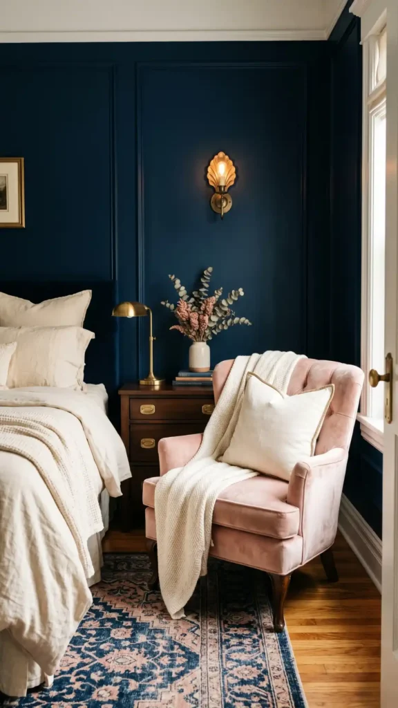
Navy walls carry the depth of a 2 a.m. sky — a saturated, almost ink-like hue that anchors a room with quiet authority. Paired with blush velvet upholstery, a soft rose-tinged fabric with a light-diffusing pile. The contrast reads as intentional rather than accidental, functioning equally well within traditional millwork-heavy interiors and clean-lined contemporary spaces.
Brass hardware — warm-toned, unlacquered or satin-finished — bridges the two tones without disrupting their tension. Ivory linens, slightly warm in undertone rather than stark white, soften the overall composition and prevent the pairing from tipping into coldness. Together, these grounding elements allow the navy-and-blush dynamic to feel curated, layered, and fully resolved.
For those seeking earth tone bedroom ideas that maintain this same intentional contrast while feeling more grounded and natural, muted terracotta and sage green offer a softer alternative that avoids muddy or boring results.
Charcoal Gray and Mustard Yellow for Modern Warmth
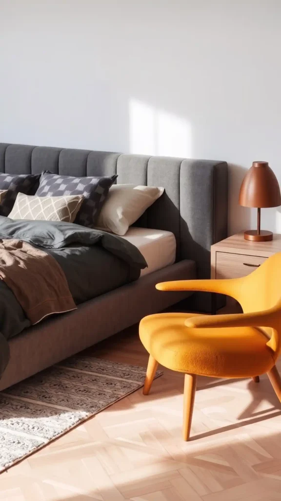
Charcoal serves as your neutral foundation—a deep, absorbing gray with subtle brown undertones that reads as grounded rather than gloomy. You layer in mustard yellow through velvet pillows, ceramic lamps, or a wool throw, and the warmth emerges instantly. Using deep, absorbing colors on large surfaces can make rooms feel smaller, so balance charcoal with strategic mustard accents that draw the eye and create visual breathing room.
You achieve modern sophistication without sterility, creating balance through controlled saturation and matte finishes.
Dusty Blue and Cream for Coastal Quiet
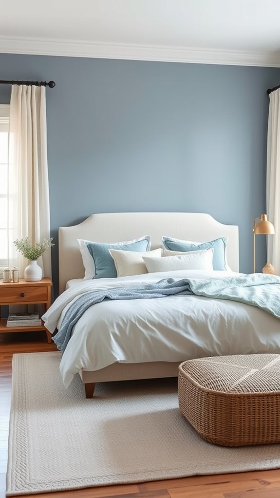
Why settle for stark coastal clichés when you can achieve something more restrained? You soften your walls with dusty blue — a muted, grey-tinged hue reminiscent of morning fog over still water — layering cream Belgian linen bedding and solid natural oak furniture for quiet, understated sophistication.
You build texture through hand-woven jute floor runners, brushed linen throw pillows, and loosely draped cream cotton, creating dimensional depth without visual clutter or decorative excess.
To complete the look, consider extending your dusty blue shade across the entire wall behind the bed as one unified headboard statement, anchoring the sleeping area without additional furniture.
Terracotta and Sand for Desert-Inspired Comfort
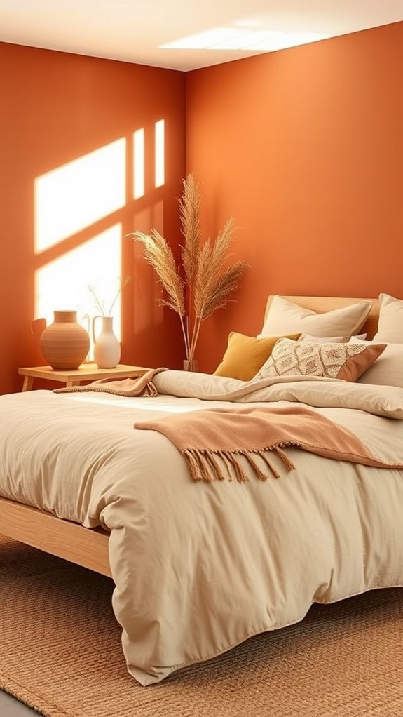
Move inland from the coast and you’ll find warmth taking the place of cool restraint, with terracotta and sand offering a grounded alternative to watery hues. You’ll paint walls in earthy clay tones — think sun-baked adobe and burnished sienna — then layer linen bedding in oatmeal and camel, selecting fabrics with a visible slubbed weave that catches afternoon light.
Add woven rattan pendants with an open lattice construction, paired alongside raw wood nightstands in unfinished white oak or bleached teak.
A philosophy expressed through matte ceramic vessels, handwoven jute rugs, and terracotta floor tiles with an unglazed, porous surface.
While bold hues often dominate trend cycles, timeless color choices ensure your desert retreat remains sophisticated for years without feeling dated.
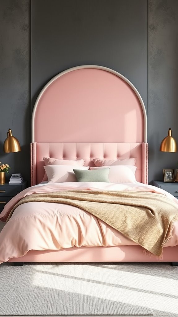
Blush Pink and Brass for Feminine Sophistication
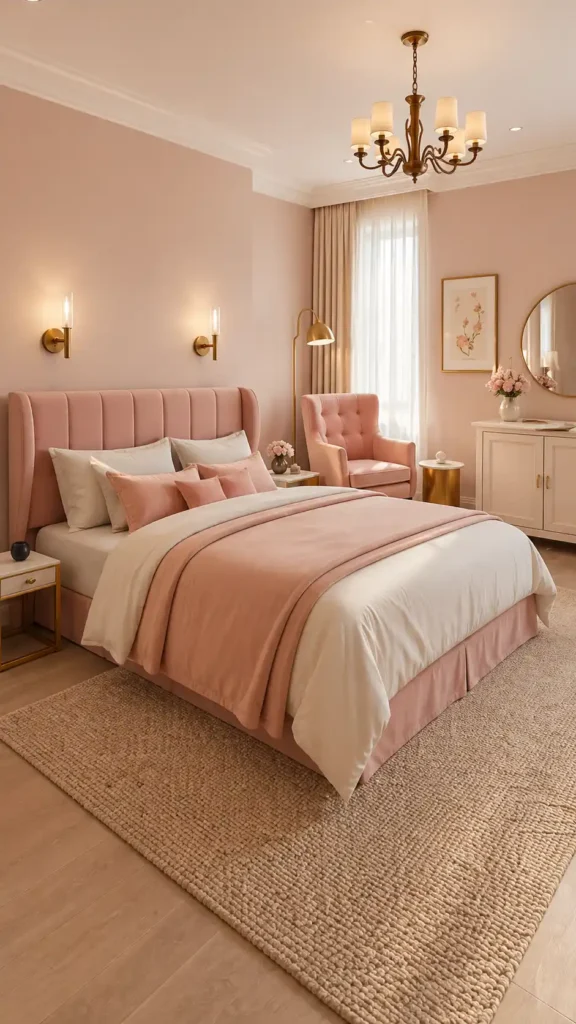
Balancing softness with substance in a bedroom requires intentional material choices that feel refined rather than saccharine. Blush pink walls establish a delicate foundation, while brushed brass accents — think aged, warm-toned hardware, elongated drawer pulls, and slender-legged side tables — ground the palette with metallic weight and visual authority. Much like a striking headboard, a well-executed color combination can transform the entire feel of a room on its own.
Layering rich tactile elements deepens the room’s sophistication beyond its color story. Tufted velvet upholstery in a dusty, muted rose anchors the bed with plush density, while honed Calacatta marble nightstands introduce cool, veined stone contrast. Stonewashed linen bedding in deeper rose and blush-mauve tones completes the scheme with relaxed, organic texture that keeps the space from tipping into over-precious territory.
Deep Forest Green and Natural Linen for Organic Depth
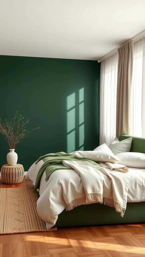
When you’re craving a bedroom that feels rooted and restorative, deep forest green walls offer an immediate sense of shelter, wrapping the space in color that mimics the quiet density of old-growth canopy. The rich, saturated hue — think muted juniper or aged moss rather than bright emerald — absorbs ambient light and anchors the room with a grounded, almost primordial stillness.
Pair that with natural linen bedding and drapery in undyed, oatmeal-toned or flaxen fabric, and you’ll introduce a loosely woven, breathable texture that softens the green’s intensity. Opt for raw-edge, live-slab wood nightstands in pale ash or weathered walnut to reinforce the organic, foraged palette without visual clutter. This combination evokes the same intentionally curated aesthetic found in well-designed vintage-inspired spaces, where every element feels chosen rather than accumulated.
Black and Warm White for Graphic Drama
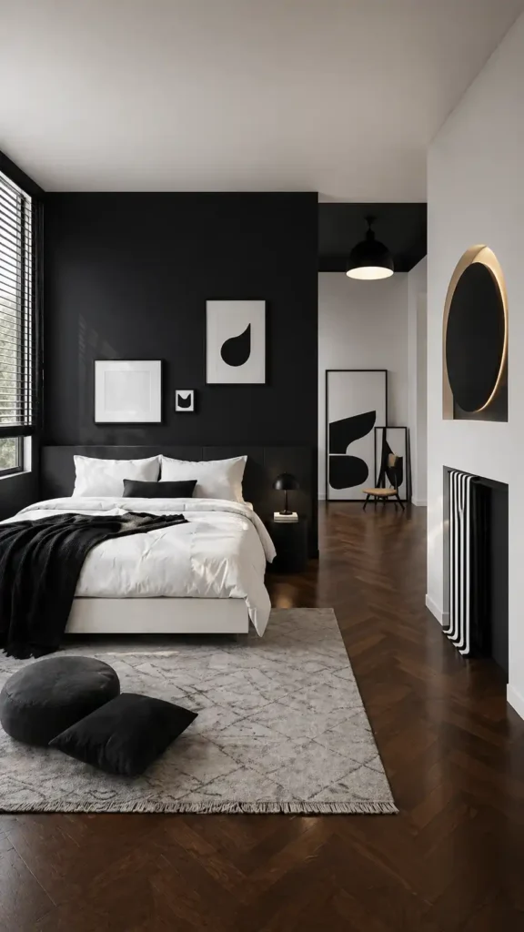
The hushed, organic palette of forest and flax gives way to something far more declarative: a bedroom rendered in stark black and warm white, wielding contrast like a sharpened tool. Matte black walls—deep, light-absorbing, and visually recessive—anchor the space with unapologetic weight, while ivory bedding and raw linen curtains introduce a tactile softness that prevents the palette from collapsing into severity.
Unbleached wool throws, their fibers loosely spun and naturally cream-toned, drape across the bed alongside pale oak flooring—wide-planked, wire-brushed, and warm-toned—grounding the room in organic materiality that tempers the graphic tension above. For those drawn to bold aesthetics, Kpop-inspired bedrooms demonstrate how graphic palettes can feel thoughtfully curated rather than overwhelming.
Lavender Gray and Silver for Subtle Luxury
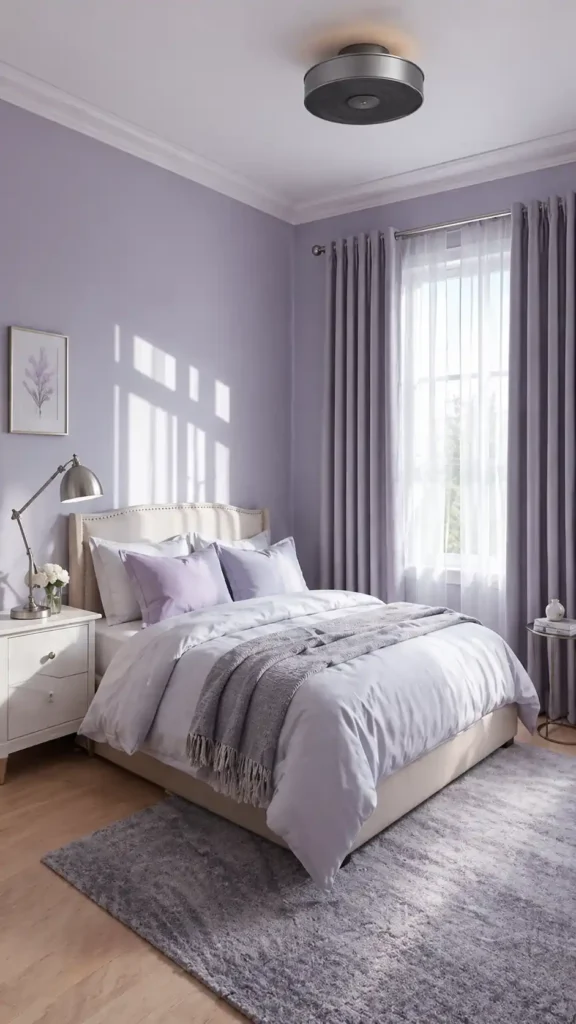
Where stark contrasts once commanded attention, a quieter opulence now takes hold in bedrooms dressed in lavender gray and silver. Matte, chalky walls layered with polished chrome fixtures and mercury glass accents create a composition that whispers instead of shouts.
Depth emerges through tonal variation, with dusty violet-tinged gray surfaces playing against cool metallic reflections. Plush velvet upholstery in muted amethyst tones pairs with brushed nickel and burnished silver nightstands, delivering a restrained sophistication that feels effortlessly elevated.
This approach mirrors the principles behind intentionally styled gallery walls, where each element is purposefully placed to create cohesion rather than visual clutter.
Olive Green and Blush for Unexpected Harmony
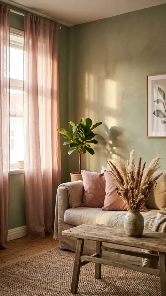
Olive green anchors your space with earthy, muted depth, while blush introduces a powdery softness stripped of saccharine sweetness. These two tones operate as complementary contrasts — one rooted in nature’s undergrowth, the other borrowed from faded rose petals and warm skin tones.
Layer these hues through crushed velvet throw pillows, loosely woven linen drapes, and hand-painted millwork along baseboards and cabinetry. The result delivers sophisticated tonal balance, proving that unexpected, tension-rich pairings consistently yield the most memorable, emotionally resonant interiors.
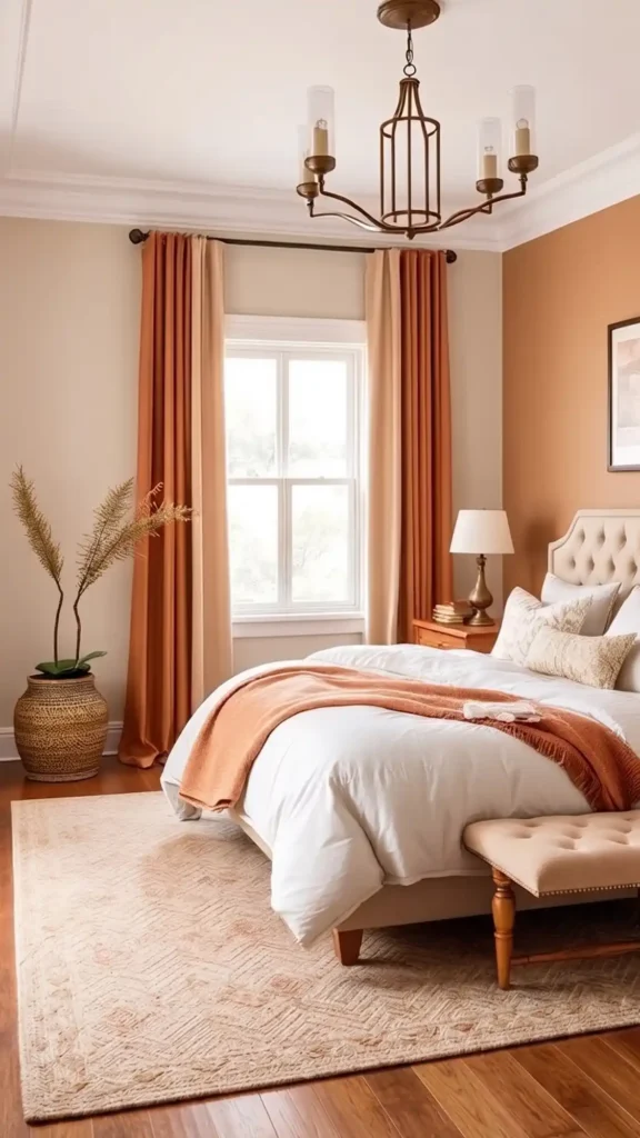
Warm Beige and Burnt Orange for Sunset Glow
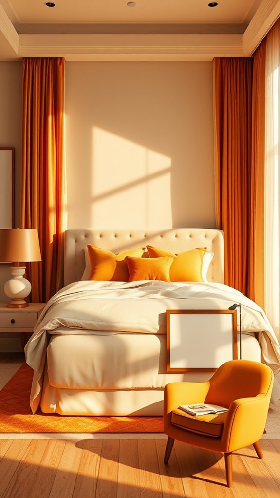
Moving from cooler, muted palettes into warmer territory opens up entirely different atmospheric possibilities for your bedroom. You anchor the space with warm beige walls — think Benjamin Moore’s “Pale Straw” or Farrow & Ball’s “String” — then punctuate deliberately with burnt orange in your throw pillows or a crushed velvet headboard in a deep terracotta hue.
You layer natural linen duvet covers, raw-edged rattan pendant lighting, and hand-woven jute area rugs to prevent overwhelming warmth, keeping the amber glow restrained and breathable rather than suffocating.
Slate Blue and Pewter for Moody Restfulness
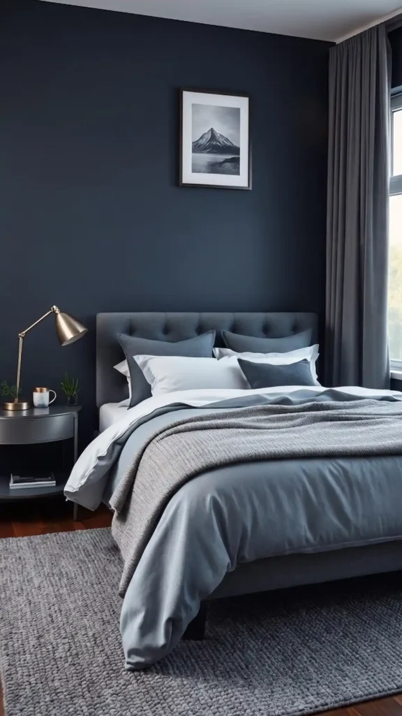
How do you create a bedroom that quiets the mind without feeling cold? Pair slate blue walls — a mid-tone, desaturated hue with cool gray undertones — with pewter accents, a brushed metallic finish that hovers between silver and charcoal. This chromatic pairing anchors the space in contemplative calm, balancing cool depth with the subtle warmth of oxidized metal.
Layer velvet upholstery in dusty blue — a muted, slightly grayed variant of the wall tone — against brushed nickel and pewter-finished lamps with cylindrical linen shades. Weave in charcoal textiles: a nubby wool throw, a low-pile area rug in graphite, linen drapery with a slight slate cast.
Cream and Espresso Brown for Classic Elegance
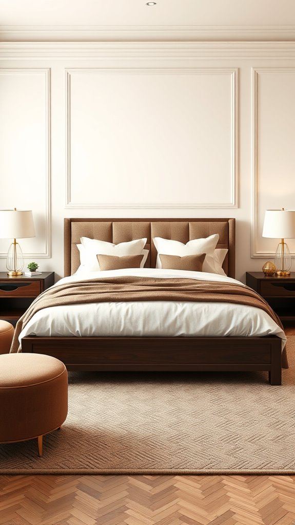
Where do you turn when you want a bedroom that feels both timeless and quietly luxurious? You reach for cream and espresso brown — a pairing that anchors your space with deep, grounded warmth. Ivory matte wall paint creates a soft, luminous backdrop, while hand-rubbed walnut nightstands and a tufted chocolate velvet headboard introduce rich, tactile contrast.
The layering is where the palette truly breathes. Aged brass table lamps with linen shades cast a honeyed, ambient glow, while stone-washed natural linen bedding in warm off-white adds relaxed texture. Together, these elements build a bedroom that reads as refined, settled, and effortlessly composed.
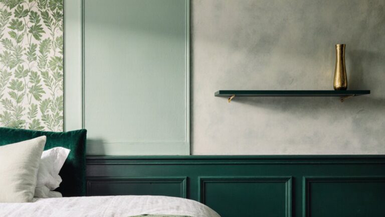
Pale Pink and Sage for Botanical Softness
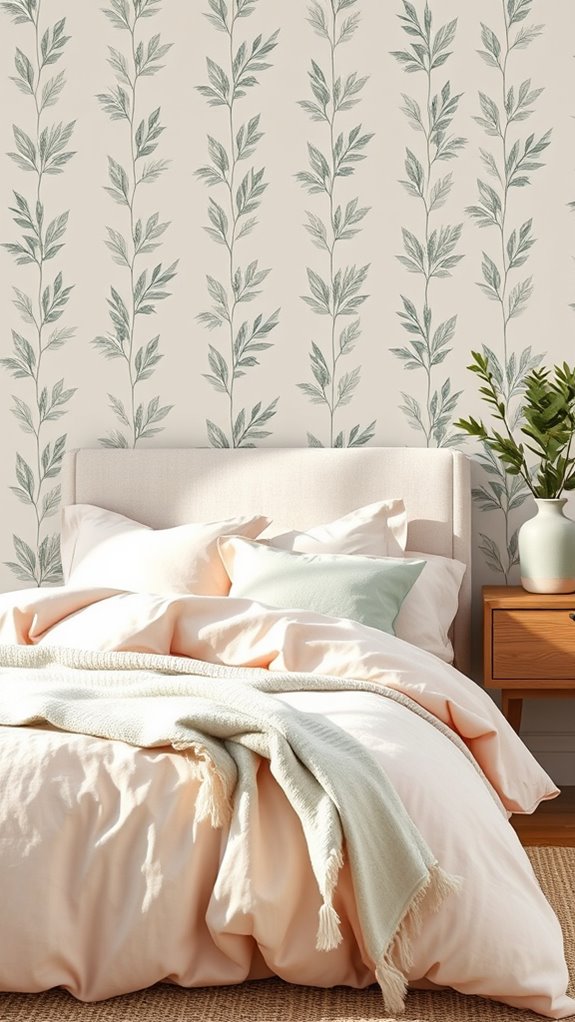
Pale pink walls and sage velvet upholstery create a botanically inspired bedroom palette rooted in chromatic restraint and organic warmth. The dusty blush tones absorb natural light softly, while the muted, grey-green velvet carries a dense, nap-rich texture that anchors the composition with quiet visual weight.
Woven linen textiles in undyed, slubby weaves reinforce the layered tactility, while eucalyptus arrangements — their silver-green foliage arching loosely in aged brass vessels — introduce living botanical structure. Brushed and patinated brass hardware throughout adds warm metallic depth, tying each element into a cohesive, understated refinement.
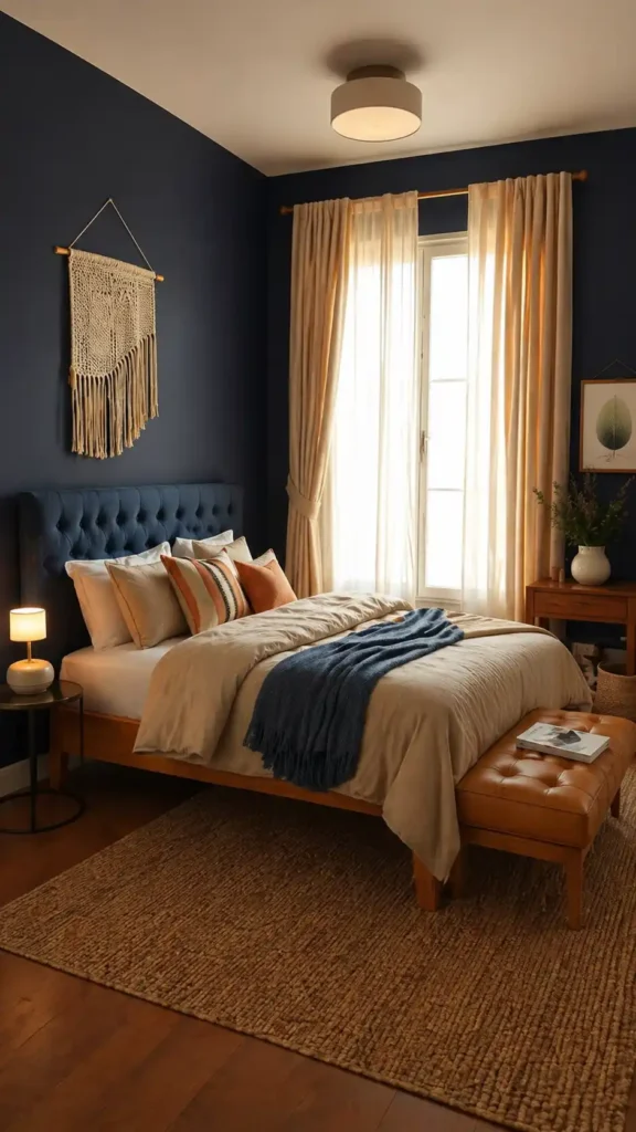
Midnight Blue and Gold for Stately Glamour
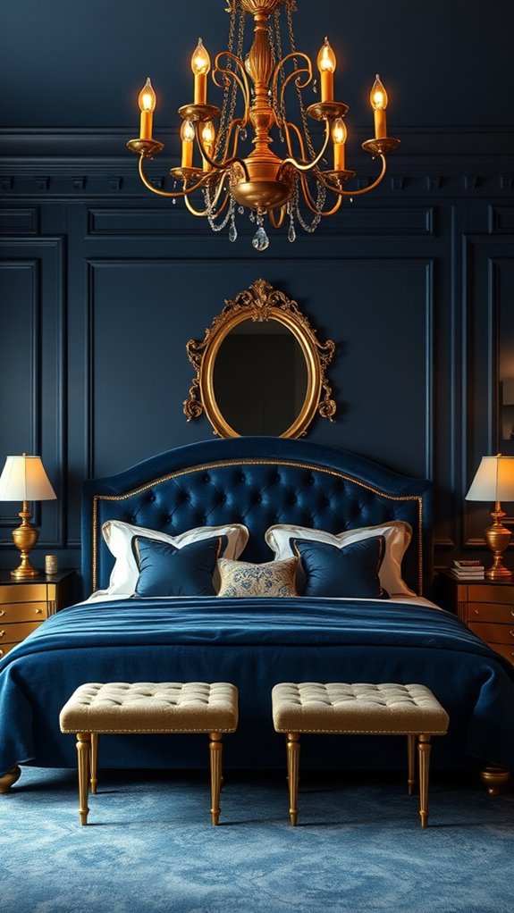
Midnight blue walls create a saturated, light-absorbing backdrop that transforms a room’s spatial perception, turning ordinary square footage into something that feels both boundless and enveloping. Against this deep chromatic foundation, gold accents — brass wall sconces with aged patina finishes, ornate gilded mirror frames with carved detailing, or metallic thread woven through cut velvet upholstery — catch and amplify residual light with warm, reflective intensity.
It’s a combination rooted in classical heraldry, naval tradition, and Art Deco opulence, which explains why it continues to register as authoritative rather than trendy across vastly different interior contexts.
Warm Gray and Pale Blue for Scandinavian Airiness
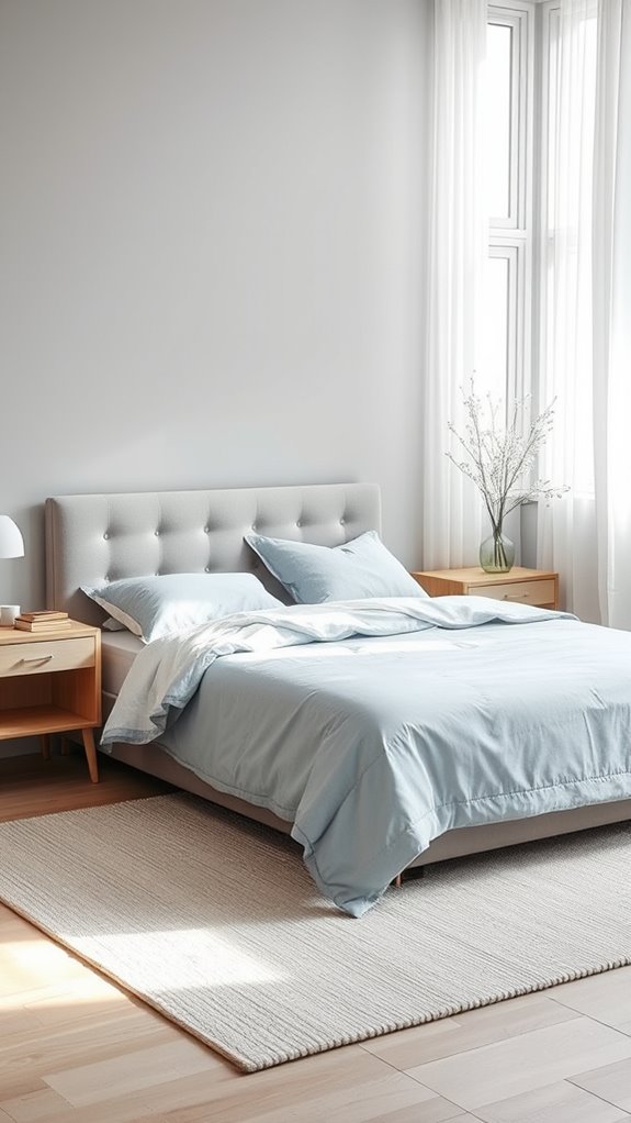
How do you capture the quiet clarity of a Nordic morning without stepping into cold, clinical territory? You layer warm gray walls with pale blue textiles, letting natural oak and linen soften the edges.
You add chunky wool throws in undyed cream, hand-thrown ceramic vessels in matte stone finishes, and wide-plank white oak flooring underfoot, creating disciplined restraint that still welcomes you home.
Cinnamon and Cream for Spiced Tranquility
Cinnamon walls grounded by cream trim create a sanctuary that settles your nervous system without dimming the light. Though you might hesitate to bring such a warm spice into your restful space, the terracotta-adjacent depth of true cinnamon — rich in red-brown undertones and earthy pigmentation — anchors a bedroom without overwhelming it.
You’ll layer natural linen bedding in oatmeal tones, its loosely woven, undyed fibers carrying the same sun-bleached warmth as raw cotton. Woven rattan accents — side tables with tight herringbone weaves, pendant shades with open lattice construction — echo the palette’s organic warmth through repetition of texture and tone.
Soft Black and Blush for Edged Romance
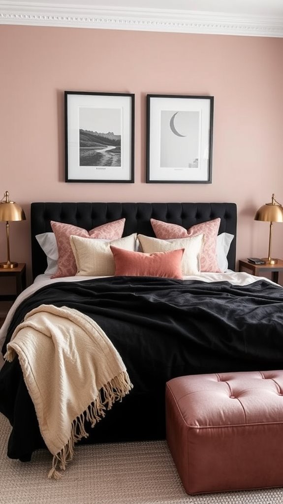
Where cinnamon offers settled warmth, soft black and blush create something more unpredictable — a tension between restraint and softness that shifts a bedroom’s emotional register without destabilizing it. Unlike grounded, spice-toned palettes, this combination operates through contrast: the weight of charcoal velvet headboards and matte black lacquered nightstands pressing against the yielding delicacy of dusty rose linen pillowcases, petal-toned throws, and aged brass hardware.
You anchor the space with deep, near-black foundations — think flat-finish walls, ebonized wood furniture frames, and gunmetal light fixtures — then allow blush to enter softly through layered textiles, ceramic vessels, and diffused lighting.
Seafoam and Coral for Playful Refreshment
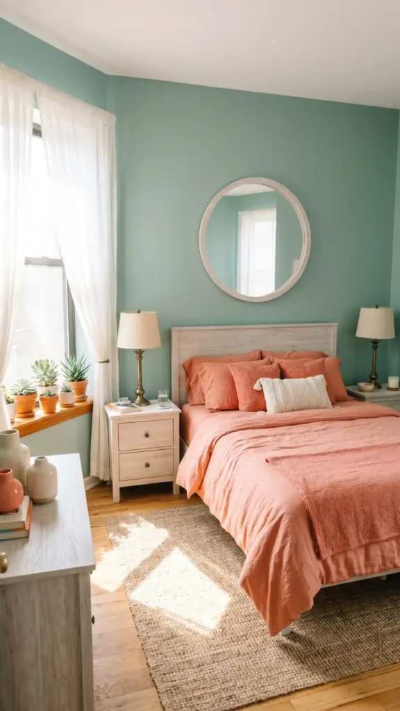
Two colors transform a bedroom into something lighter without sacrificing sophistication. Seafoam walls paired with coral accents create a deliberate balance between cool blue-green undertones and warm reddish-orange hues, achieving chromatic equilibrium rarely found in residential spaces.
Linen bedding in soft coral, aged-brass table lamps, and whitewashed oak furniture layer texture and material contrast throughout the room. Matte seafoam walls keep the space visually grounded with their muted, desaturated depth, while strategically placed coral elements inject gentle warmth and playful energy without overwhelming the eye.
Taupe and Ivory for Quiet Luxury
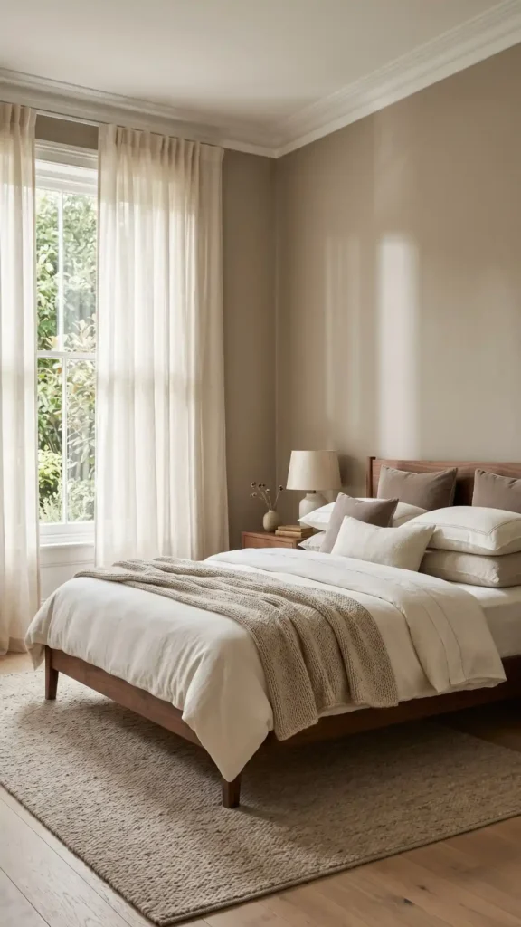
Taupe walls and ivory linens create a bedroom that feels expensive without demanding attention. The subtle contrast between warm greige tones and soft cream textiles does the heavy lifting, eliminating the need for bold statements or decorative excess.
Velvet pillows in dusty mushroom, chunky wool throws in oat, and floor-length linen curtains in natural ecru layer tactile richness across every surface. Warm walnut furniture with straight legs and minimal hardware anchors the space, grounding the softness with structured silhouettes. The result is disciplined restraint — a room that speaks in whispers.
Indigo and Wheat for Artisanal Character
Why settle for flat color when you can weave history into your walls? Layer hand-dyed indigo textiles — deep cobalt-toned, naturally fermented with Japanese shibori or West African resist-dyeing techniques — against wheat-toned Venetian plaster walls, their warm amber-ochre surface applied in multi-coat troweled layers for a luminous, textured depth that factory finishes can’t replicate.
Pair a Malian mud-cloth bedcover — geometric white-on-black patterns woven from hand-spun cotton and fermented with bogolan mud pigment — with raw, undyed Belgian linen curtains, their loose weave casting soft filtered light. Add turned-wood side tables in dark-oiled walnut or ash, their lathe-carved profiles referencing 17th-century joinery traditions. This layered combination honors global craft heritage without tipping into heavy-handed rustic aesthetics.
Rose and Slate for Balanced Femininity
Rose and slate balance softness with gravity in a pairing that carries lighter structural tension than heavier, earthbound combinations. Dusty pink walls anchor against charcoal upholstery or slate bedding, creating feminine space without saccharine excess.
Matte slate ceramics temper rose velvet across surfaces, keeping the room grounded, current, and quietly confident — a study in contrasts that feels both delicate and deliberately composed.
Moss Green and Stone for Grounded Retreat
Where else could you seek refuge but a space that borrows its calm from the forest floor? You’ll wrap your walls in muted, clay-tinged moss green — a saturated, organic hue with warm undertones and a flat, breathable finish — letting stone-toned linens in brushed, heavyweight cotton and raw white oak furniture with visible grain and hand-hewn edges ground the palette.
You’ll feel the accumulated tension of overstimulated modern living quietly dissolve into the layered, textural depth of a space that breathes.
Soft Plum and Champagne for Regal Calm
Soft plum whispers of contained opulence without demand, a tone that carries velvet weight and bruised-violet depth without the aggression of deeper jewel hues.
Layer these tones through cut-velvet upholstery in dusty mauve, silk drapery with a subtle iridescent sheen, and brushed brass hardware with a warm, matte-satin finish.
Champagne metallics — pale gold leaf detailing, aged brass candleholders, and burnished mirror frames — soften plum’s inherent gravity, introducing luminosity without harshness.
Paint the ceiling in pale antique gold to capture and reflect candlelight downward, warming the entire room with amber-tinted diffusion.
The result is royalty without coldness, a chamber of generous, enveloping calm that actively invites rest.
Warm White and Natural Wood for Clean Serenity
Warm white’s quiet authority sets a foundation you can build on for years without tiring of it — a tone that feels clean without becoming clinical. Layer in natural wood through quarter-sawn oak nightstands, hand-oiled walnut bed frames, or Baltic birch shelving, and you’ve created a dialogue between matte color and open-grain texture that feels intentional, not accidental.
Designers call this timeless. You’ll call it home.
Smoke Gray and Amber for Sophisticated Warmth
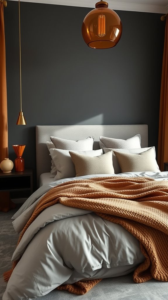
Smoke gray walls absorb light without stealing warmth, giving you a backdrop that feels grounded rather than gloomy. You’ll layer in amber through aged brass pendant lights, cognac leather accent chairs, or honey-toned oak dressers with a hand-rubbed finish.
Balance cool undertones with warm metallics, and you’ll achieve timeless elegance that adapts to shifting daylight.
Final thoughts
You’ve now explored 27 proven palettes that transform bedrooms through intentional color relationships — from grounded moss greens and warm terracotta earth tones to refined navy contrasts and soft sage neutrals. Each combination carries specific psychological weight, influencing mood, perceived room scale, and the quality of natural and artificial light within the space.
Whether you gravitate toward deeply saturated jewel tones or hushed, desaturated neutrals, your final selections should authentically reflect how you want to feel during restful hours and waking moments alike. Layer contrasting textures — matte linen, brushed velvet, smooth lacquer — to add visual depth without introducing additional hues. Test large paint samples across multiple walls, observing how morning sunlight, afternoon glare, and warm evening lamplight shift each pigment’s undertone throughout the day.
Trust that restraint and tonal discipline consistently yield the most enduring, professionally resolved results. The right combination awaits your personal interpretation.