Luxury Red Interior Design — How to Make It Look High-End
Red is one of the most historically significant luxury colors in the world. The dyes required to produce it were among the most expensive commodities in ancient trade. Royal courts, high churches, and aristocratic estates used it precisely because it communicated power, wealth, and refinement.
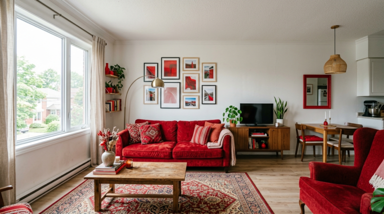
And yet, in contemporary home design, red more often reads as bold than as luxurious — because most people apply it without the specific ingredients that separate expensive-looking red rooms from simply colorful ones.
Those ingredients are specific and learnable. Here’s what they are — and the material choice at Tip #3 is the one that changes everything.
Understand What Makes Anything Look Expensive
Before discussing red specifically, it’s worth identifying what actually makes any interior look expensive. It comes down to five things:
- Material quality: Natural materials (marble, velvet, solid wood, linen) look more expensive than synthetic ones
- Restraint: Fewer, better things always read as more luxurious than many mediocre things
- Scale: Well-proportioned furniture and correctly sized art signal confidence and design literacy
- Finish quality: Matte finishes on walls, satin on trim, natural patina on metals
- Color depth: Complex, layered colors look more expensive than flat, one-dimensional ones
Luxury red design applies all five principles simultaneously.
Choose the Most Complex Red You Can Find
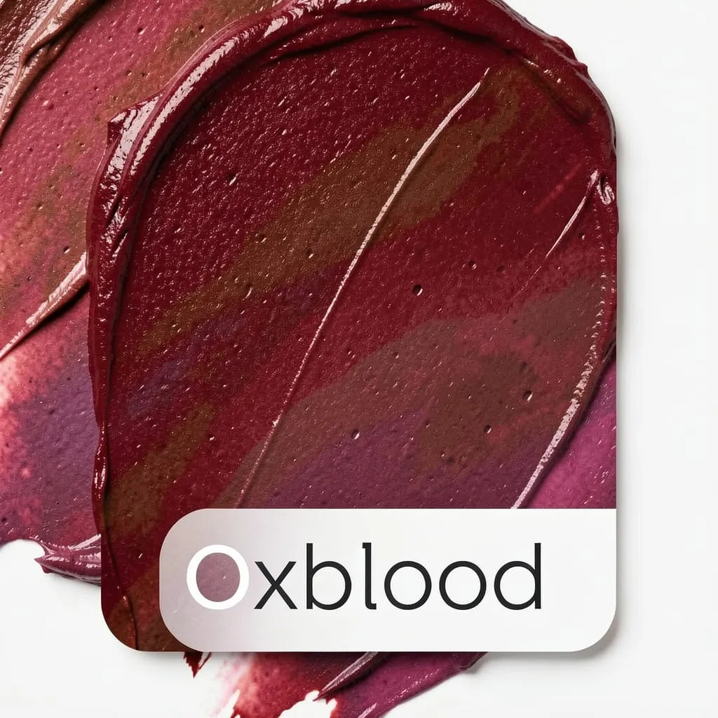
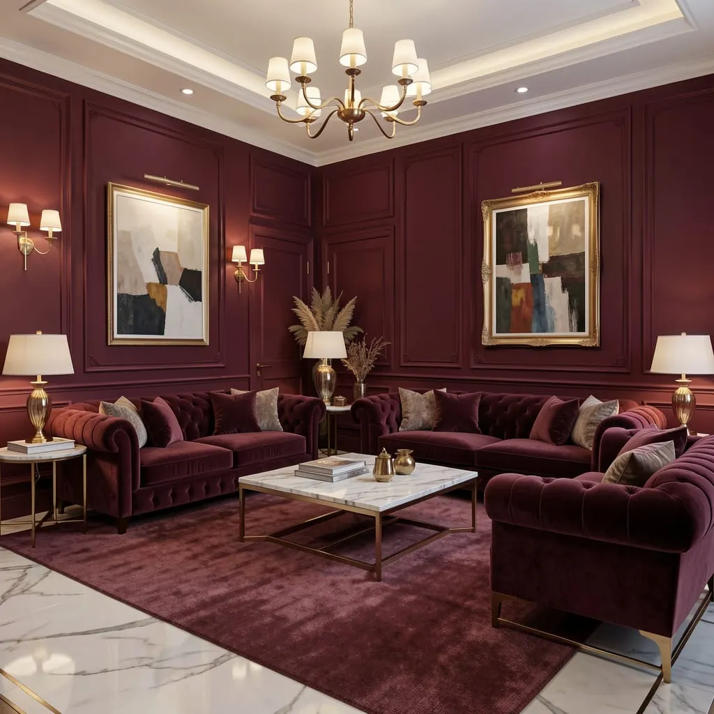
The most expensive-looking reds are never simple. They have depth — brown undertones, a hint of purple, or the complexity of aged wine. They shift slightly under different light conditions, creating the impression of a color that was carefully selected rather than pulled off a shelf.
Luxury red recommendations:
- Farrow & Ball Incarnadine: Complex, muted, impossibly sophisticated
- Sherwin-Williams Antique Red: Already muted and complex straight from the can
- Any “heritage” or “historical” paint range: These tend toward complex, layered reds that photography shows in old European estates
Avoid: any red described as “bold,” “vibrant,” or “primary.” These are flat, simple reds that read as decorative rather than designed.
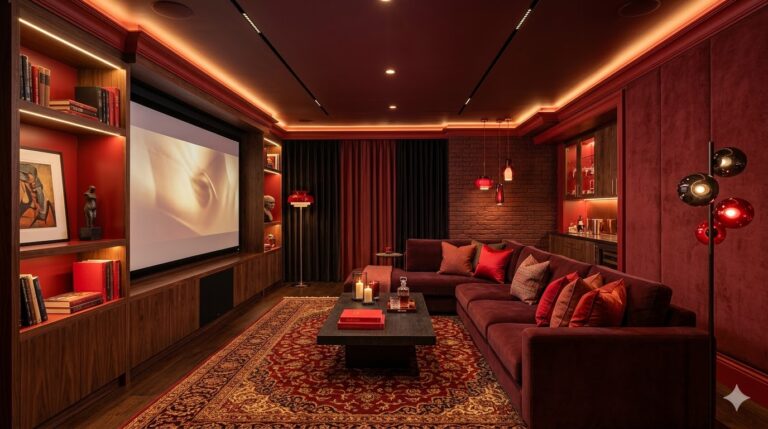
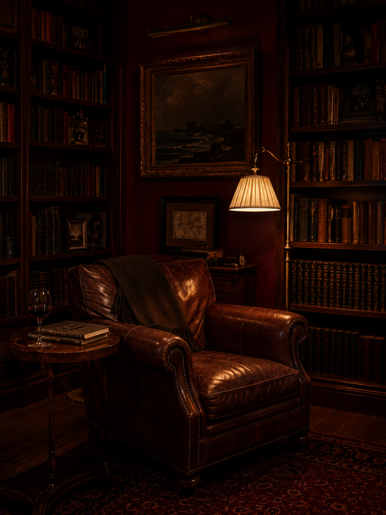
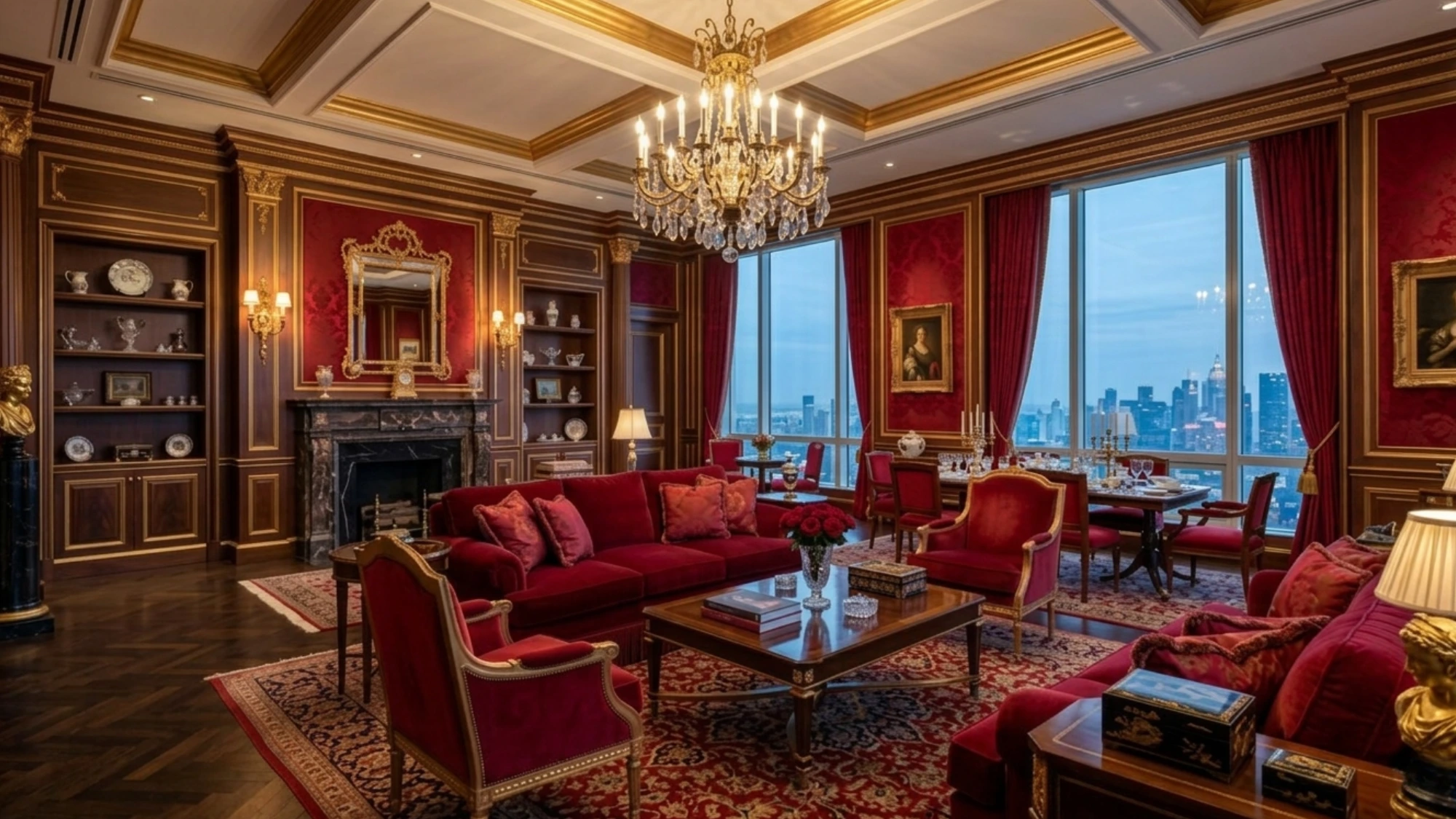
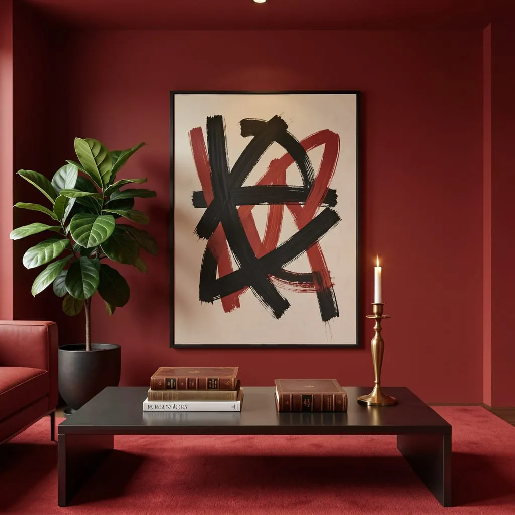
Invest in Velvet — It’s the Most Luxurious Material at Any Price Point
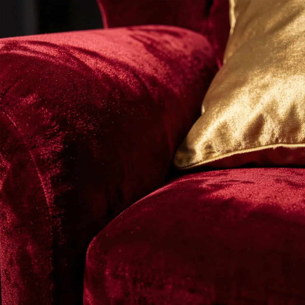
No material communicates luxury in a red room as effectively as velvet. It does something other fabrics can’t: it shifts in appearance as you move around it, catching light in some directions and absorbing it in others. This creates the sense of depth and animation that defines expensive-looking upholstery.
Deep red velvet on a sofa, armchair, or set of cushions transforms a room in a way that is immediately and universally readable as luxurious.
You don’t need to spend a fortune on velvet. IKEA, H&M Home, and mid-range retailers carry velvet pieces at accessible prices that look dramatically more expensive than their cost. Pair velvet with: warm brass hardware, marble surfaces, and linen or wool in neutral tones.
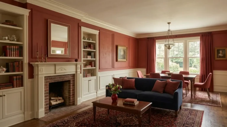
Use Architectural Detail to Frame the Color
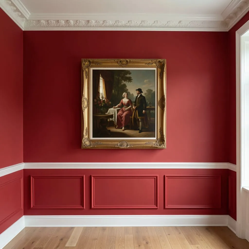
Luxury interiors are defined by architectural detail — and in a red room, that detail frames the color in a way that signals deliberate design.
Crown molding, picture rails, wainscoting, chair rails, and coffered ceilings all serve the same purpose: they give the red walls defined edges and deliberate proportions. A red wall bounded above by crown molding and below by white wainscoting is an architectural statement.
If your home doesn’t have existing architectural detail, it can be added inexpensively using pre-made molding from hardware stores. Painted bright white, even simple molding transforms a plain red wall into something genuinely considered.
Bring in Marble, Brass, and Dark Wood — the Classic Luxury Trio
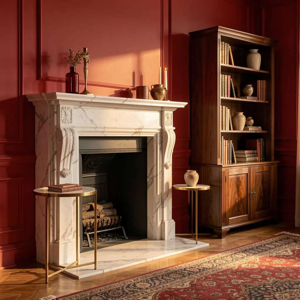
Luxury red interiors share a consistent material palette that has remained constant across centuries: marble for surfaces, brass or gold for metal accents, and dark wood for furniture.
Marble: A marble fireplace surround, coffee table top, or even a small marble tray signals quality immediately. Marble-effect alternatives have improved dramatically and are difficult to distinguish from the real thing in the right context.
Brass: Matte or aged brass (not polished gold) appears in lamp bases, picture frames, cabinet hardware, and side table legs. It catches light warmly against red walls in a way no other metal does.
Dark walnut or mahogany: Either as flooring, a bookcase, or a side table. The depth of dark wood against deep red creates the richest possible combination of warm tones.
Edit Ruthlessly — Luxury Lives in Restraint
The single most common mistake in attempting luxury red design is filling the room with too much. More objects, more accessories, more patterns — all of it dilutes the impact.
Luxury is edited. Go through your current accessories and remove everything that doesn’t earn its place. In a red room, less is always more — because the room itself is already doing significant visual work. Let the color breathe. The restraint is the luxury.
Luxury Red Has Always Been Within Reach
The ingredients of a genuinely luxurious red interior are not primarily about budget. They’re about understanding what luxury actually communicates: complexity, restraint, material quality, and deliberate proportion.
Your next step:
See how these same principles apply at different scales with our guide: [Red Living Room Ideas: 15 Budget-Friendly Ways to Pull It Off →] — because luxury and budget aren’t mutually exclusive when you know which choices matter.
Or browse the full [Red Interior Design category →] for every approach to red at every investment level.