Red Interior Design for Open-Plan Homes
Open-plan living is the design challenge that red makes most complicated — and most rewarding.
In a room with clear walls, using red is straightforward: one wall, clear boundaries, contained impact. In an open-plan home where living, dining, and kitchen flow into one another without walls to separate them, red becomes a question of territory. Where does it start? Where does it stop? How do you use it without it bleeding into spaces where it doesn’t belong?
I redesigned an open-plan apartment with red as the primary accent color. The result was one of the most cohesive interiors I’ve created — but it required a different approach than any closed-room red project. Here’s what I learned, and Tip #3 is the insight that unlocked the whole plan.
Treat the Open Plan as Multiple Zones, Not One Giant Room
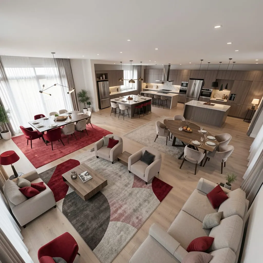
The fundamental mistake in open-plan red design is treating the entire space as one room and applying red throughout. The result is visual saturation — red everywhere, nowhere to rest the eye.
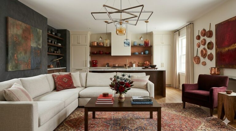
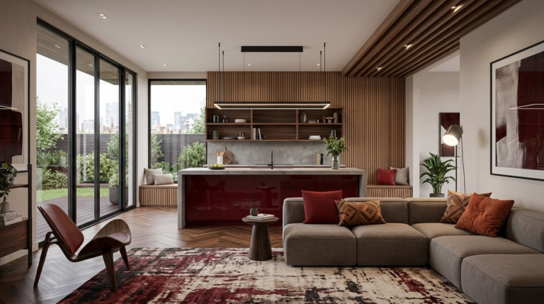
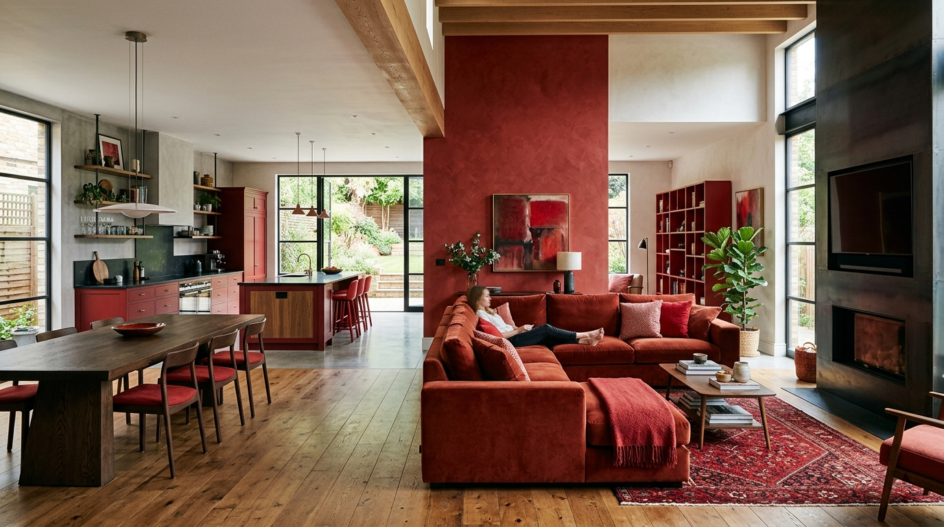
The correct approach: identify three to four distinct zones within the open plan and treat each as its own room with its own focal point. Red appears in only one or two zones — typically the living area.
Zone definition tools:
- Rugs: The most effective zone divider in an open plan
- Furniture arrangement: A sofa with its back to the dining area creates an implicit wall
- Lighting: Different pendant styles over different areas signal different zones
- Ceiling variation: A dropped section, a beam, or a different ceiling treatment above each zone
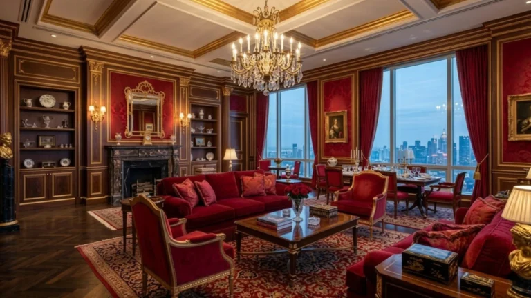
Use Red to Define the Primary Living Zone
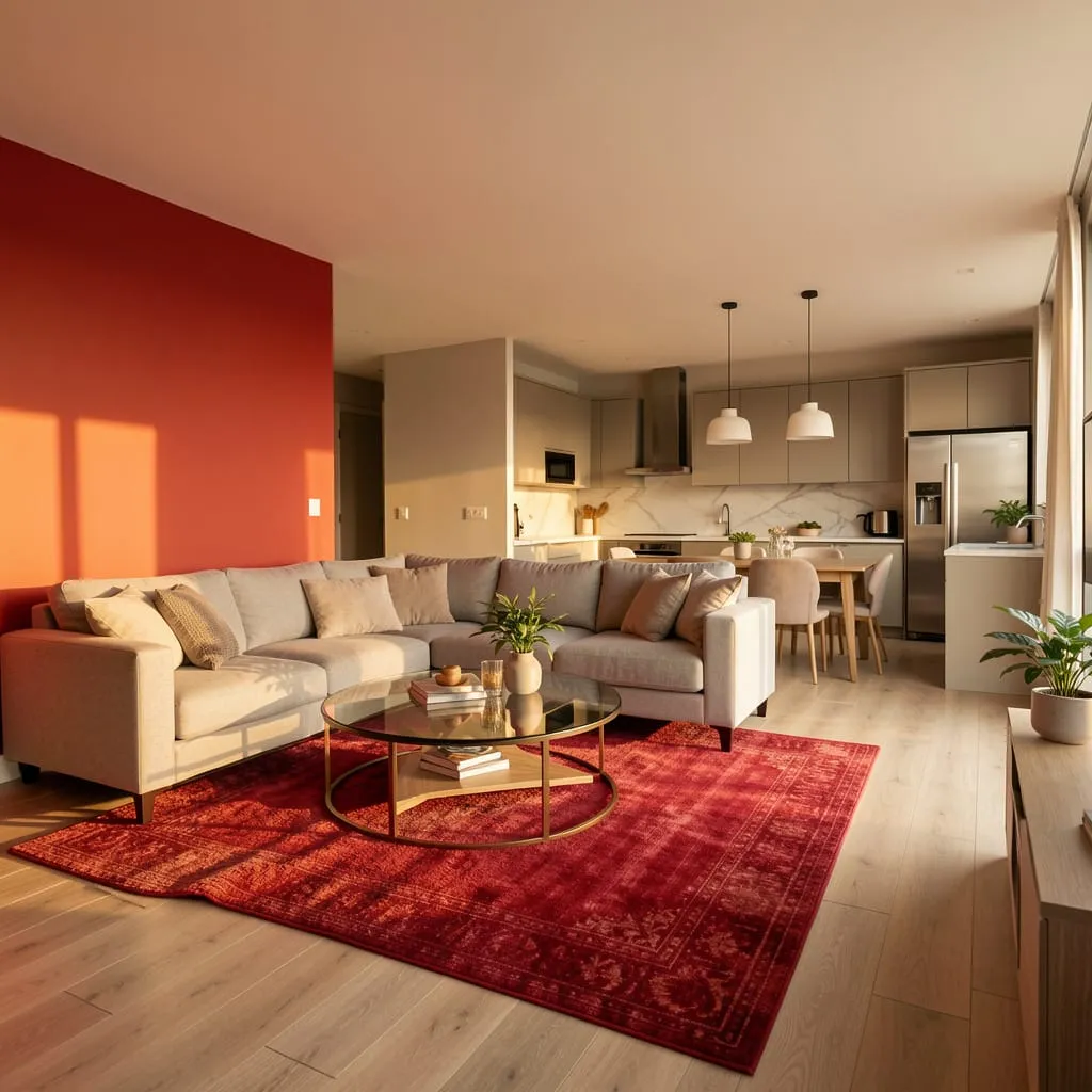
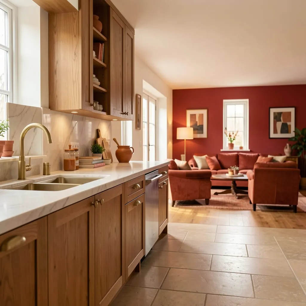
A red accent wall in the living zone does something particularly valuable in an open plan: it creates a visual anchor that the rest of the space orients around. Even when standing in the kitchen, the red wall in the living area draws the eye across the space and gives it a clear focal point.
Apply red to:
- The wall that forms the “back” of the living area
- One statement piece of furniture visible from other zones
- The rug that defines the living zone floor area
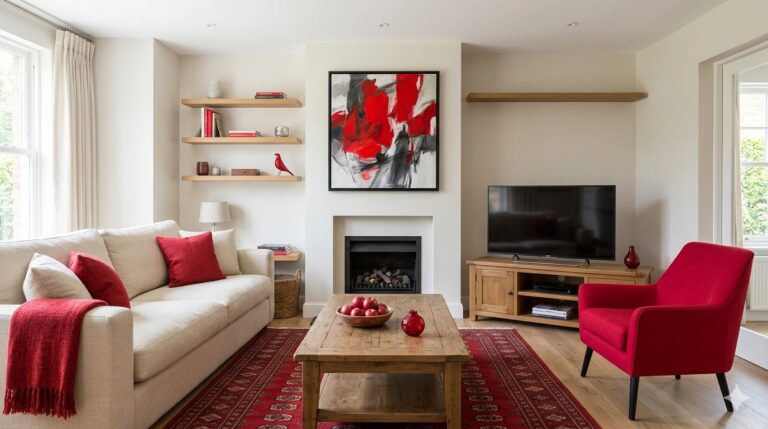
Keep the dining and kitchen areas in neutral tones — warm whites, natural wood, and warm grey work best.
Use Color Flow to Connect Zones Without Repeating Red
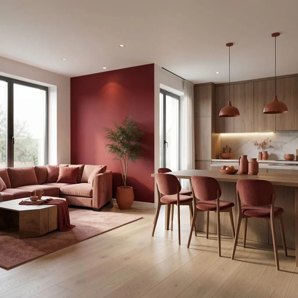
You don’t need to repeat red in every zone. You need the zones to acknowledge it.
Color flow works by using a gradient of relatedness rather than exact repetition:
- Living room: Bold red (the source)
- Dining area: Muted red-adjacent tones — terracotta chair cushions, a warm rust throw
- Kitchen: Earthy warm accents — a terracotta pot, warm wood tones, copper or brass hardware
Each zone shares the warm undertones of red without actually using red. Moving through the space feels cohesive because the undertones stay consistent even as the colors vary.
Anchor Each Zone With Its Own Rug
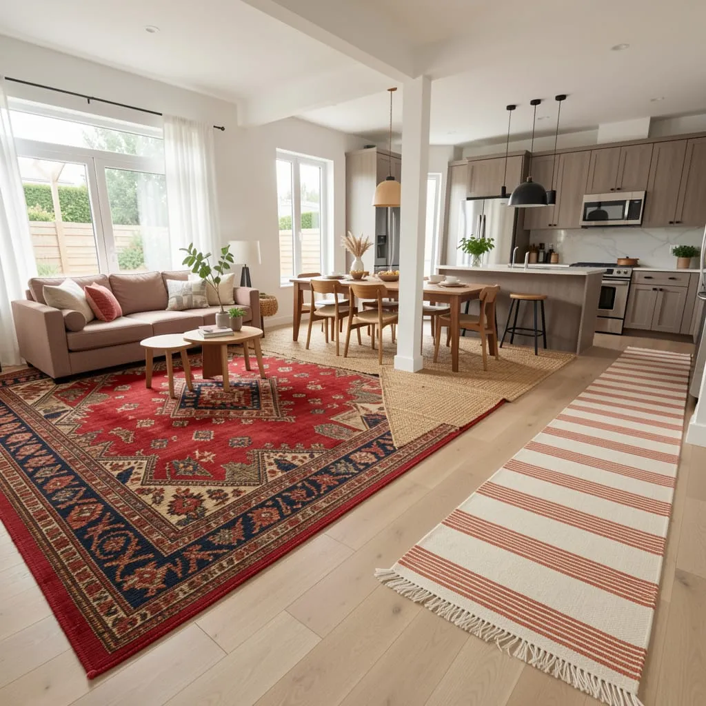
In an open plan, rugs are doing the work that walls do in closed rooms — they define territory and signal transitions.
The rug relationship in a red open plan:
- Living zone rug: The boldest — a patterned rug with red as a primary color, or a solid red in a large format
- Dining zone rug: More neutral — a natural jute, a geometric in warm tones, or a flatweave in cream and terracotta
- Kitchen runner: The most restrained, tying back to the warm tones of the living zone
Control Sightlines — What You See From Where Matters
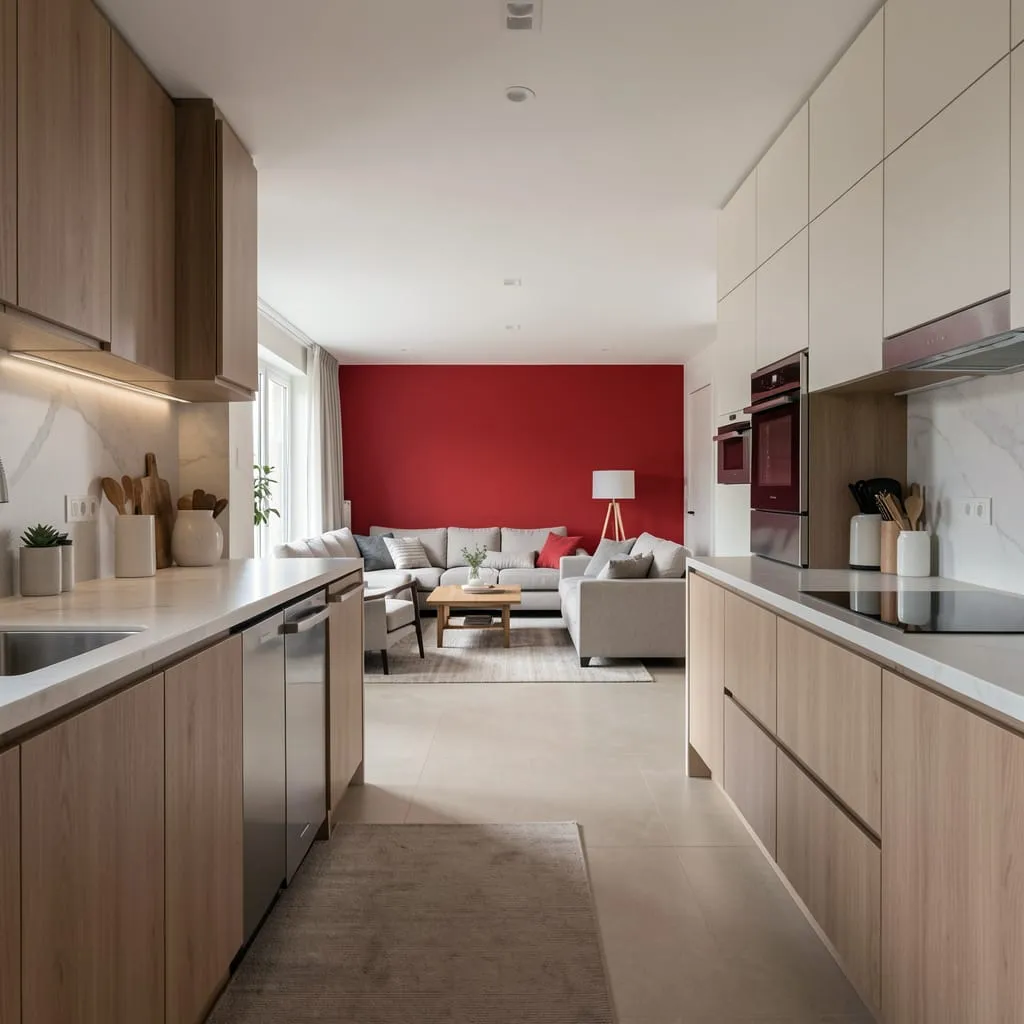
In an open plan, every position in the space has a different sightline — and you need to consider what the red looks like from each of them.
- From the kitchen: The living room’s red wall should be visible as a distant focal point
- From the dining area: The red should be partially visible, providing backdrop without competing
- From the entry: The red wall should create an immediate sense of warmth and intention
Walk through each zone and observe the sightlines before finalizing your red placement. The goal is for red to be discoverable rather than inescapable.
Keep Kitchen and Dining Hardware Warm to Maintain Cohesion
The kitchen and dining areas don’t need red — but they need to speak the same warm language:
- Brass or copper fixtures echo the warmth of red without adding the color itself
- Warm wood tones on cabinet faces, open shelving, or dining furniture carry the palette forward
- Terracotta or rust-toned ceramics tie back to the red zone without duplicating it
Open Plans Are Where Red Shows Its Full Range
Done well, a red open plan creates a space where color flows, transitions, and creates discovery as you move through it — one of the most sophisticated expressions of red interior design possible.
Ready to go further?
Our guide on [Red and Grey Interior Design: 15 Sophisticated Ways to Balance the Contrast →] covers the neutral palette that pairs most effectively with red in large, open spaces.
Or explore the full [Red Interior Design category →] for every application and space type.