How to Use Red Without Making Your Home Look Like a Restaurant
There’s a reason red is the most used color in restaurant and fast food branding. It stimulates appetite, creates urgency, and commands attention. It’s incredibly powerful.
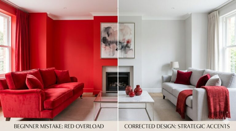
It’s also exactly why, when you use it wrong in a home, the result looks less like a cozy living room and more like a booth at a diner.
I made this mistake in my first apartment. The room wasn’t bad — it just felt like somewhere you’d order a burger, not relax on a Sunday morning. It took me a while to figure out what restaurants do with red that you need to undo at home.
Here’s the exact framework — and Tip #4 is the one most decorating guides completely miss.
Understand Why Red Reads as “Restaurant” in the First Place
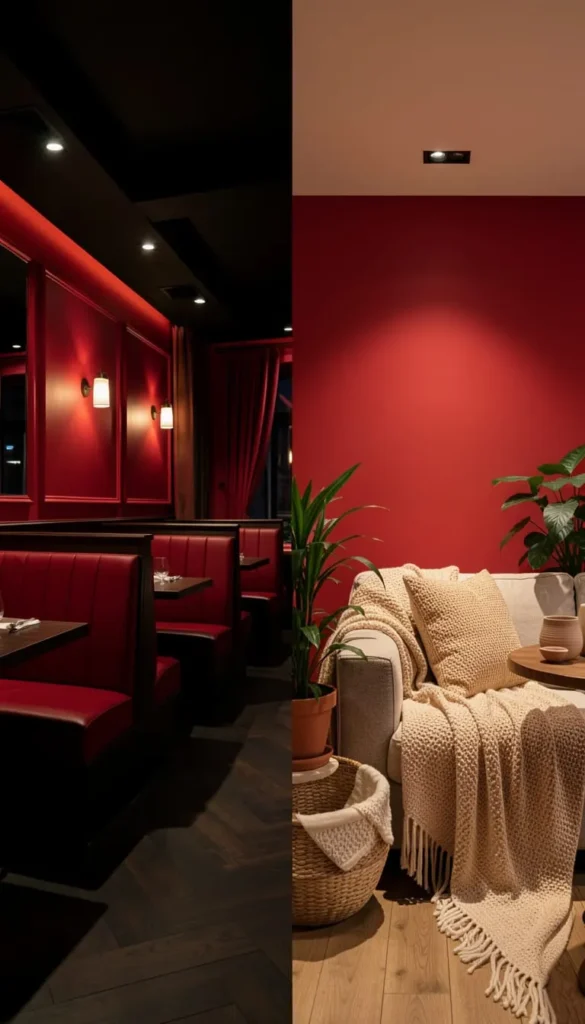
Restaurants use red in a very specific way: saturated, high-contrast, paired with dark woods, bright overhead lighting, and minimal softness. Every element is chosen to create stimulation and turnover — not relaxation.
When homeowners replicate these conditions unconsciously, the result feels commercial. The fix isn’t removing red. It’s changing the company red keeps.
The residential red formula differs in five key ways:
- Lower saturation (muted, dusty, or earthy reds instead of fire-engine brightness)
- Warmer, softer lighting (lamps over overheads)
- Natural textures (linen, wood, stone — not vinyl and laminate)
- Organic imperfection (plants, layered textiles, worn finishes)
- Breathing room (white space, lighter furniture, visible floor)
Every tip in this post addresses one of these five levers.
Choose a Red With Depth, Not Brightness
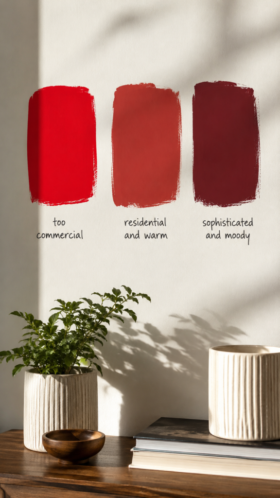
The most restaurant-like reds are the brightest ones — pure, saturated, high-chroma reds that vibrate off the wall. For a home, go one of two directions:
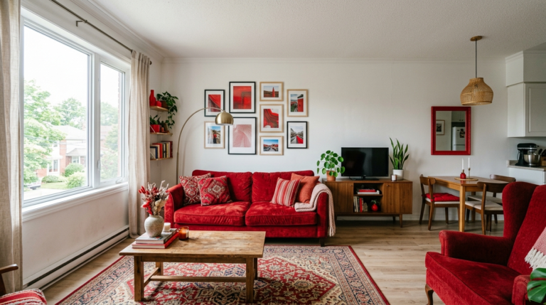
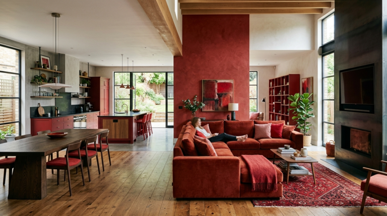
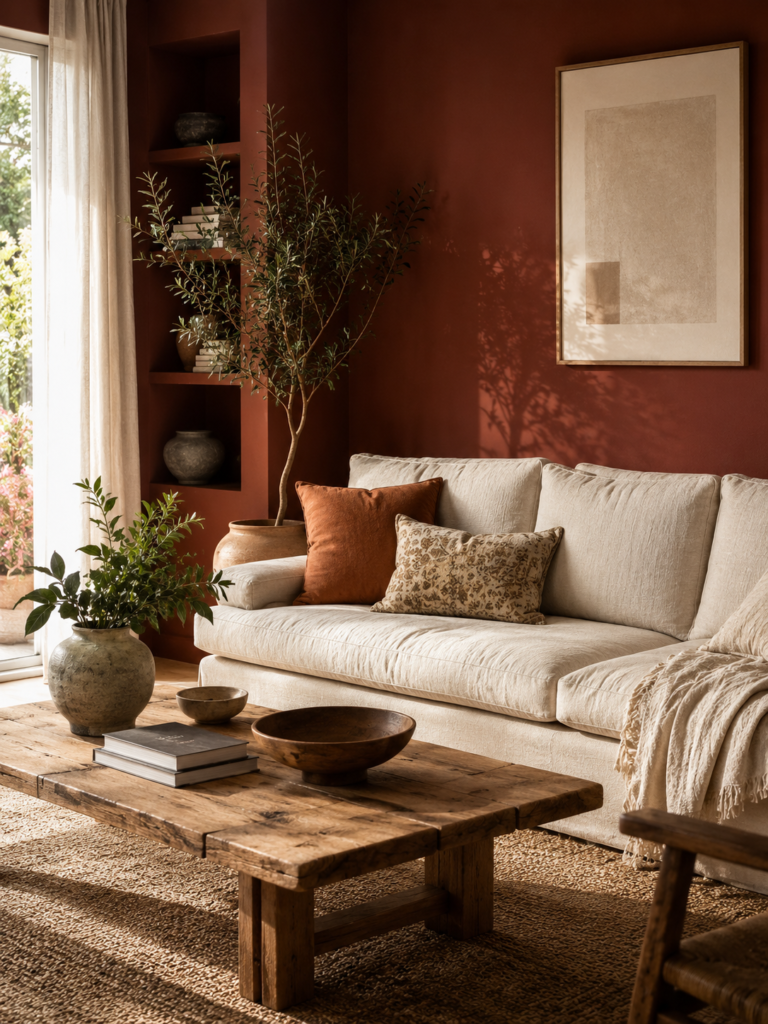
Warm and earthy: Terracotta, rust, tomato, brick red. These have brown or orange undertones that feel grounded and organic. They read as “home” because they echo natural materials — clay, soil, autumn leaves.
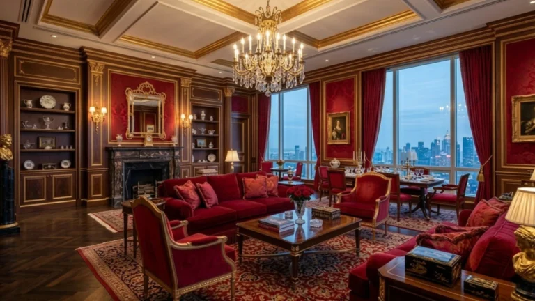
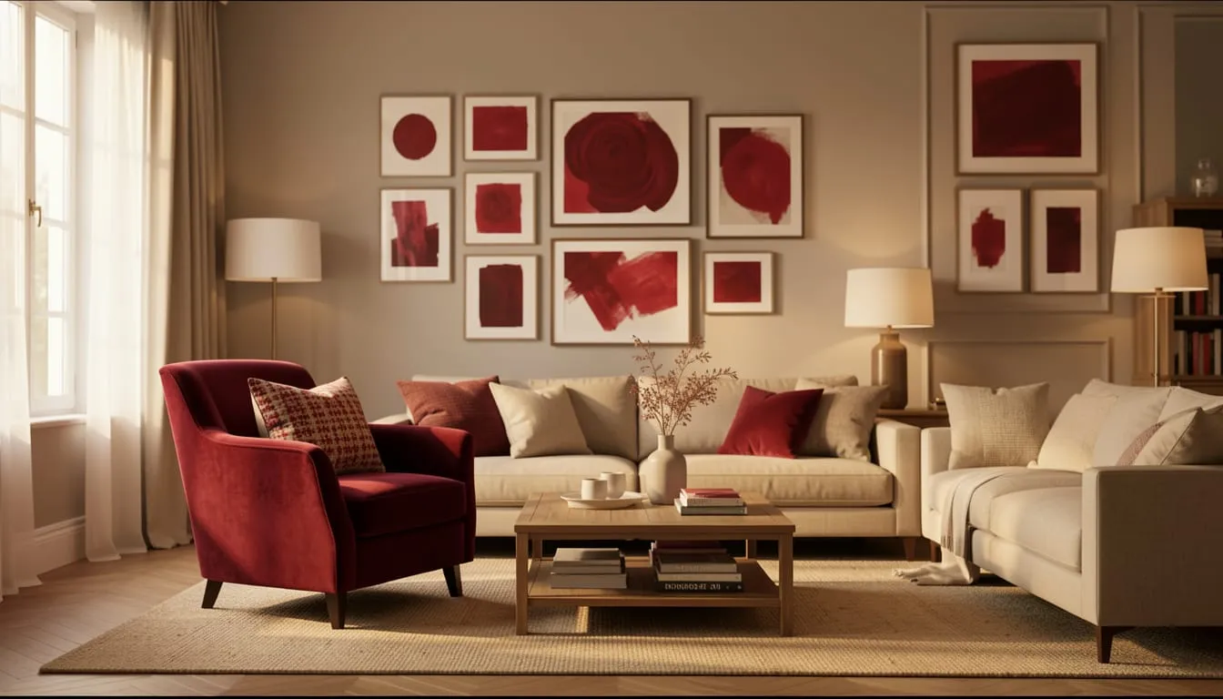
Deep and complex: Burgundy, wine, oxblood, dark crimson. These have enough depth that they read as sophisticated rather than stimulating.
Avoid: pure RGB red, cherry red, or any red described as “bold” or “vibrant” on the paint chip.
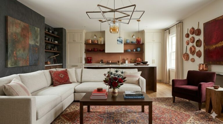
Pair Red With Soft, Natural Materials
Restaurants use hard, durable, easy-to-clean surfaces: vinyl, lacquer, polished wood, metal. These materials reflect light and amplify the intensity of red.
At home, the antidote is softness and texture:
- Linen and cotton upholstery instead of leather or vinyl
- Raw or matte-finished wood instead of high-gloss
- Jute, wool, or cotton rugs instead of hard flooring only
- Ceramic, clay, and stone accessories instead of chrome or glass
- Woven or rattan baskets as storage or decorative elements
Each soft, natural material you add absorbs light rather than reflecting it — which lowers the visual temperature of the room and moves it firmly into residential territory.
Get the Lighting Right — This Is the Most Overlooked Fix
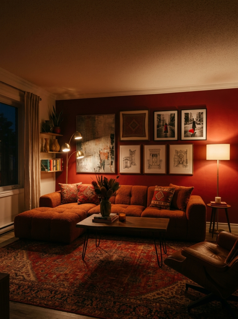
Restaurants use bright, even overhead lighting designed for visibility. This type of lighting makes red look harsh, flat, and institutional — the single biggest reason a red room can feel like a restaurant even when everything else is right.
The residential lighting rule for red rooms:
- No overhead-only lighting. Replace or supplement with layered lamp lighting.
- Warm bulbs only. 2700K–3000K. Anything cooler makes red look aggressive.
- Multiple light sources at different heights. A floor lamp, a table lamp, and an accent light create dimension.
- Dimmer switches on any overhead lighting you do use.
Spend $15 on the right bulbs before you spend anything else. The difference is immediate and dramatic.
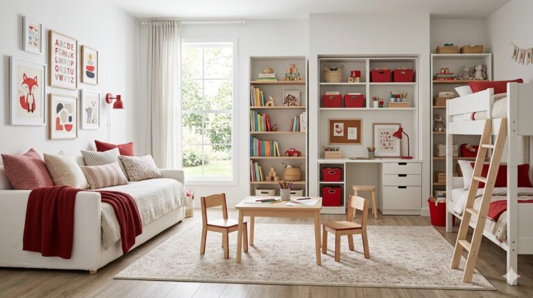
Add Plenty of White or Cream as a Counterbalance
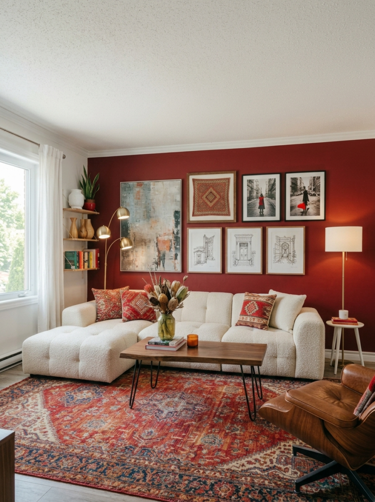
Restaurants use red wall-to-wall because they want maximum stimulation. Homes need breathing room.
White and cream are red’s most important partners in a residential setting. In a room with one red wall, three white walls and a white ceiling create the contrast that makes the red feel intentional rather than overwhelming.
The ratio to aim for: roughly 60% light/neutral, 30% red, 10% natural accent tones (wood, brass, greenery).
Bring In Organic Life — Plants Change Everything
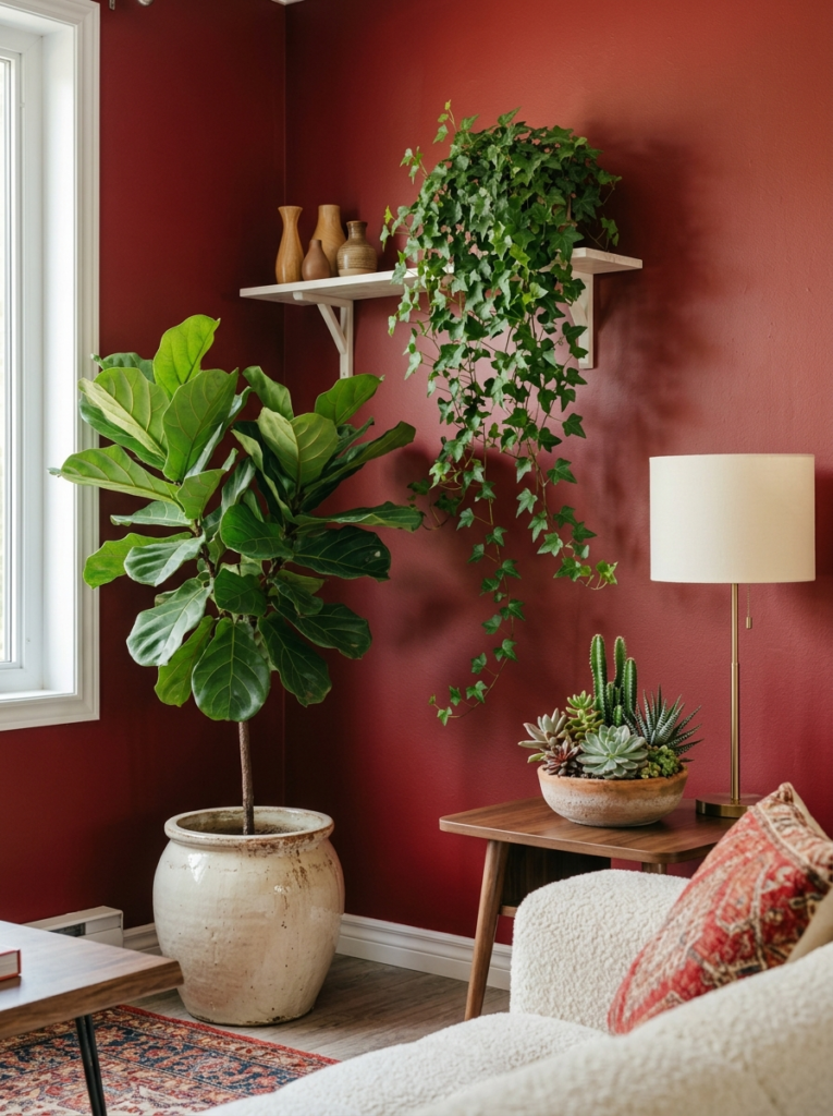
No restaurant fills its space with lush, thriving plants. Greenery introduces organic imperfection, natural texture, and living color. It softens the intensity of red and grounds it in the natural world rather than a commercial one.
Best plants for red rooms:
- Fiddle-leaf fig: tall, architectural, pairs beautifully with red
- Monstera: large leaves with strong visual presence
- Trailing pothos: adds softness and movement on shelves or hanging planters
- Snake plant: structural and low-maintenance in terracotta pots
Your Red Room Should Feel Like a Home, Not a Destination
The line between a red room that feels like a warm, inviting home and one that feels like a restaurant is entirely about the details surrounding the red. Muted shades, soft textures, warm layered lighting, breathing room, and living plants. That’s the formula.
Your next step:
Read our guide on [Red and White Interior Design: 10 Timeless Home Ideas →] — it covers exactly how to build the light, airy palette that keeps red firmly in residential territory.
Or explore the full [Red Interior Design category →] for room-by-room guides on using red with confidence.