11 Bedroom Accent Wall Colour Ideas That Work With Every Furniture Style
You’re looking to transform your bedroom with an accent wall, but you’re uncertain which color will complement your existing furniture and design direction. The right shade—whether a deep charcoal, warm terracotta, or muted sage—can either anchor your space or clash with everything you’ve already invested in.
Understanding how different hues interact with various furniture styles—from sleek modern minimalist pieces in lacquered white or brushed metal to rich traditional hardwood frames in mahogany or walnut—is essential before you commit to paint. Discover which colors guarantee versatility across the widest range of materials, finishes, and design aesthetics.
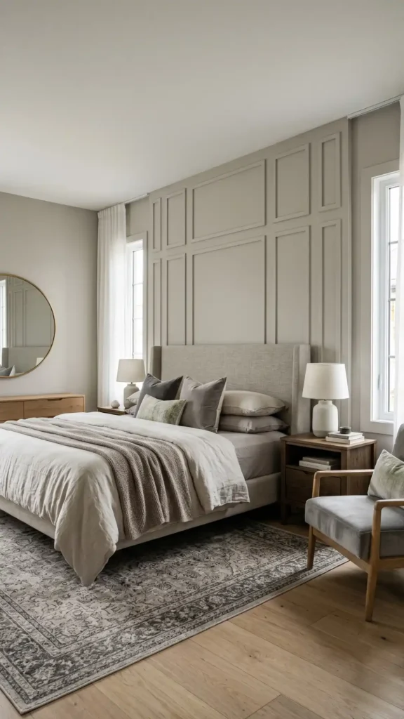
Deep Charcoal Gray: The Bedroom Neutral That Works Everywhere
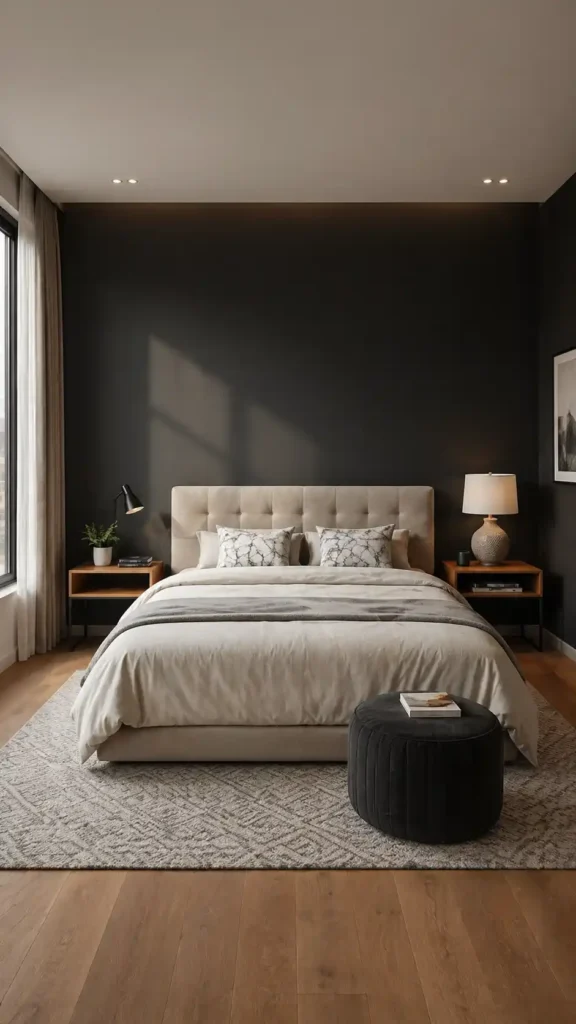
Deep charcoal gray succeeds in bedroom environments because of its remarkable chromatic neutrality — a sophisticated, blue-undertoned dark shade that harmonizes effortlessly with mahogany four-poster frames, brushed-nickel platform beds, and weathered-oak Scandinavian furniture alike.
This rich, muted tone functions as a visual anchor, pulling together contrasting textures like linen duvets, velvet throw pillows, and lacquered nightstands without competing for attention. Its light-absorbing pigmentation reduces harsh glare, softens ambient shadows, and cultivates a psychologically restorative environment engineered for deep, uninterrupted rest.
What makes this shade particularly compelling is how it demonstrates that a restrained palette can still deliver remarkable personality and depth through subtle tonal variation rather than bold color contrasts.
Soft Sage Green: Calming Sophistication Without Clashing
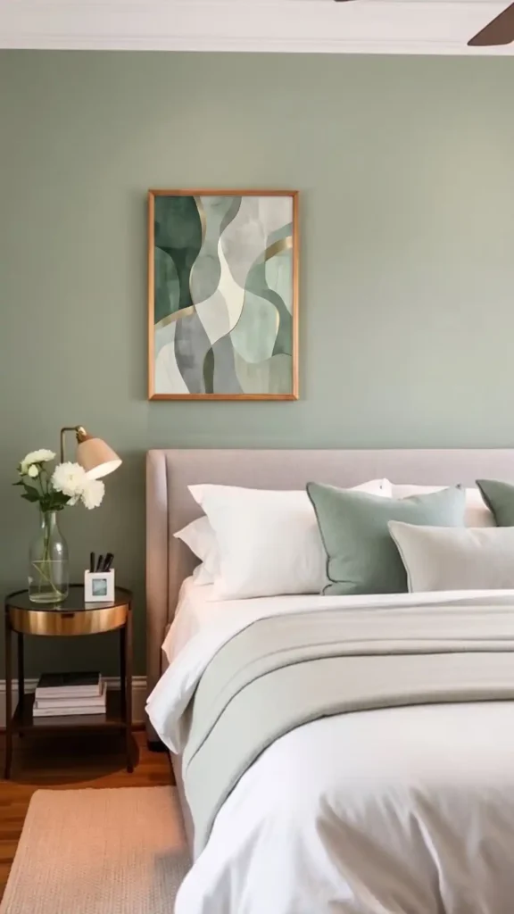
Soft sage green operates through gentle visual harmony rather than dramatic anchoring presence, creating a serene, muted backdrop that complements virtually any furniture aesthetic without competing for visual dominance. This low-saturation, gray-toned green pairs seamlessly with warm oak and walnut wood tones, brushed brass and matte black metal accents, and both linen-upholstered and velvet-finished pieces.
The color’s desaturated, earthy quality actively reduces visual fatigue across extended periods, while its inherent sophistication keeps the overall bedroom palette feeling cohesive, layered, and intentionally curated rather than incidental or default. For those considering more substantial textural alternatives, bedroom accent wall ideas range from simple paint applications to full wall panelling that can achieve similar calming effects with added dimension.
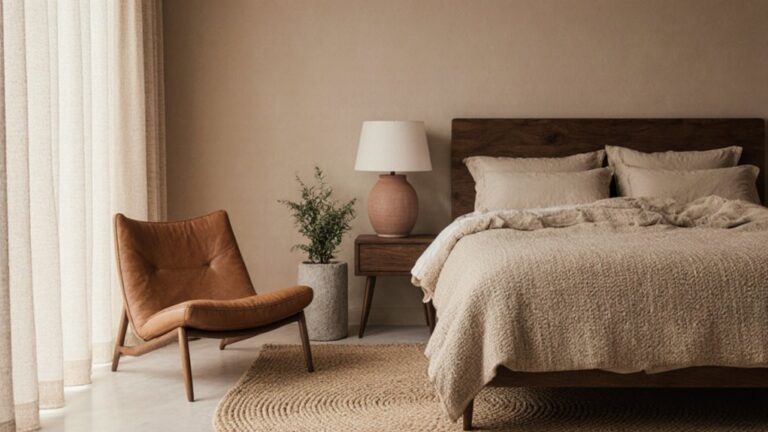
Warm Terracotta: Earthy Elegance for Any Aesthetic
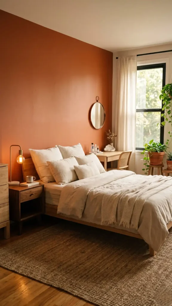
A sunlit bedroom featuring a single terracotta-painted accent wall in a deep, matte orange-brown finish, contrasted against a low-profile platform bed with a natural linen duvet and layered cream cotton pillows, flanked by solid walnut nightstands holding brushed brass table lamps with warm-toned Edison bulbs, a woven jute area rug anchoring the hardwood floor, trailing pothos vines in terracotta clay pots positioned in the corner near a large window with sheer linen curtains filtering golden afternoon light, with a small aged copper mirror mounted above a raw oak dresser, atmospheric and editorial in style, warm natural lighting, shallow depth of field, with a minimalist vanity table displaying Korean bedroom aesthetic styling through curated skincare bottles and soft cloud-shaped ceramics that create the clean, dreamy atmosphere popular on Xiaohongshu.
Navy Blue: A Timeless Bold Choice That Grounds Your Space
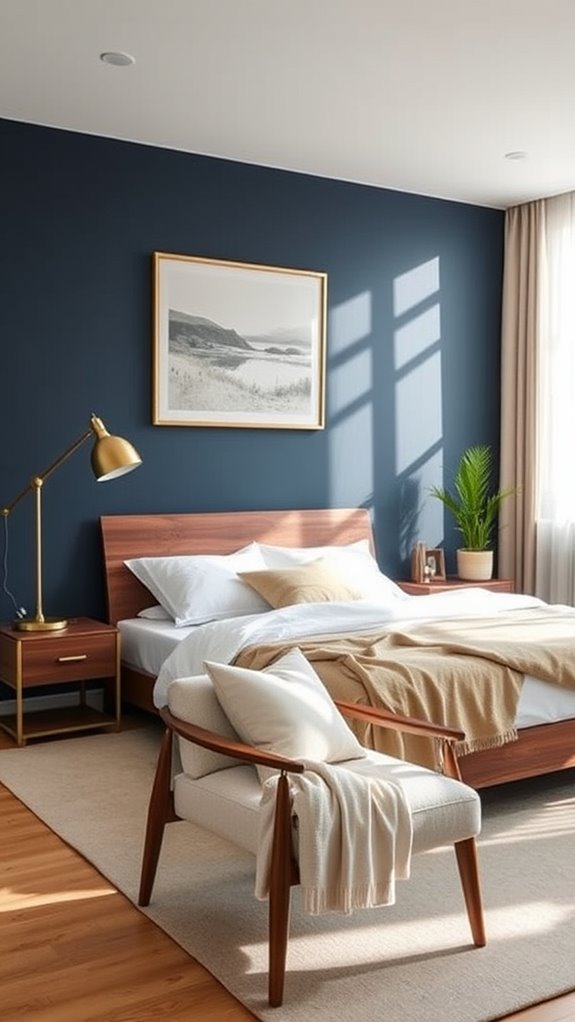
Navy blue creates a sophisticated, grounding effect that’s versatile enough to complement nearly any furniture style in your bedroom.
This deep, rich hue pairs beautifully with both sleek, minimalist modern pieces and ornate, carved traditional furniture, anchoring your space with timeless elegance and a sense of visual weight.
You’ll find that navy works exceptionally well with warm-toned teak or walnut wood furniture, brushed brass hardware and accent fixtures, and crisp white or ivory linen bedding, creating a cohesive, polished atmosphere with strong contrast and layered depth.
Like the best girls bedroom ideas, navy blue is designed to grow with your taste rather than expire after one phase, making it a smart long-term investment for your space.
Blush Pink: Subtle Warmth for Modern and Traditional Rooms
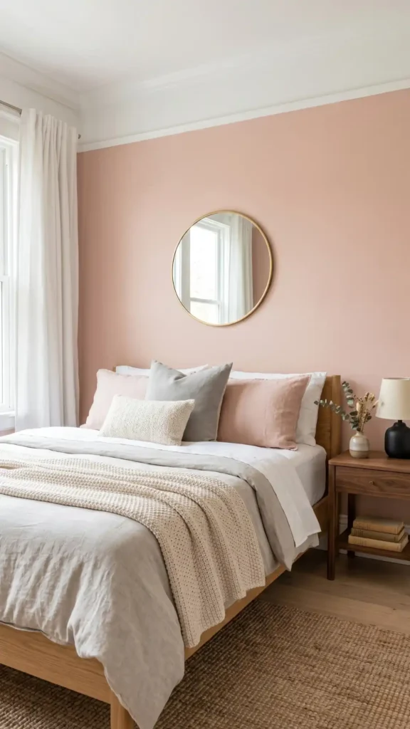
Blush pink brings a soft, inviting warmth to your bedroom while maintaining the sophistication that works across both modern and traditional design aesthetics. This muted rose tone, with its dusty, desaturated hue and gentle peachy undertones, complements natural oak and walnut furniture, brushed brass and matte black metal accents, and neutral linen or cotton textiles equally well.
Pair it with crisp white crown molding and trim, cool soft grays, or warm cream and ivory textiles to enhance its adaptability across varying room scales and lighting conditions. Together, these layered tonal combinations create a serene, visually cohesive sleeping environment that feels simultaneously current in minimalist and contemporary interiors and enduringly elegant in more classically styled spaces. A cozy minimalist bedroom achieves its welcoming atmosphere through careful balance of clean lines and soft, tactile elements rather than excess decoration.
Muted Mustard Yellow: The Unexpected Color That Pairs With Everything
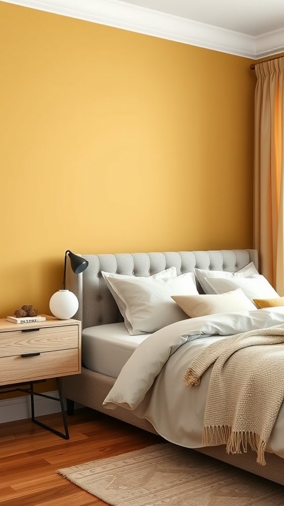
Muted mustard yellow works beautifully in bedrooms across contrasting design styles because of its warm, subdued undertones that bridge the gap between cool contemporary aesthetics and rich traditional sensibilities.
This ochre-adjacent, low-saturation hue complements sleek modern minimalist furniture — think clean-lined oak frames and brushed brass hardware — while simultaneously harmonizing with antique mahogany pieces and hand-carved wooden headboards.
Paired against natural linen, cotton percale, or textured boucle bedding in ivory, cream, or soft taupe tones, muted mustard yellow generates layered visual depth without visually overpowering a sleep-focused environment.
The color’s inherent warmth introduces a sophisticated, grounded quality that supports the low-stimulation, cocoon-like atmosphere essential for consistent, restorative sleep.
Drawing from Japandi bedroom ideas, this versatile shade also embodies the perfect marriage of Japanese minimalism and Scandinavian warmth, making it ideal for creating a calm, clutter-free retreat.
Soft Greige: Bridging Gray and Warmth
Soft greige seamlessly merges the cool sophistication of gray with the organic warmth of beige undertones, producing a muted, balanced neutral that serves as an exceptionally versatile bedroom foundation. This carefully calibrated tone eliminates visual tension, allowing diverse furniture silhouettes, material finishes, and design languages to coexist harmoniously within the same space.
Whether anchoring sleek, lacquered modern pieces or richly carved traditional hardwood furniture, soft greige adapts without competing. Its inherent tonal flexibility invites layering of contrasting textures — such as nubby linen, smooth velvet, and raw natural wood — alongside a broad spectrum of accent colors, making it a reliably strong choice across virtually every interior design direction.
Consider incorporating luxury bedroom panelling behind the bed to amplify soft greige’s sophisticated character through added texture and dimensional interest.
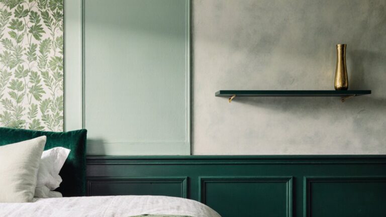
Deep Forest Green: Drama and Depth for Confident Spaces
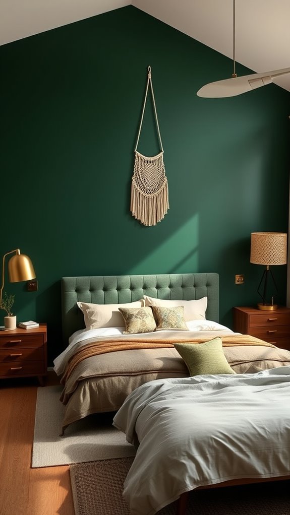
Deep forest green delivers the dramatic sophistication that transforms a bedroom into a confident, enveloping sanctuary.
This rich, saturated jewel tone — anchored in cool blue-green undertones — pairs beautifully with warm teak or walnut furniture, aged brass hardware, and deep cognac leather accent pieces.
The color’s inherent depth creates layered visual interest without overwhelming square footage, establishing an intimate, cocoon-like atmosphere. That enveloping quality actively promotes restful sleep and personal reflection, making it a purposeful choice for those ready to move decisively beyond soft, non-committal neutrals.
Deep forest green achieves this balance by functioning as one of the most versatile earthy tones that manages to feel grounded and natural without ever tipping into boring or muddy territory.
Warm Taupe: Understated Sophistication Across Every Style
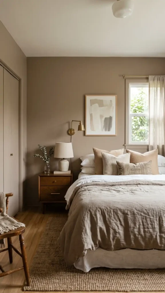
Warm taupe offers a more understated path for those drawn to sophisticated color but hesitant about deep, commanding tones. This versatile, mid-toned neutral sits between beige and gray on the color spectrum, carrying warm undertones that prevent the cold starkness often associated with purely gray palettes.
It works seamlessly with modern minimalist furniture, traditional wood pieces, and eclectic styles alike, adapting effortlessly across design languages without visual conflict. Warm taupe creates calming, low-contrast environments without demanding attention, allowing sculptural furniture forms, layered textiles, and curated décor accents to remain the focal points while maintaining a consistent sense of visual interest and ambient warmth throughout your bedroom space. In compact spaces like a smart 10×10 bedroom, this adaptable neutral proves especially valuable, providing spatial cohesion that makes precise furniture placement feel intentional rather than constrained.
Dusty Lavender: Calm Purple Tones for Any Design
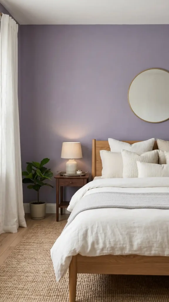
Dusty lavender offers muted, violet-adjacent purple tones with a desaturated, chalky finish that complements modern minimalist, traditional ornate, and eclectic bohemian furniture styles equally well. This soft, low-saturation hue reduces visual stimulation through its gentle chromatic intensity, promoting deeper, more restful sleep cycles. Its versatility places it among the bedroom aesthetic ideas easiest to complete, requiring minimal coordination with existing décor.
When applied as a bedroom accent wall, it pairs beautifully with ivory and warm-white neutral bedding, natural oak or walnut wooden bed frames, and brushed gold or antique silver metallic accents. Together, these elements create a cohesive, layered, and visually calming bedroom environment with a refined, understated elegance.
Textured Off-White: Subtle Depth That Never Overwhelms
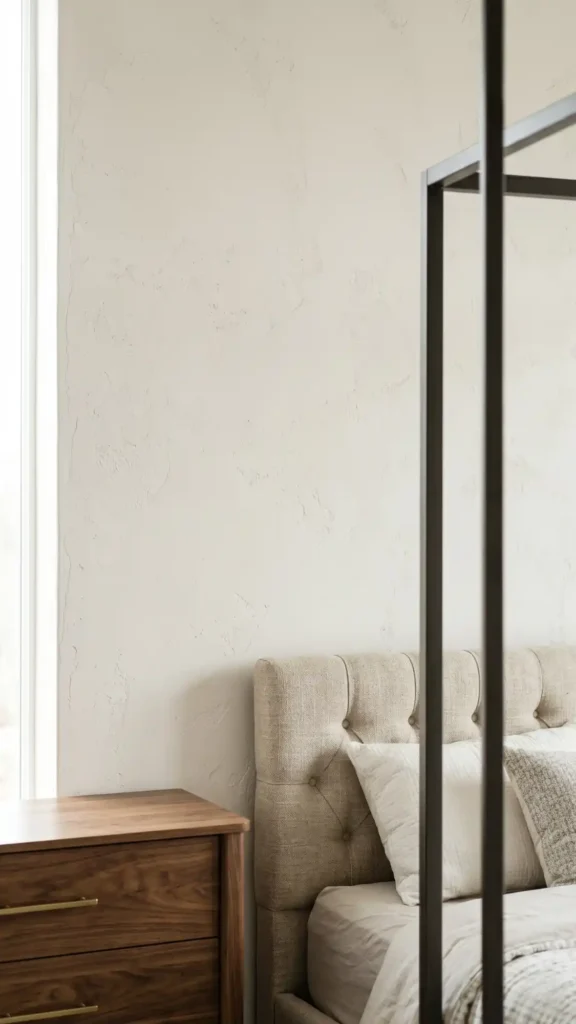
Textured off-white walls create subtle depth that complements virtually any bedroom furniture without demanding visual attention, making them an excellent choice for those seeking lasting versatility across evolving design preferences. The inherent tonal complexity of linen-like, sand-finish, and skip-trowel surfaces rewards closer inspection while maintaining an overall sense of quiet restraint.
Matte finishes with gentle surface variation enhance minimalist, traditional, and contemporary styles alike, adapting effortlessly to warm walnut grain, cool brushed nickel, and richly woven upholstery textures. This deliberately understated neutral palette allows your wooden dressers, tufted upholstered headboards, and powder-coated metal frames to remain commanding focal points while the walls themselves establish a serene, light-diffusing backdrop that amplifies both natural and ambient illumination.
Final thoughts
You’ve now explored eleven transformative accent wall colors — each carefully selected to complement diverse furniture styles, existing color palettes, and varied lighting conditions. Whether you gravitate toward deep charcoal gray with its dramatic, shadow-rich depth, soft sage green with its organic, botanical warmth, or dusty lavender with its muted, romantic undertones, each option creates compelling visual contrast.
These carefully curated hues work across multiple furniture aesthetics, from mid-century modern walnut pieces to contemporary white-lacquered frames, rustic reclaimed wood headboards, and traditional dark mahogany sets. The right accent wall color anchors your bedroom’s focal point while enhancing spatial perception and atmospheric mood.
Select the specific shade that best responds to your room’s natural light exposure, artificial lighting temperature, and your personal design sensibility. Then invest in premium, low-VOC interior paint with high pigment density and proper wall preparation — including priming, sanding, and patching — to ensure rich, even coverage and durable, long-lasting results.