9 Bedroom Paint Colour Mistakes That Make Rooms Feel Smaller
You’re likely making critical color choices in your bedroom that shrink the space without realizing it. Painting all four walls in dark hues, mixing too many competing colors, or ignoring your ceiling’s significant role in the overall scheme creates unwanted visual heaviness that compresses the room’s perceived dimensions.
Strategic color placement, proper natural and artificial lighting calibration, and deliberate paint finish selection dramatically transform how spacious your room actually feels. Understanding these nine common mistakes reveals precisely what’s working against your space’s full aesthetic and dimensional potential.
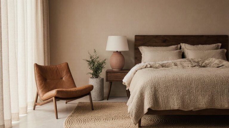
Painting All Four Walls in Dark Colors
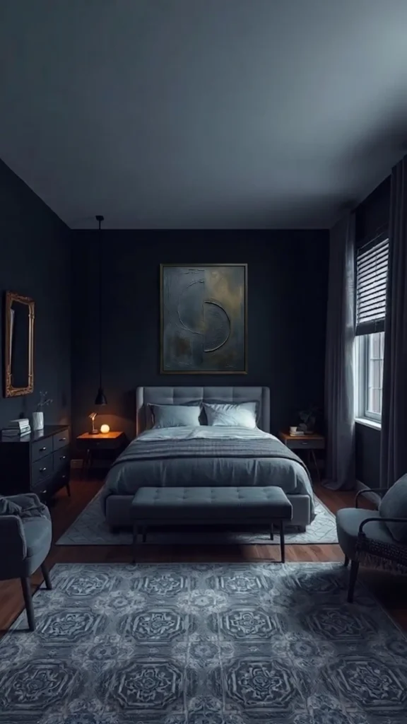
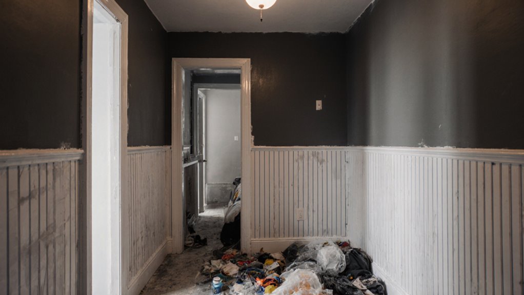
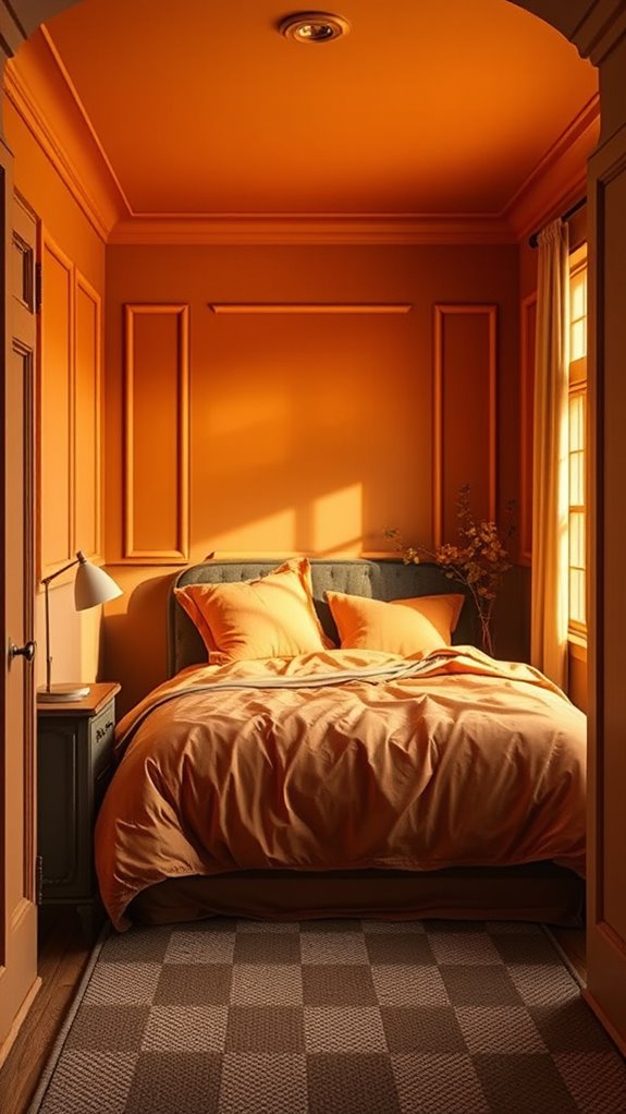
Painting all four walls in dark colors is one of the most common and impactful mistakes homeowners make, as it considerably reduces the perceived square footage and spatial volume of a bedroom environment. Deep, saturated hues such as charcoal, navy, and forest green absorb ambient and artificial light rather than reflecting it, creating a visually compressed, closed-in atmosphere that feels oppressive rather than intimate.
Instead, apply lighter shades — soft whites, warm creams, or pale greiges — across at least three walls, reserving darker, richer tones exclusively for a single accent wall. This strategic color placement maintains a sense of openness and airflow throughout the room while simultaneously introducing visual depth and intentional contrast. For a more grounded and natural feel without sacrificing spaciousness, consider incorporating earthy bedroom elements through textiles and decor rather than wall color.
Mixing Too Many Paint Colors
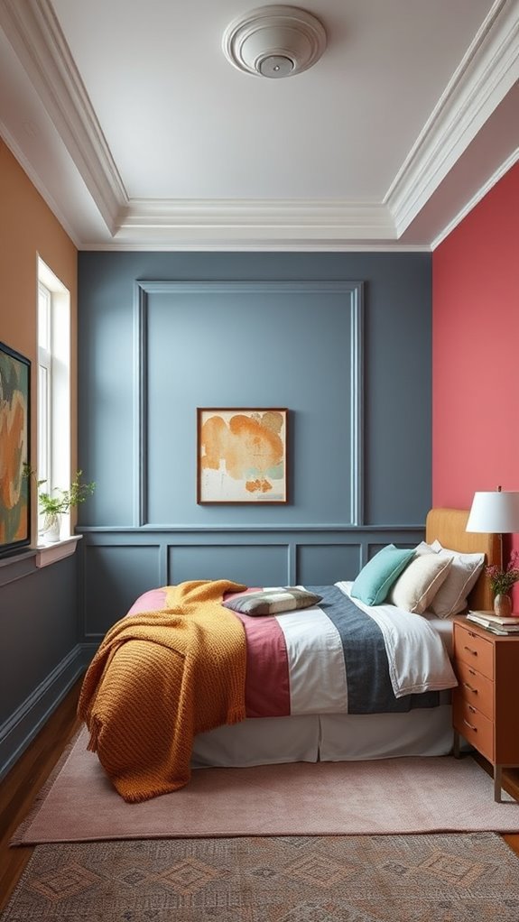
While you might think incorporating multiple paint colors adds visual interest to your bedroom, too many competing hues actually fragments the space — making it feel cluttered, disjointed, and noticeably smaller. Layering three, four, or five distinct wall colors introduces visual noise that overwhelms the eye and disrupts spatial flow. Dark, saturated colors absorb light and can make a bedroom feel closed in and cramped when used excessively across multiple surfaces.
Stick to a cohesive color palette using two complementary shades maximum — for example, a muted sage green paired with a warm off-white, or a dusty navy anchored by a soft greige. This deliberate, restrained approach maintains visual continuity across walls, trim, and architectural features, allowing your bedroom to feel more expansive, harmonious, and intentionally designed rather than chaotic.
Neglecting the Ceiling in Your Color Scheme
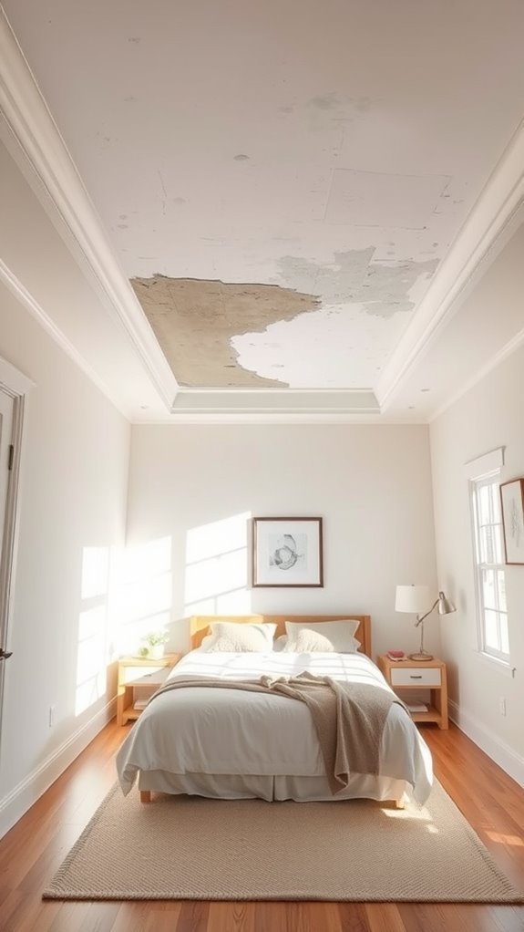
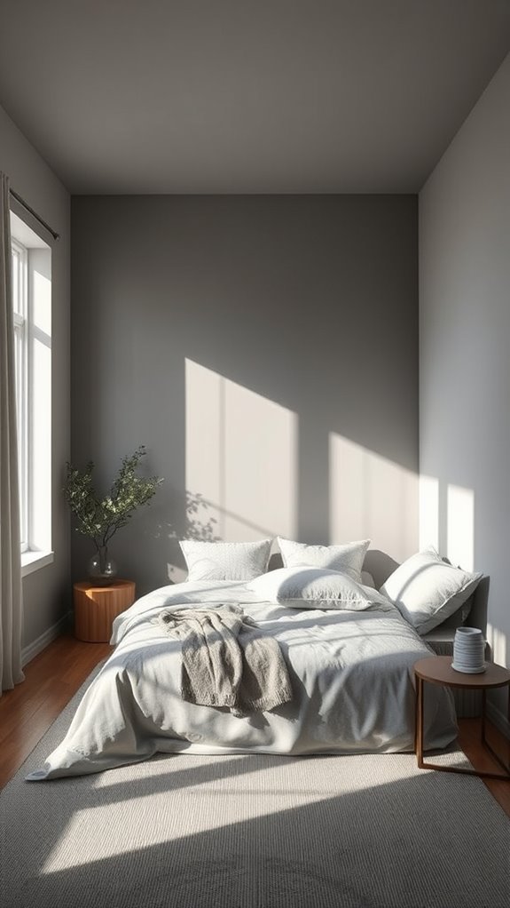
The ceiling, often treated as an afterthought, functions as a critical fifth wall that dramatically influences a room’s perceived volume, luminosity, and spatial character. Applying bright white latex paint or soft warm neutrals—such as alabaster, linen, or pale greige—to ceiling surfaces maximizes light reflectivity, bouncing natural and artificial illumination across walls, floors, and furnishings to cultivate an expansive, breathable atmosphere. Just as timeless girls bedroom ideas evolve with changing tastes rather than needing complete overhauls, a well-considered ceiling color proves its longevity by supporting various wall palettes and décor styles through the years. Deep, saturated ceiling colors—charcoal, navy, forest green, or burgundy—absorb ambient light and compress vertical height, transforming generous bedroom proportions into visually tight, low-slung spaces that feel enclosed rather than restful. Deliberate ceiling finish selection, whether matte, eggshell, or semi-gloss, paired with a thoughtfully coordinated wall palette, creates cohesive tonal relationships that amplify openness and architectural dimension throughout the entire room.
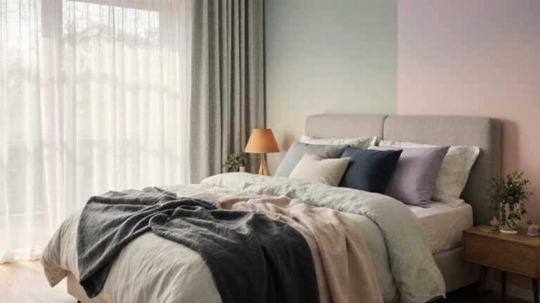
Layering Warm Tones Without Cool Relief
An all-warm color palette—featuring terracotta walls, golden yellow trim, rust-toned textiles, and honey-stained oak furnishings—creates visual monotony that compresses your bedroom’s spatial perception, making even generously sized rooms feel dense and enclosed.
Introduce cool accent colors like soft dusty blues or pale sage greens through framed artwork, linen bedding, or a single painted accent wall to interrupt the chromatic saturation. This deliberate warm-cool contrast expands the room visually, adds chromatic depth, and preserves the cozy, inviting atmosphere throughout your space. Consider how layered bedroom lighting can further enhance this balance by distributing warm illumination across multiple sources rather than relying on harsh overhead fixtures, allowing the cool accent tones to recede naturally while maintaining the enveloping warmth of your color scheme.
Why Matte Finishes Make Rooms Feel Smaller
How does your bedroom’s paint finish affect spatial perception? Matte finishes, characterized by their flat, light-absorbing pigment composition and zero-sheen surface texture, diminish the brightness and openness of interior spaces by failing to redirect available natural or artificial light sources. When light-absorbing walls lack reflective capacity, they create an optical illusion of advancement, compressing perceived square footage and generating a psychologically enclosed, cave-like atmosphere in otherwise adequately sized rooms. Satin finishes, with their subtle 25-35% sheen level, or semi-gloss options, boasting a 50-70% reflectivity rating, actively bounce photons across wall surfaces, amplifying ambient luminosity and creating the perception of expanded, airy square footage. Even when working with neutral bedroom ideas, the strategic use of sheen can introduce personality and depth without sacrificing the sense of spaciousness.
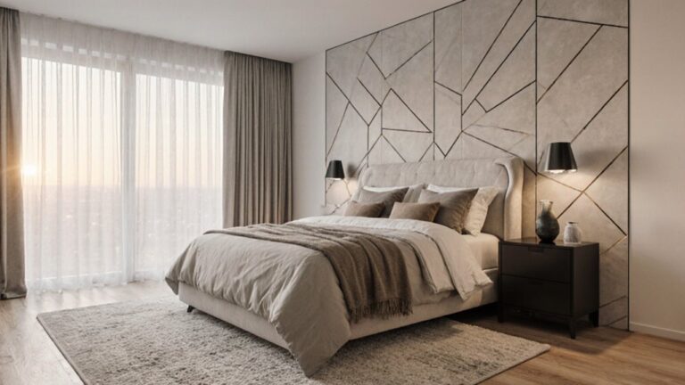
Strategic Placement: Why Accent Walls Matter
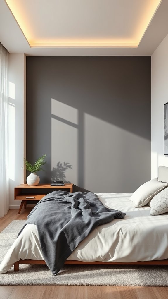
Strategic placement of accent walls can transform your bedroom’s spatial perception, especially when you’re working with matte finishes that already absorb light. Paint one wall in a lighter shade, positioning it directly opposite your bed frame to create measurable depth and a convincing illusion of expanded square footage.
Avoid dark, heavily pigmented accent walls in compact, low-ceiling rooms, as saturated charcoals and deep navies will compress an already-limited space further. Instead, apply pale jewel tones — soft sage greens, dusty muted amethysts, or washed-out cerulean blues — across a single focal wall, drawing the eye outward along the horizontal plane and visually stretching the room’s perceived dimensions. For inspiration on creating depth through color placement, consider how reading nook designs use strategic wall treatments to define cozy yet spacious-feeling corners.
Ignoring Your Bedroom’s Unique Lighting

While accent walls can visually expand your bedroom’s square footage, they’ll only succeed if you’ve honestly assessed both the natural daylight exposure and artificial lighting conditions specific to your room.
North-facing bedrooms receive cooler, indirect light throughout the day, while south-facing rooms enjoy warmer, more intense illumination — factors that dramatically alter how paint colors read on your walls.
Dark, pigment-rich colors like charcoal, navy, or deep forest green absorb light waves rather than reflecting them, compressing perceived ceiling height and shrinking the room’s apparent dimensions.
Test your chosen color using large paint swatches or sample boards at multiple times of day, carefully observing how sharp morning light, softer afternoon rays, and warm tungsten or LED evening lighting each transform the color’s undertones, saturation, and overall visual weight on your accent wall.
Professional designers often rely on tested bedroom color combinations to achieve effortless, space-enhancing results that account for these lighting variables.
Oversaturating Every Surface With Bold Colors

Bold, saturated colors splashed across every wall create a visually oppressive environment that psychologically compresses your bedroom’s square footage, triggering a claustrophobic sensation even in generously proportioned rooms.
Strategic color deployment transforms this dynamic entirely. A single, carefully selected feature wall — ideally the headboard-facing surface or a structurally prominent architectural element — delivers maximum chromatic impact without visual suffocation. Surrounding walls finished in soft neutrals like warm greige, muted ivory, or pale linen create spatial breathing room while amplifying the bold accent’s intensity through deliberate contrast.
This targeted approach preserves your room’s perceived ceiling height, horizontal depth, and natural light reflectivity, simultaneously honoring your appetite for rich color while maintaining an expansive, open atmosphere. When the remaining surfaces embrace cozy minimalist principles through restrained palettes and intentional simplicity, the bedroom feels curated rather than cramped.
How Trim and Baseboards Shift Perceived Space
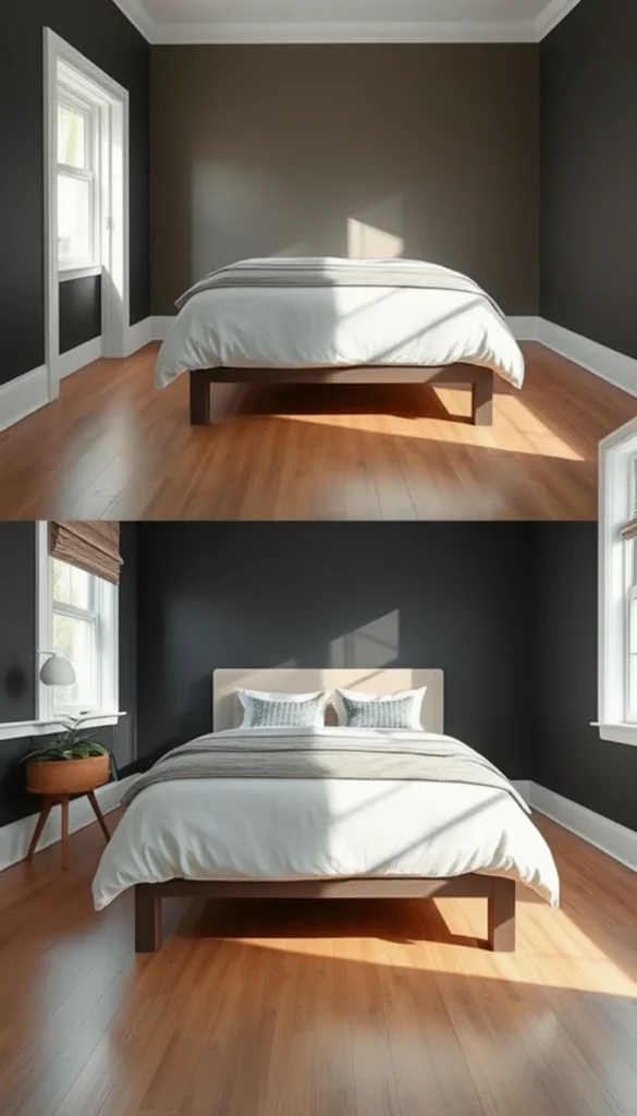
A bright, airy bedroom interior featuring floor-to-ceiling white walls seamlessly blending into matching white crown molding, chair rail, and wide baseboards, creating an uninterrupted monochromatic envelope. Natural light streams through sheer linen curtains onto wide-plank hardwood floors in warm honey oak. A king-sized upholstered bed in soft dove grey linen anchors the room, flanked by matching walnut nightstands with brushed brass hardware. Split composition showing one half with tone-on-tone wall and trim treatment appearing expansive, the other half featuring deep charcoal painted trim against pale walls appearing compressed and segmented. This visual principle mirrors how a striking headboard can similarly transform spatial perception through vertical accent placement.
Final thoughts
Choose a light base color for your walls, such as soft white, pale gray, or warm cream, and complement it with a single bold accent wall to create intentional visual depth. Incorporate cool undertones—think muted sage, dusty blue, or lavender—to naturally push the walls outward and expand the perceived square footage.
Keep your ceiling painted in a crisp, bright white or a shade marginally lighter than your walls to draw the eye upward and heighten the room’s vertical dimension. Opt for satin-finish paint across your surfaces, as its low-sheen reflectivity bounces ambient and artificial light more effectively than flat or matte alternatives. Layer your lighting strategically with recessed overhead fixtures, warm-toned bedside sconces, and indirect LED strips to eliminate dark corners and maintain consistent brightness throughout the space.