Red and Wood Tones — How to Make Them Work in a Modern Home
Red and wood tones should be natural partners. Both are warm. Both are rooted in nature. Both appear constantly in the world’s most beautiful interiors.
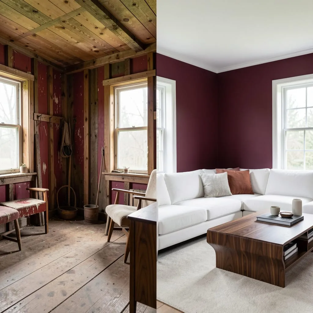
And yet, paired carelessly, they can look like a country cabin that forgot it was supposed to be modern.
The difference between red-and-wood that looks expensive and red-and-wood that looks dated comes down to three specific decisions — the shade of red, the finish of the wood, and the neutrals you use to bridge them. Get those three right, and the combination becomes one of the most sophisticated palettes in residential design.
Here’s exactly how, and the wood finish tip at #3 is the one most people miss entirely.
Why Red and Wood Work — And When They Don’t
Red and wood share warm undertones that naturally harmonize. In nature, autumn leaves are red, orange, and brown simultaneously. The eye reads this combination as inherently organic and grounded.
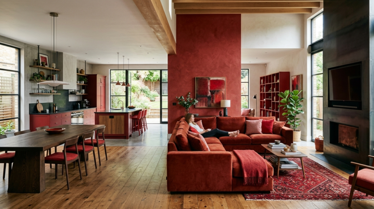
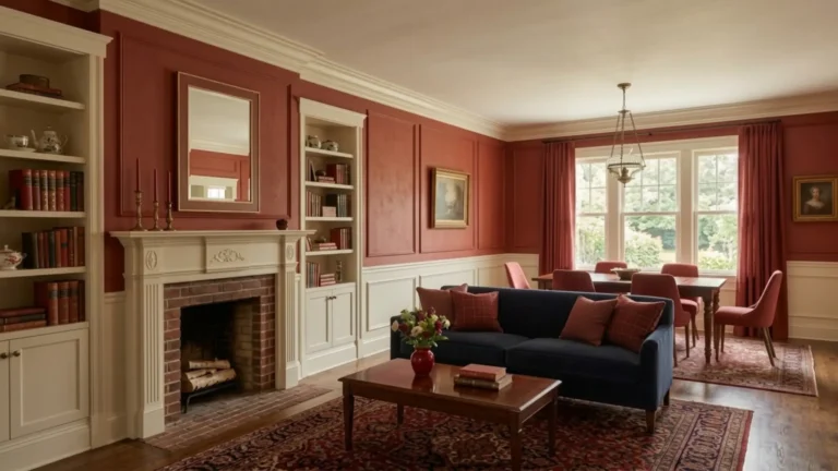
Where the pairing goes wrong: when both the red and the wood are at maximum warmth simultaneously. Bright red walls with orange-toned pine flooring and honey oak furniture creates a sensory overload with nothing to anchor it — the result feels heavy, dated, and overwhelmingly warm.
The solution is contrast and restraint — choosing one element to be the warm star and letting everything else recede.
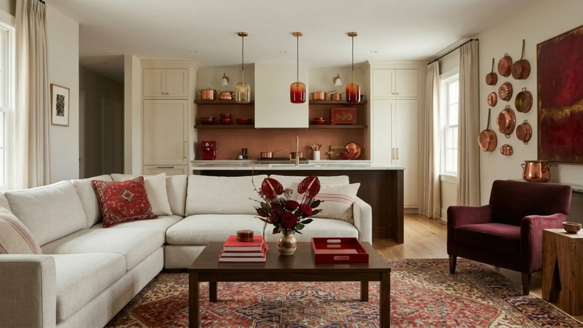
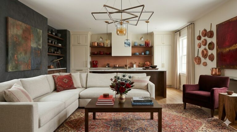
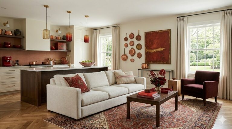
Pick a Red That Complements Rather Than Competes With Your Wood
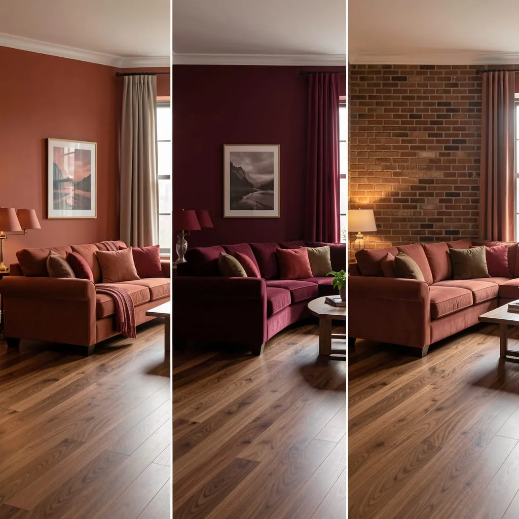
Against warm, orange-toned woods (pine, oak, bamboo): Go cooler or darker with your red. Deep burgundy, wine, or a slightly cooled crimson creates the contrast that makes both readable as separate elements.
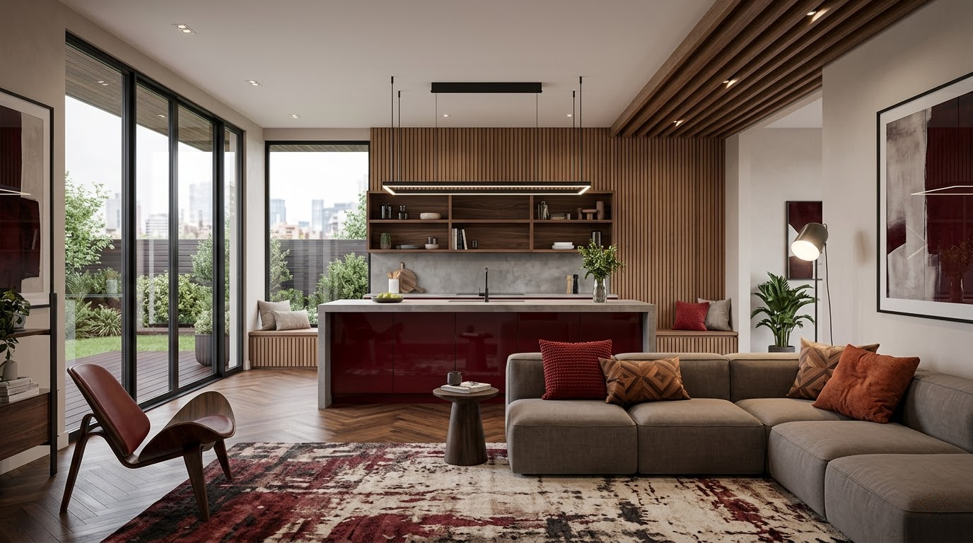
Against dark, rich woods (walnut, mahogany): Warmer reds work beautifully. Terracotta, brick red, and rust share the warmth without blending into it.
Against grey-toned woods (grey-washed oak, whitewashed pine): Almost any red works. The coolness of the wood provides built-in contrast to even the warmest red.
The rule: if your wood is warm-toned, go cooler or deeper with your red.
Choose the Right Wood Finish for a Modern Result
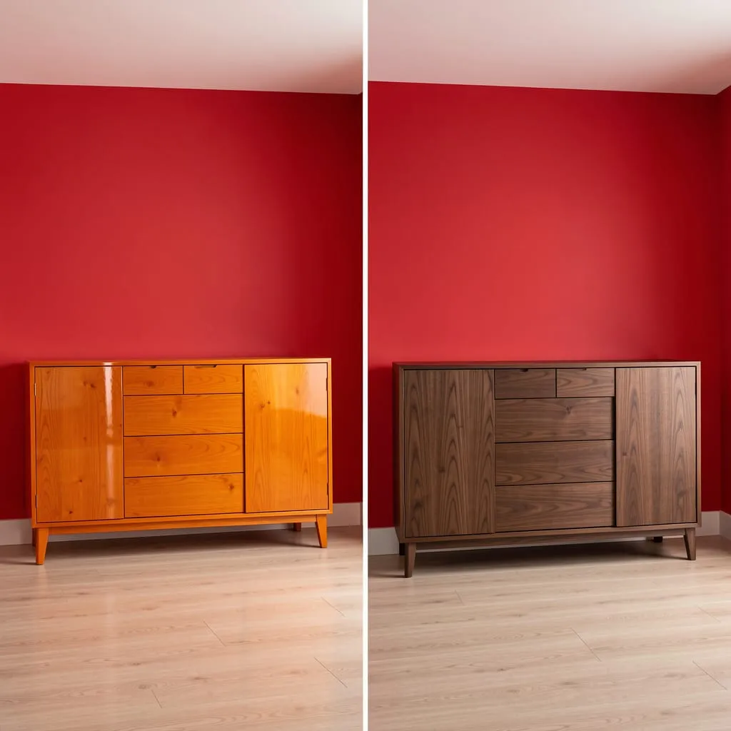
This is the tip most red-and-wood guides skip — and it most directly determines whether the combination reads as modern or dated.
High-gloss, orange-stained, or heavily varnished wood amplifies the warm tones in any red and creates the cabin-adjacent result most people want to avoid. The same wood species in a matte, natural, or dark-stained finish produces an entirely different result.
Modern wood finishes to choose:
- Matte or satin-finish walnut: Rich, dark, pairs with almost any shade of red
- Whitewashed or grey-washed oak: Cool contrast to warm reds
- Raw or lightly oiled wood: Natural and organic, particularly beautiful with terracotta and rust reds
- Dark-stained maple or ash: Affordable and modern-looking in matte finish
Avoid: high-gloss finish, orange-toned stains, heavily knotted pine.
Use White and Warm Grey as Bridge Colors
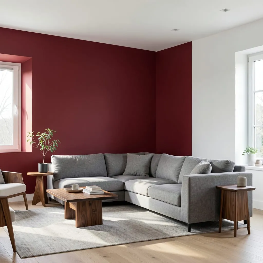
Without a bridge color, the combination can feel dense and overwhelming. White is the most effective bridge: it provides visual breathing room and creates the contrast that makes both the red and the wood more readable.
Warm grey is the most sophisticated bridge: it shares enough warmth with both elements to feel cohesive but provides enough neutrality to prevent overload.
The formula: one red element, one warm wood element, and a significant amount of white or warm grey surrounding both.
Add Metal Accents to Modernize the Combination
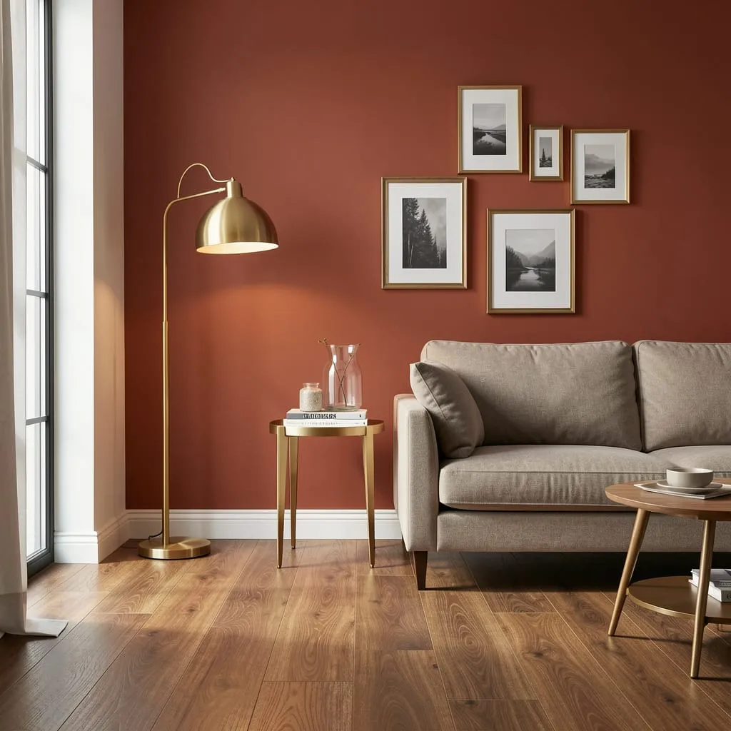
Metal finishes are the ingredient that most reliably moves a red-and-wood combination from traditional to contemporary. Best metals for red-and-wood rooms:
- Brushed brass: Warm enough to complement both, refined enough to feel modern
- Matte black: Creates strong graphic contrast — effective in more minimal rooms
- Bronze: The warmest option, works especially well with deep reds and dark walnut
Apply through lamp bases, picture frames, cabinet hardware, side table legs, and curtain rods.
Let the Floor Do Some of the Work
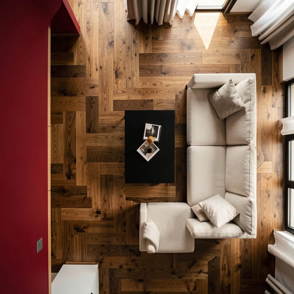
If your home already has wood flooring, you’re halfway to a successful red-and-wood room before making a single additional choice. The floor and one red wall are enough — every other element can be neutral.
Often, restraint in the additional wood elements — one piece of wood furniture, or just the floor itself — creates a cleaner, more modern result than layering wood throughout.
Red and Wood Is One of Design’s Great Partnerships
Used with intention, red and wood create interiors that feel simultaneously warm and sophisticated — rooted in the natural world but thoroughly modern in execution.
Ready to apply this to a specific room?
Our guide on [Red Living Room Ideas: 15 Budget-Friendly Ways to Pull It Off →] covers how to build a complete red living room — including wood flooring and furniture decisions — from the ground up.
Or explore the full [Red Interior Design category →] for every room type and pairing.