Red Interior Design Mistakes Every Beginner Makes (And How to Fix Them)
I’ve made almost every red interior design mistake on this list personally. Some of them twice.
The good news: every single one is fixable — often without repainting, without new furniture, and sometimes without spending anything at all. The better news: knowing these mistakes in advance means you don’t have to make them to learn from them.
Mistake #4 is the one I see most often and the one nobody talks about — and it’s the reason more red rooms look restaurant-like than luxurious.
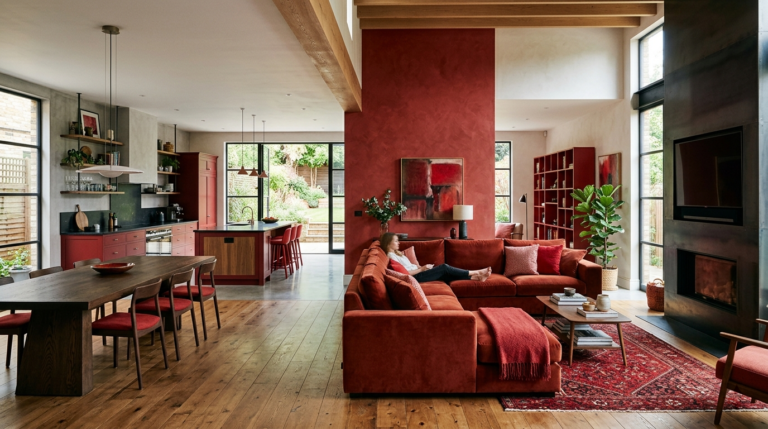
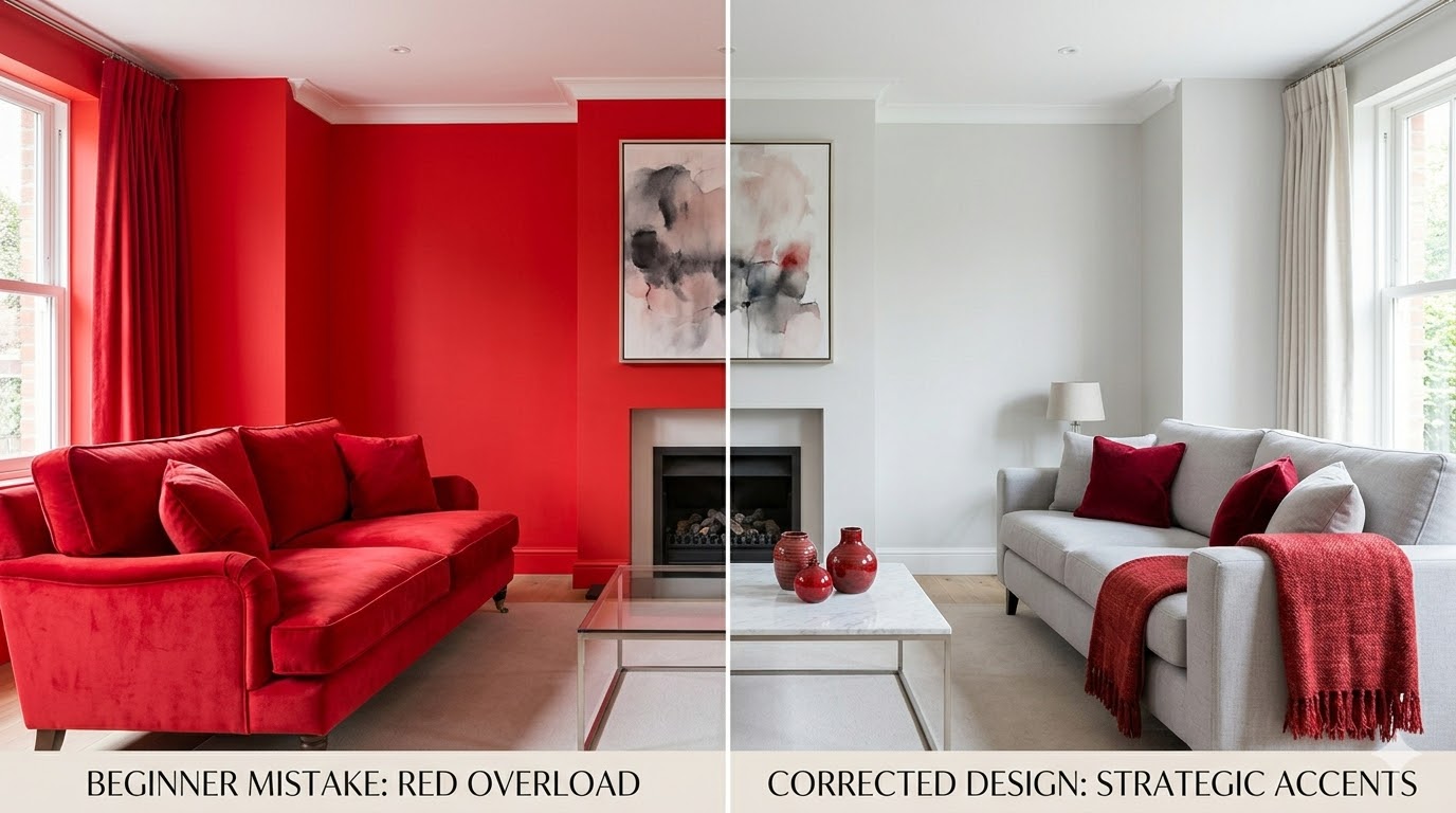
Mistake #1: Painting All Four Walls
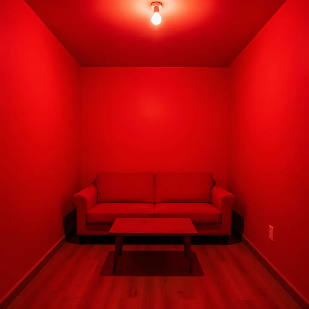
Four red walls in any room smaller than a large dining room creates an overwhelming effect that most people immediately regret. Red advances visually — it appears to move toward you — which means four red walls in a typical room feel much closer than four white ones.
The fix: Paint one wall only. The accent wall delivers 80% of the visual impact at 25% of the coverage. Everything else should be a neutral — white, cream, or warm grey.
Mistake #2: Choosing the Wrong Undertone for Your Light
Not all reds behave the same way in different light conditions. Cool reds (those with blue or purple undertones) look muddy and flat in rooms without strong natural light. Warm reds (those with orange or brown undertones) glow under almost any light condition.
The fix: Match your red to your room’s light. Cool or dim light → warm undertones (terracotta, brick, rust). Bright, warm light → more flexibility, including cooler reds.
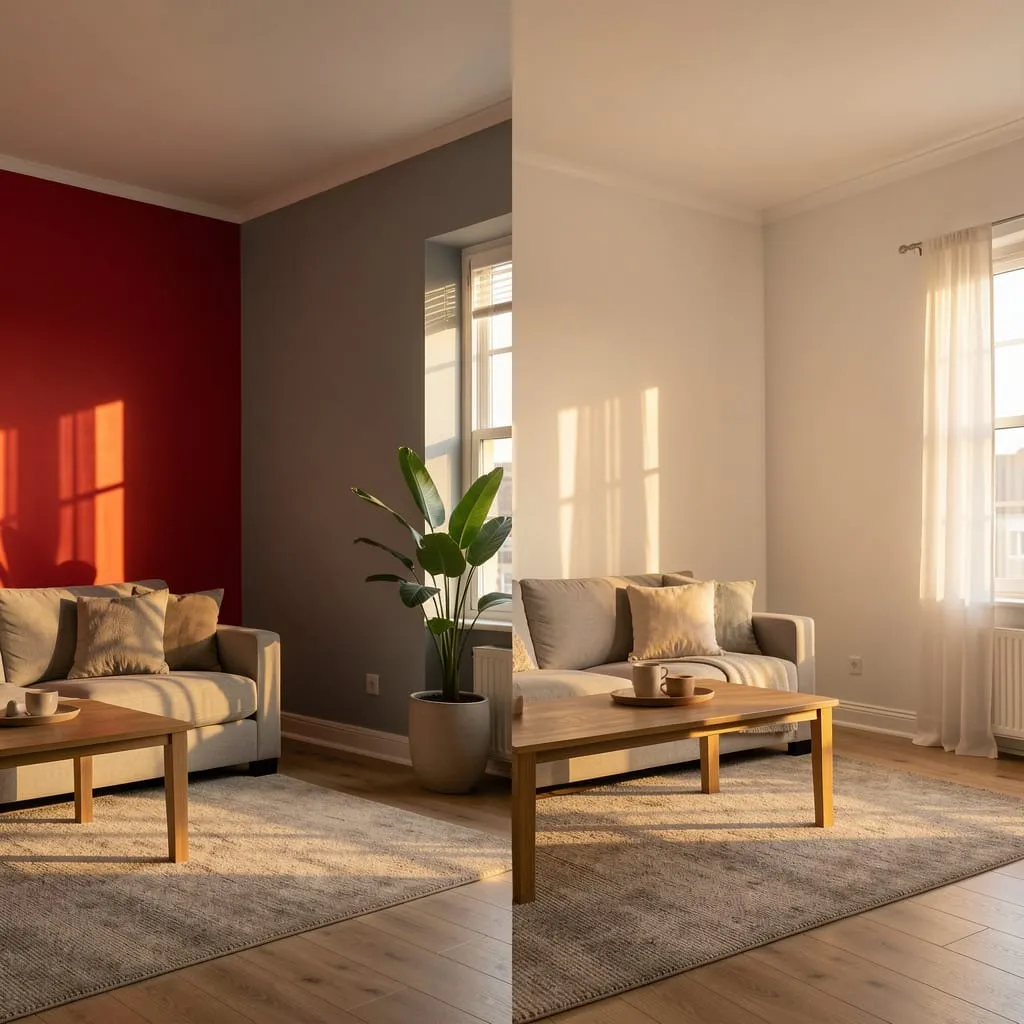
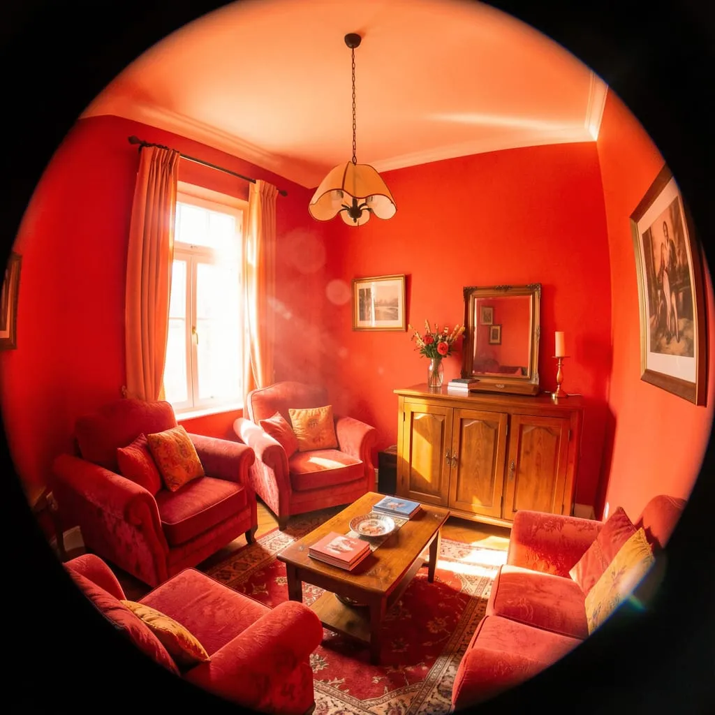
Mistake #3: Using the Wrong Lighting
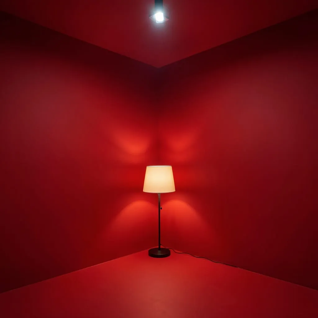
Cool, bright overhead lighting makes red look aggressive and flat. Warm, layered lighting makes it look rich and luxurious.
The fix: Replace cool bulbs with warm ones (2700K maximum). Add a floor or table lamp aimed at the red wall. Install a dimmer on any overhead fixture. The change is dramatic, immediate, and costs under $20.
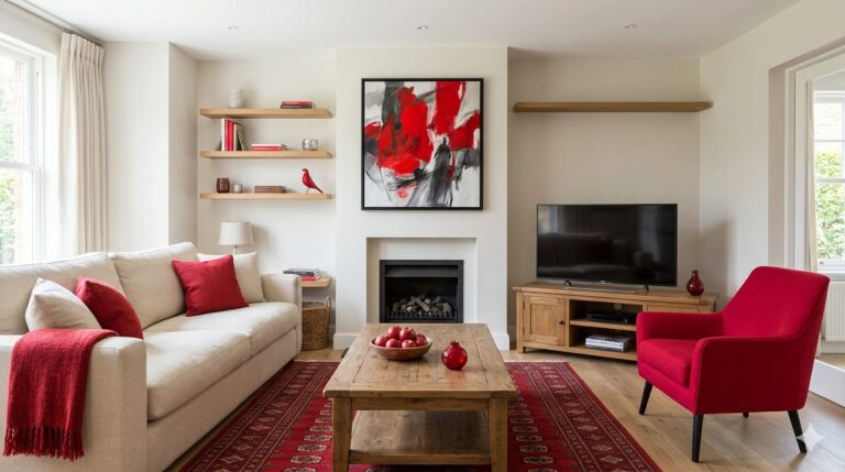
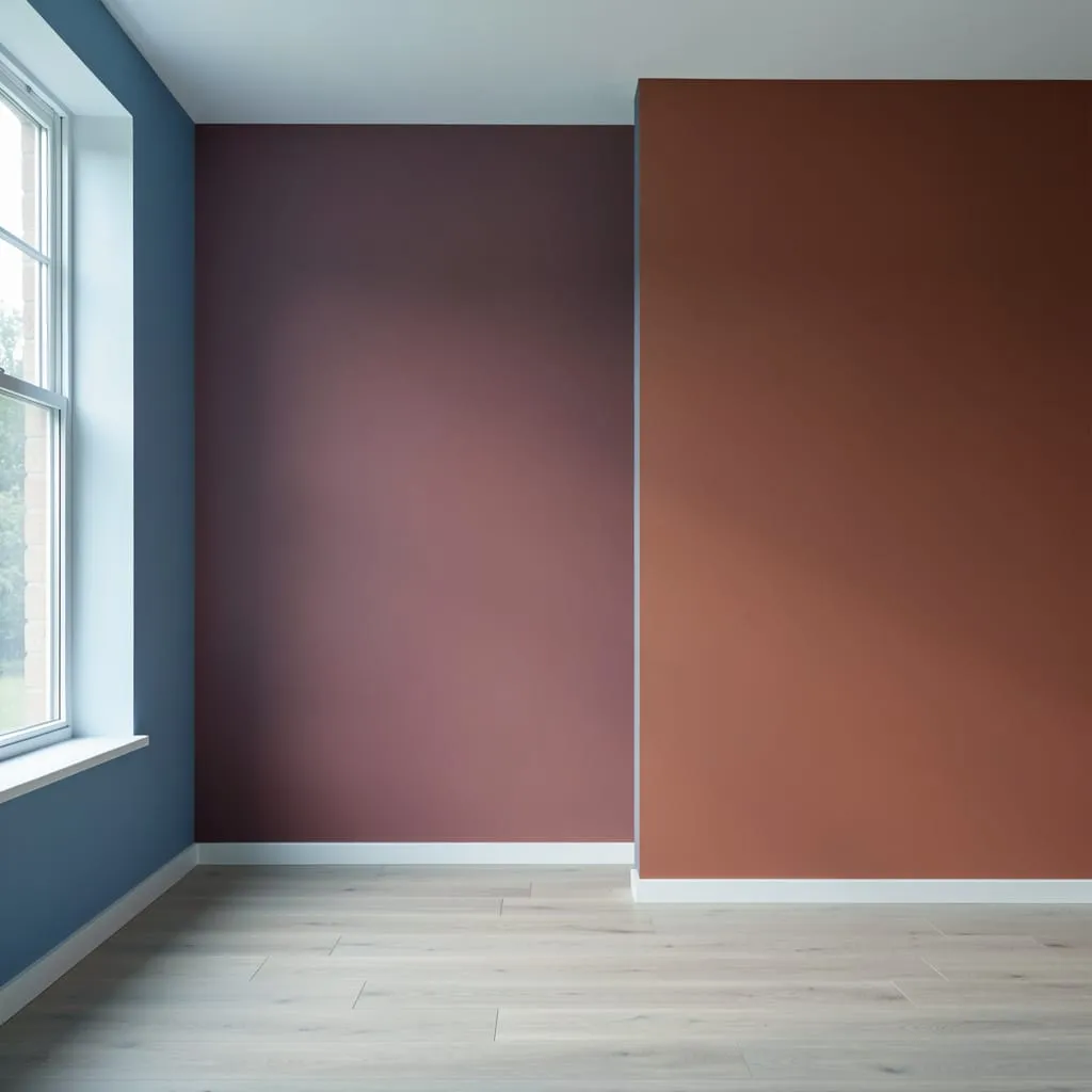
Mistake #4: Ignoring the Transition Color
This is the mistake nobody talks about — and it’s the reason so many red rooms feel uncomfortable without the homeowner knowing why.
When a red wall meets an adjacent wall in a medium or saturated color, the visual transition is jarring. The eye doesn’t know where to rest.
The fix: Any wall adjacent to your red wall should be a true neutral — white, cream, or very light warm grey. The neutral gives the eye a visual rest point between the red statement and whatever is on the other side of the room.
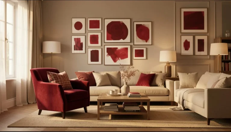
Mistake #5: Red With the Wrong White
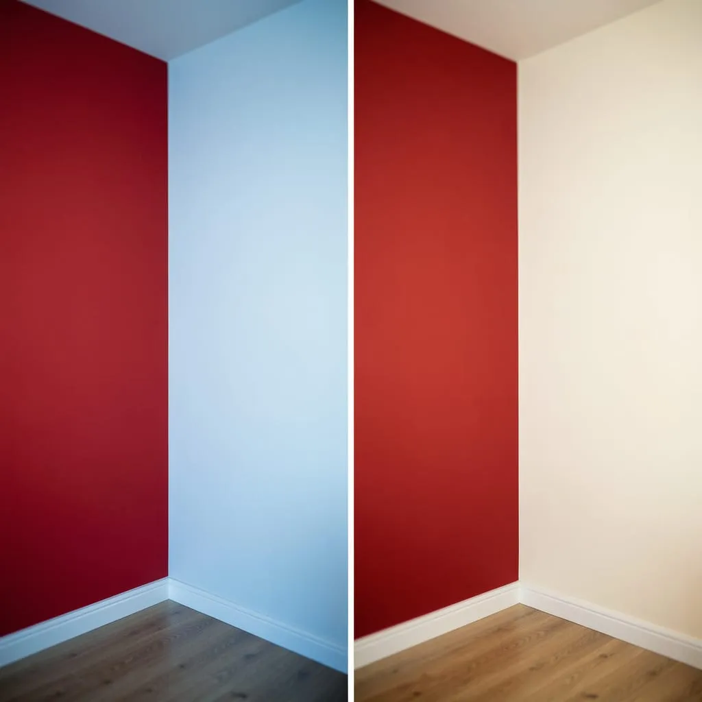
Cool whites (those with blue or grey undertones) fight against warm reds, creating a subtle visual tension that makes the room feel slightly off even when everything else is correct.
The fix: Pair warm reds with warm whites — those with cream, yellow, or pink undertones. Benjamin Moore White Dove, Sherwin-Williams Alabaster, and Farrow & Ball All White are reliable warm whites that harmonize with most red shades.
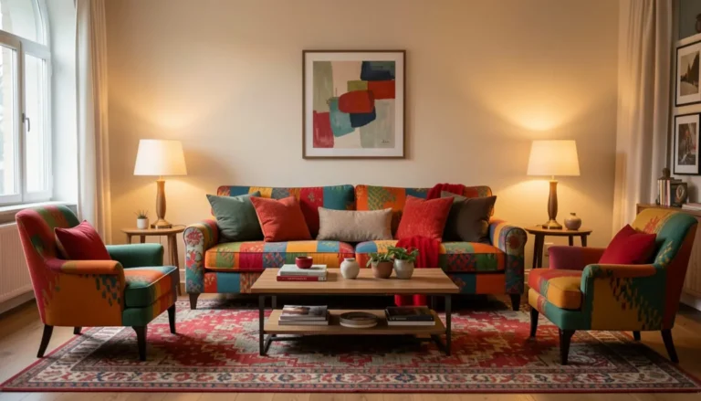
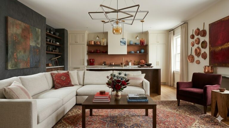
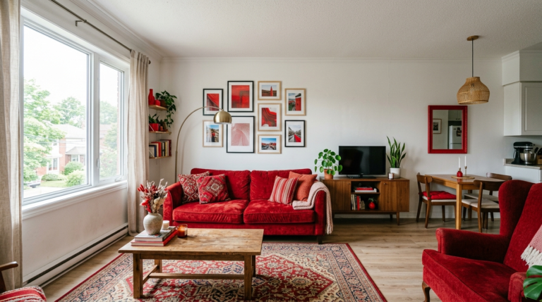
Mistake #6: Too Much Red Furniture Alongside Red Walls
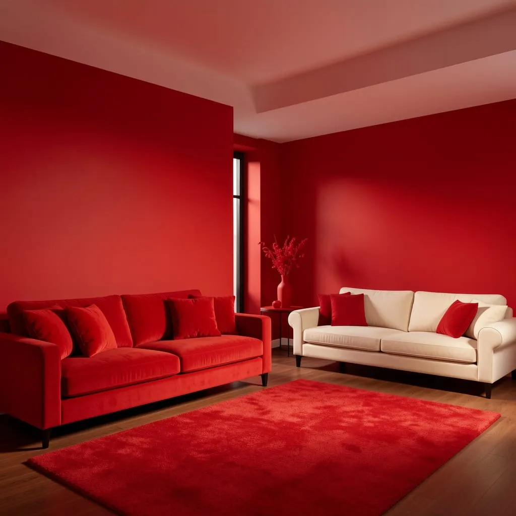
A red accent wall and red upholstered furniture in the same room creates a monochromatic effect that eliminates contrast — and contrast is what makes bold color interesting.
The fix: If you have a red wall, choose neutral upholstery — cream, ivory, warm grey, or natural linen. If you want a red sofa, keep the walls neutral. One primary red element per room is almost always the right amount.
Mistake #7: Not Accounting for Red’s Behavior in Photos
Phone cameras often oversaturate red, making it appear brighter, more orange, or more intense than it actually looks in person.
The fix: Shoot in the best natural light you have (morning or late afternoon), use manual white balance control if possible, and slightly underexpose — it pulls red back toward its actual appearance rather than the blown-out version phone cameras often produce.
Every Mistake Is Cheaper to Fix Than You Think
The most expensive red mistake is doing nothing — living with a room that doesn’t work when a $15 bulb swap or a can of white paint would resolve it entirely.
Your next step:
Now that you know what to avoid, see the approach in action with our full guide: [Red Living Room Ideas: 15 Budget-Friendly Ways to Pull It Off →]
Or start exploring room-specific applications in the [Red Interior Design category →] — every guide there is built around avoiding these exact mistakes from the start.