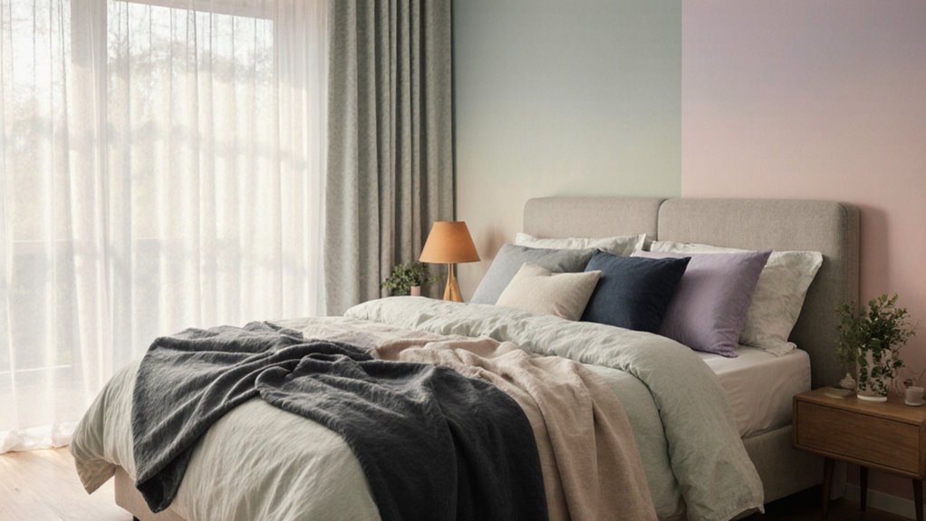
15 Calming Bedroom Color Palettes for Better Sleep
Your bedroom’s color scheme directly affects how quickly you fall asleep and how deeply you rest. Researchers confirm that cool, muted tones lower cortisol levels, signaling your brain to wind down. Choosing the wrong palette can quietly sabotage your sleep without you realizing it. These 15 carefully selected pairings show you exactly which combinations work and why.
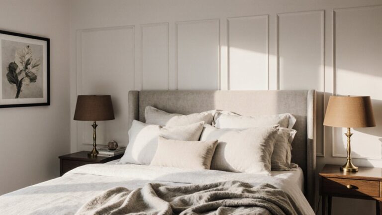
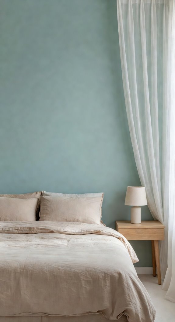
Soft Blue and White for the Most Sleep-Friendly Bedroom
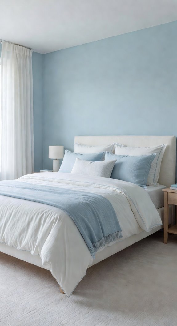
Soft blue and white may be the most effective color combination you can choose for a sleep-friendly bedroom. These hues lower your heart rate and reduce mental stimulation, making it easier to fall asleep.
Paint your walls a muted periwinkle or powder blue, and pair them with crisp white bedding and natural linen accents for a calming, cohesive palette.
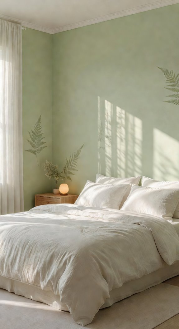
Sage Green and Warm Ivory for a Bedroom That Feels Grounded
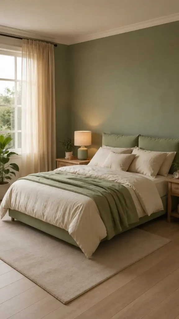
While blue tones work beautifully for sleep, sage green paired with warm ivory brings a different kind of calm to your bedroom. These earthy tones reduce visual stimulation, helping your mind settle naturally. Use sage on your walls and ivory for your bedding and trim. Together, they create a grounded, nature-inspired palette that supports consistent, restful sleep.
Lavender and Gray for a Bedroom That Eases Your Mind at Night
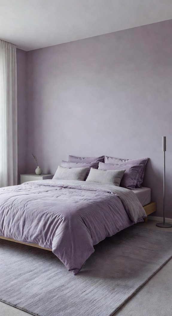
Lavender and gray work together to create a bedroom palette that’s both visually soft and psychologically calming. You’ll want to use muted lavender on your walls and pair it with cool gray bedding and curtains.
This combination reduces visual stimulation, helping your mind wind down.
Add white trim to keep the space feeling clean and balanced.
Navy and Soft Gold for Bedrooms That Encourage Deep Sleep
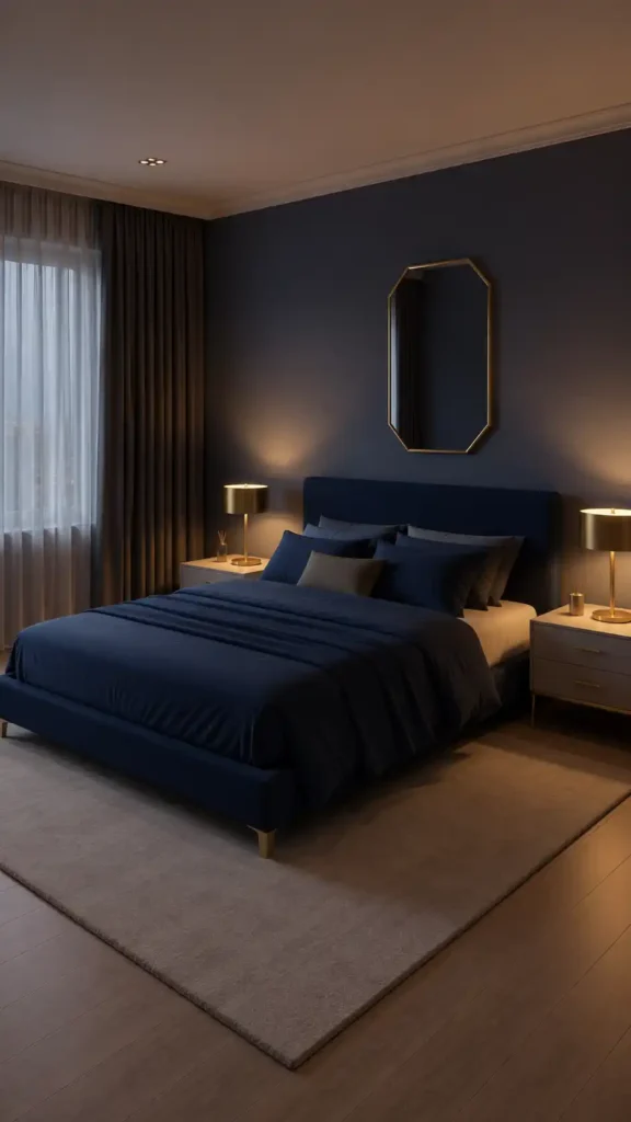
Navy and soft gold create a grounding color palette that signals your brain it’s time to rest, drawing on deep, muted tones that reduce stimulation.
Paint your walls navy, then layer in soft gold through linen throw pillows or a brass bedside lamp. These tones work together, creating visual warmth without overstimulating your senses before sleep.
Slate Blue and Dove Gray for a Bedroom That Feels Calm and Polished
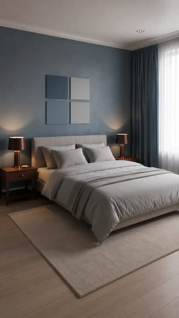
Slate blue and dove gray create a bedroom palette that feels both refined and restful, giving your space a polished look without sacrificing calm. Use slate blue on your walls and dress your bed in dove gray linen. Add brushed nickel fixtures to reinforce the cool, cohesive tone throughout your room.
Pale Green and White for a Nature-Inspired Sleep Space
While cool blues and grays bring polish to a bedroom, pale green and white offer something softer and more organic. You’ll find this palette mimics nature’s neutral tones, reducing visual stimulation before sleep. Paint walls in sage or celadon, then layer white linen bedding and natural wood furniture to ground the space with earthy, biophilic warmth.
Muted Teal and Linen for a Bedroom That Feels Calm and Airy
Muted teal and linen create a bedroom palette that feels both grounded and open, striking a balance that neither pale green nor cool gray can quite match. You’ll want to pair teal walls with linen bedding and light oak furniture, keeping the contrast soft. This combination supports a calm, airy atmosphere that promotes restful sleep.
Dusty Rose and Cream for Bedrooms That Feel Warm Without Running Hot
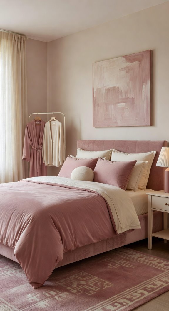
Dusty rose and cream might seem like a bold pairing, but these two tones work together to create warmth that stays soft and controlled.
You’ll want cream on your walls and dusty rose in your textiles, like linen throw pillows or a velvet duvet.
This combination adds visual warmth without raising the room’s psychological temperature.
Blush Pink and Beige for a Soft Bedroom You’ll Actually Sleep In
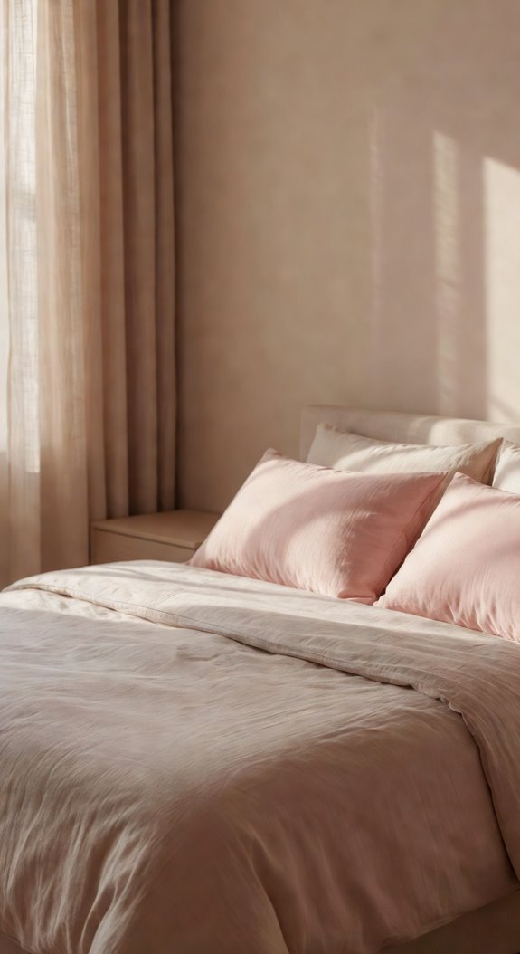
Blush pink and beige work together because they share the same warm undertone, which keeps the palette feeling unified rather than mismatched.
Paint your walls blush, then layer in beige linen bedding and a natural wood nightstand. You’ll create depth without visual noise, letting your brain shift into rest mode more easily each night.
Lilac and Soft White for a Bedroom That Lowers Mental Stimulation
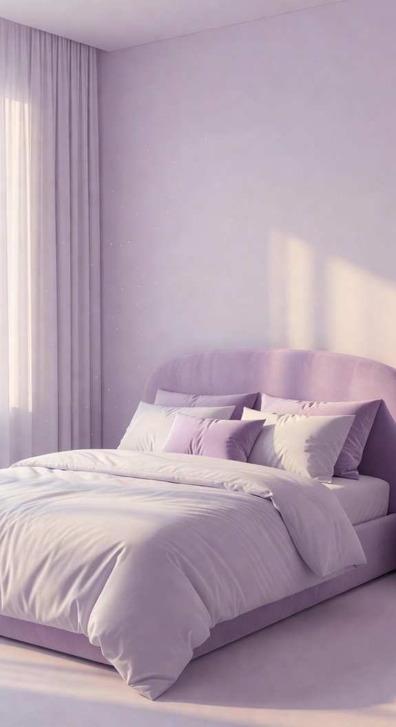
Lilac and soft white create a low-stimulation environment that signals your brain to wind down before sleep. You’ll want matte finishes on your walls, since they absorb light rather than reflect it. Pair lilac walls with white linen bedding and natural wood nightstands. This palette keeps visual noise minimal, reducing cortical arousal so your mind shifts into rest more efficiently.
Pale Yellow and Light Gray for Warmth That Won’t Keep You Awake

Pale yellow and light gray work together to give your bedroom warmth without the visual stimulation that disrupts sleep. Yellow’s softness keeps the space inviting, while gray grounds it with neutral balance. Use matte finishes on walls to reduce light bounce. Linen bedding in warm white ties both tones together, creating a cohesive palette that supports restful sleep.
Charcoal and Warm White for a Moody Bedroom That Still Lets You Rest
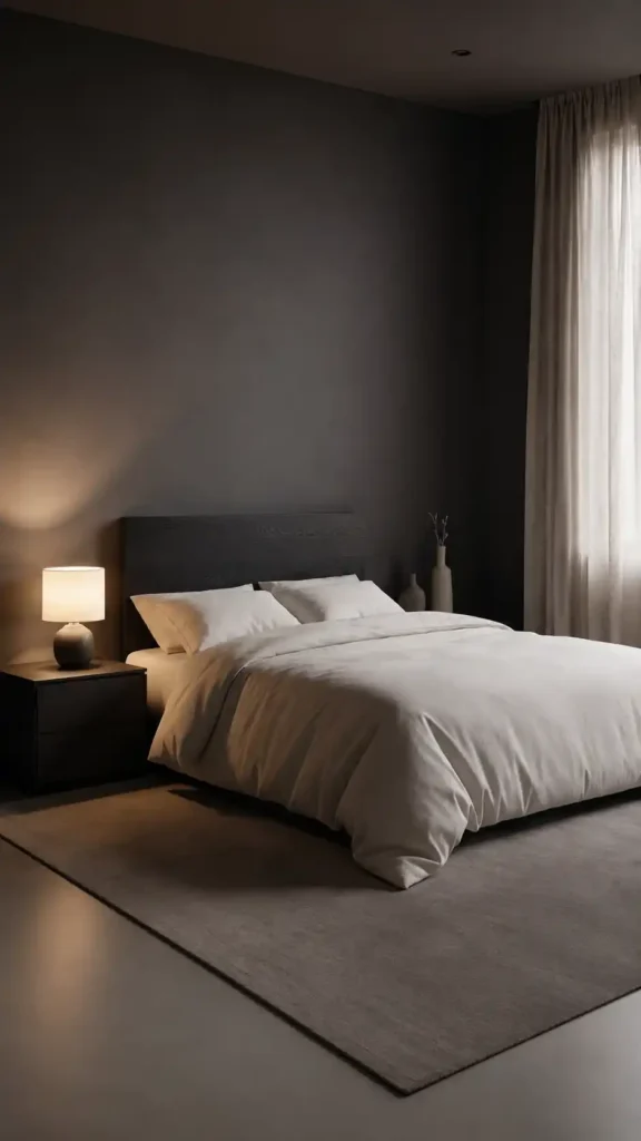
Charcoal and warm white might seem like a bold choice for a bedroom, but this high-contrast pairing can actually support restful sleep when you balance it correctly.
Use charcoal on a single accent wall and keep remaining walls warm white. Add linen bedding and matte black hardware to ground the palette without overwhelming your senses.
Warm Taupe and Sand for a Bedroom That Melts Away Tension
If charcoal feels too dramatic for your space, warm taupe and sand offer a softer alternative that still grounds the room with visual weight. These earth tones reduce visual stimulation, which signals your nervous system to relax.
Pair them with linen bedding, natural wood nightstands, and matte finishes to create a cohesive, tension-free environment that supports deeper sleep.
Terracotta and Cream for a Warm Bedroom That Promotes Restful Sleep

Terracotta and cream work together to create a bedroom that feels both grounded and inviting, making them a surprisingly effective pairing for sleep-focused design.
You’ll want to use terracotta sparingly on one accent wall, letting cream dominate your bedding and larger surfaces.
This balance prevents the palette from feeling too warm or visually heavy at night.
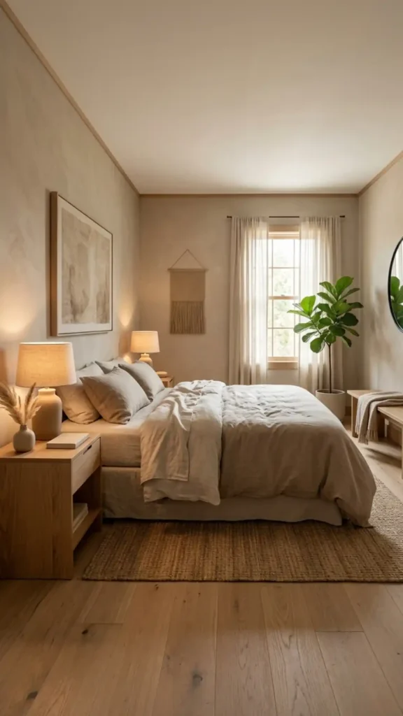
Greige and Wood Tones for a Bedroom That Promotes Deep Sleep
Greige—a blend of gray and beige—pairs naturally with warm wood tones to create a bedroom environment that’s both visually quiet and deeply restful.
Use matte greige walls with oak or walnut furniture to ground the space.
Linen bedding in cream or oat reinforces the palette’s neutral warmth.
Together, these elements reduce visual noise, helping your nervous system ease into sleep.
How to Choose Paint Undertones
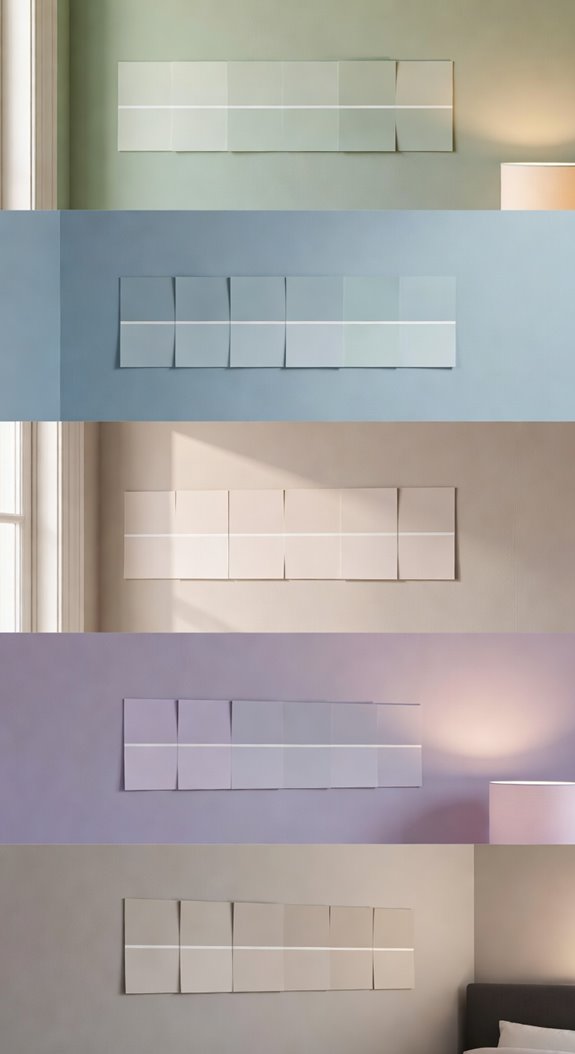
Once you’ve settled on a color family like greige or soft blue, the next step is understanding undertones, because they determine how a paint color actually reads on your walls.
Warm undertones like yellow or red create coziness, while cool undertones like green or violet feel more serene.
Test paint samples in your actual bedroom lighting before committing.
Common Mistakes

Even small color missteps can quietly undermine your bedroom’s restfulness, so it’s worth knowing which ones to avoid before you open a single paint can. Choosing overly saturated hues, ignoring undertones, or skipping test swatches are the most common errors.
You should also avoid cool whites in warm-toned rooms, since they’ll create visual tension that disrupts the calm you’re trying to build.
Final thoughts
Your bedroom’s color palette directly affects how well you sleep each night. Whether you choose soft blue, sage green, or muted lavender, the right tones can lower stress and signal your brain to rest. You don’t need a full renovation to see results. Start with paint, layer in coordinating textiles, and avoid undertones that clash. Small, intentional changes in color can meaningfully improve your sleep quality over time.